For this exercise I was asked to work in a wood or to study a group of trees. I was on holiday in Croatia at the time and found a beautiful clearing by a wooded area.
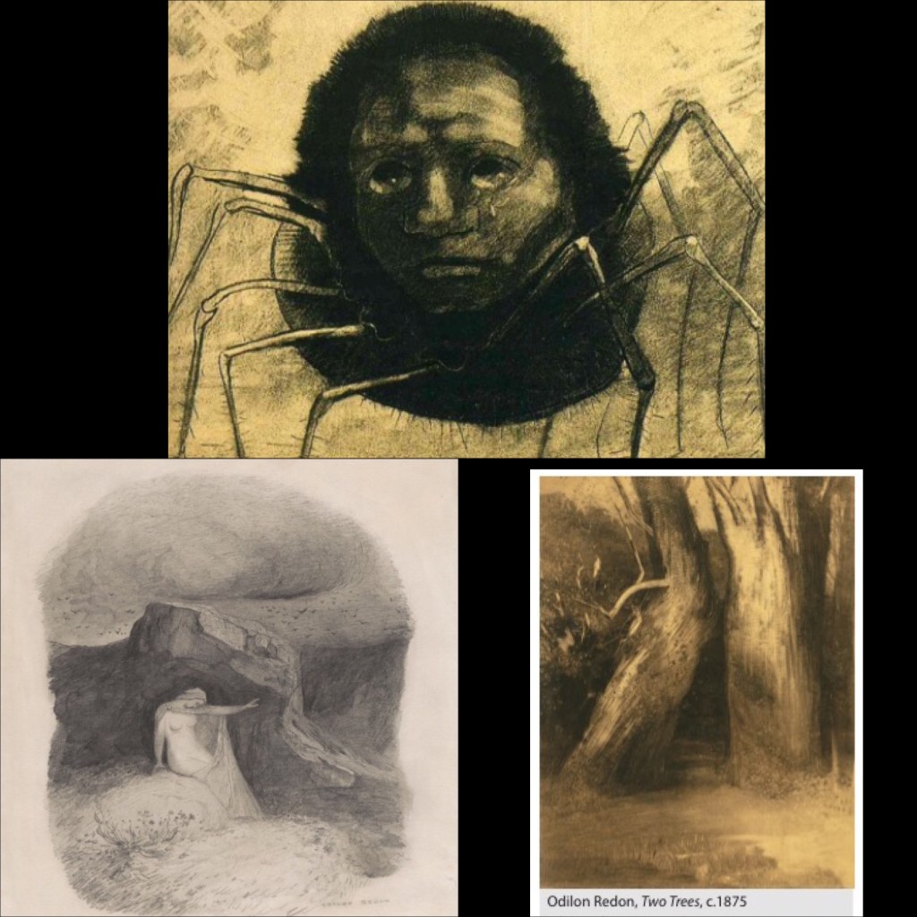
I decided I still wanted to look at Odilon Redons work and try to capture some of his mood and emotion in my own work.
I worked a2 size and used charcoal. I drew the scene out very roughly in biro first so I could sus out the logistics of where everything goes. This proved to be a mistake as the blue biro next to the black charcoal clearly doesn’t work so I would not do this again.
I felt quite overwhelmed by the large a2 sized paper and throughout my drawing wished I was working smaller.
I tried to distinguish different species of tree from another by using different marks and by pressing harder or lighter on my charcoal stick, I also experimented with putting my charcoal stick on its side or using a pencil sharpener to sharpen it in order to create wider or thinner lines.
I tried to handle light areas by leaving areas blank from the white of my page or by using my putty rubber (sometimes this would just smudge my work though and look quite ineffective.)
Just like my last tree drawing I found it difficult to keep up with where all of the branches went and how they all interacted with each other I found myself getting confused quickly . In the end I just tried to get a feel of the overall direction they were going in. I also decided to stop worrying too much about making sure each branch was exact and instead tried to aim towards creating an atmosphere of the scene just like Odilon Redon manages to do.
Overall I am generally pleased with my drawing. I do think that I managed to create an atmosphere and a mood, (maybe not quite to the same extent as Odilin Redons work) but it is a start I feel.
However there are plenty of areas of my drawing that could do with improvement. Some areas of my drawing have lines which are too heavy. There are also areas that look clumsy and too deliberate. There are also areas of my drawing that have been overworked and just appear as quite messy and un refined. Also as I mentioned before my use of blue biro doesn’t work at all.
I think in future I need to keep my lines light and thin and then work up into creating tone, in order to avoid clumsy heavy lines. I also think I should avoid mixing my media’s for a while until my use of form and lines improves at least.

I did really enjoy this exercise and I am starting to become more aware of how I can improve my work and where I am going wrong.
