Category Archives: Part 1

Exercise 1: Drawing fabric using line and tone.

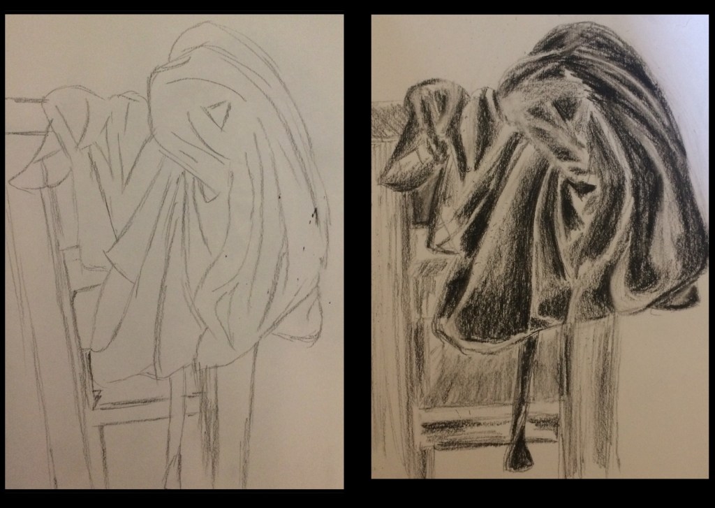
For this exercise I was asked to throw a piece of clothing or a length of plain fabric across a chair to make folded and soft layers of fabric and then make two 15 minute sketches, one using line and the other concentrating on tone. 

I draped my dressing gown over a kitchen chair. I drew using charcoal on a3 white paper. I started with a quick 15 minute line drawing, I tried to observe the lines of the fabric following the curves, rises and falls.

Because I only spent 15 minutes on my drawing, there will undoubtedly be some inaccuracies, however drawing quickly forced me to concentrate fully on the lines of the objects in front of me and produce a more raw and fluid drawing without worrying about mistakes and inaccuracies. 

My next drawing was in tone. I again used charcoal and I again only spent 15 minutes on my drawing. I worked quickly and I tried to identify and emphasise the areas of light and shade. I think I did manage to show the creases and folds in my dressing gown as well as showing the weighty thickness of the fabric. However my drawing is quite unrefined and I think I have overused the charcoal, my drawing may have been more effective if my charcoal use was less heavy and more subtle. 

I then divided my page into 12cm squares where I drew five minute sketches of different parts of the fabric. I tried to look at the shapes caused by the folds and I tried to emphasise form by showing areas of light and shade. I used a selection of different media’s including, charcoal, Indian ink, colouring pencils and oil pastels. 

I enjoyed doing this exercise as I enjoy working quickly and I enjoyed using a selection of different media’s. I did find it difficult though to create volume in the folds of the fabric and clearly some drawings are more successful than others. 

For example my drawing using colouring pencils is quite successful as I can see clearly the folds in the material and where shadow is created. I have also managed to show form through tonal areas. My drawing using purple and yellow pastel paint is less successful though, I think this is mainly because I drew in pastel to start with then I added water to activate the paint! However the colour of the paint seemed to run into each other & I lost the form that I had created. 

Exercise 4: Monochrome

For this exercise I was instructed to work  towards creating an image in a single colour. 

I was really inspired by the fish on the plate drawing in the handbook. Created by an OCA student of a mackerel and a blue patterned plate. 

I loved the shimmer of the mackerel and it’s beautiful pattern and fine detail. 

I decided to take a trip to Sainsburys and buy my own fish. 

I put my fish on a plate, considered my viewpoint and started sketching my composition a3 size using my blue biro. I enjoyed using a biro as it gave a permanent line. It allowed me no room for mistakes and certainly no room to get hung up rubbing out mistakes over and over again. 

Before I applied more tones of colour I decided to practice a range of blue tones so I was prepared. I used watercolour as it is a medium I haven’t used so far in this course. I also thought it may work quite well with the biro. 

As I began to add paint and build the colour up, I tried to focus on looking at the way the light catches on the fish and against the plate. I tried to capture some of the small detail of the fish scales and I tried to do this by showing the contrast between the very plain plate against the very detailed fish. 
I tried to show the texture of the fish through mark making with my biro and through building up colour with my paint. 

I found using monochrome quite difficult. Especially as I was working from still life. I kept wanting to work into the flesh of the fish using flesh tones of pinks and browns. Also looking at my finished piece it is clear I have been somewhat hesitant on the application of colour and I could have built up my colours tones further in order for it to be a more effective drawing? 

In my drawing I think I have managed to capture the pattern and shimmer and tone of the fish effectively. However what hasn’t worked so well is it’s contrast against the plain white plate. In hindsight I think this would have been a more effective piece of work if I had of used a more detailed and more exciting patterned plate. 

Exercise 2: Observing shadow using blocks of tone

For this exercise I was asked to place two pale, simple shaped objects together and position a lamp so they were lit from one side. 
I experimented with a white ceramic bowl a white ceramic tea cup and a white ceramic mug. Below are some photographic layouts. 

Then I was asked to make some quick sketches in my a2 sketchbook observing light and dark, mapping out the broad areas of light and shade. 
Below is my first drawing. I worked a2 size and used a stick of charcoal. I worked with the charcoal as I would a pencil and I am not happy with my result! I seem to have misjudged its shape and form and whilst working to fix its proportions, I worked over and over my shades of black charcoal, which has not worked. I decided that the best thing to do with this drawing was to leave it and to start a new.

For my second drawing I used my charcoal stick on its side to achieve thick bold strokes . I then tried to block in the graduation of tone. I started with mid tones then added lighter and darker tones, pressing down harder and lighter as I worked. I also tried to work on smaller details such as interlocking shadows. 
Overall I felt this was a better drawing than my first one. I think my tonal work with the charcoal was more successful as was my initial use of shape and form. 

I found this work difficult, mainly because I was working on such a large scale. I am not especially happy with my results, however I feel it has been a good learning tool and hopefully this method will improve my drawings in the future. 

Exercise 1: Groups of objects

For this exercise I was asked to choose at least 6 objects of different sizes and shapes some of them being 3D shapes like rectangles and cylinders and some of them being less regular in their form. The six objects I chose were, a tube of paint, a jar of linseed oil, my sons money box, a limo cutting tool, my sons miniature vanish bottle and a bottle on sunscreen. I selected the objects due to their shape and form. 

I began by photographing my objects from different positions experimenting with layout to get the best composition. Below are my different layouts.

For my drawing I worked on a2 sized paper. Before starting my drawing I wanted to make my page more interesting so I collaged over it using brown paper and greaseproof paper. On reflection a simpler background may have been more effective?

I used just  a pencil, a graphite stick and a biro for my drawing and I tried to loosely describe my objects. I tried to work big and fill the space. I was asked to imagine I could see through my objects. I believe this was so I could focus purely on shape and form and not get too carried away with fine detail? 
Below are the different stages of my drawing.

I struggled to fill the a2 paper, I am not confident about working on such a large scale and I feel this is evident in my drawing. I found working on such a large scale difficult but I can see the benefits as it really loosened up my wrist and I really felt like I was expressing myself. 
I ended up cutting my paper down so my drawings fitted the page better and this did work, however in the future I must really focus on this. 

I am relatively pleased with my drawing however aside from not working large enough I can see that I do need to work on my accuracy of form. 

Assignment 1

For my first assignment I have been asked to choose a few objects that trigger a response from me. I am currently away from home so don’t have too many objects of significance with me. However I chose both of my sons ‘special’ items my youngest son Teddy who is 3 has ‘baby’ a raggedy old teddy bear and my eldest son Leo who is 5 has ‘babby’ a raggedy old blanket. We have been living in Australia for the last few months but are due to leave in the next couple of weeks. I have chosen a bag with the name of my sons school on it. It is a wonderful loving and vibrant international school and it has been a big part of all of our lives whilst we have been here. I have also included my sons goggles as both my children have learnt to swim in Australia and this has been a really big deal. These chosen objects I think really summarise my last few months here in Australia and will always allow me to look back on a wonderful time in my life. I spent a little while placing these objects in different positions to create the perfect layout. I tried to set them up in a space where they could create interesting shapes and angles. I also tried to consider lighting hitting the objects at an interesting angle. I did this by experimenting with positioning my bedside lamp at different angles. Below are some photographs of my different arrangements.

For my drawing I worked on a3 paper. I started with a pencil and I tried to take my time blocking out proportions and positioning. I tried to utilise some of the experimental mark making skills I have discovered in this course so far and I tried to think about applying shadow. I finished my drawing using charcoal where I tried to draw out the darkest areas.

Reflecting upon my drawing, I am pleased with some of my mark making technique and some areas of accuracy on my drawing. However I still feel that my drawing looks flat in areas and I am not especially pleased with it. I feel that adding charcoal on top of my pencil work to draw out darker areas almost ruined it and it was better before hand. (I unfortunately didn’t photograph this though.) I am however aware that this is just the start of the course and hopefully as the course develops so will my work.

Reflection on my progress: I looked at the assessment criteria for the course and I tried to review my work using this criteria. For the first assessment criteria point I was to demonstrate my technical and visual skills, materials, techniques, observational skills, visual awareness, design and compositional skills. I feel I have demonstrated all of these above points not only in my assignment but in my project work leading up to my assignment. The next assessment criteria point was the quality of my outcomes, content, application of knowledge, presentation of work in a coherent manner, discernment, conceptualisation of thoughts and communication of ideas. Even though I achieved all of these points I think I may loose marks on the quality of some of my outcomes. The next assessment criteria point was a demonstration of my creativity, my imagination, my experimentation, invention and development of a personal voice. For this criteria point I think my work may be lacking as I feel for these projects and my assignment I was following a set of very clear instructions and had limited opportunity to demonstrate my own creativity and imagination. The final assessment criteria point was on context reflection- research and critical thinking. For this point I have tried to reflect upon my work as best as possible but without any feedback or guidance so far or without examples of how to best achieve this I feel I am unable to comment further on this area until my work has been assessed by my tutor.

Exercise 4: Shadows and reflected light

For this exercise I was asked to draw two objects with reflective surfaces, I chose two glasses. I set them against a black background (two black tshirts taped to the wall.) below are some experimentations of layout. 

I was asked to use charcoal and a putty rubber and to work large scale (a2). I found this exercise difficult. I felt like I was constantly not happy with my work, however instead of constantly throwing my work away and re starting I decided to pursue my drawing and battle through. I tried to show the reflected light and shade of one object falling onto the other and I tried to focus on the shapes, shadow and light. 

I started my work by drawing my objects basic outline then adding the basic lines of shadow. 

I used my white paper to represent my lightest tonal areas. I started with the mid tones and worked up to the dark tones. I tried to lift out the smallest lightest tones with the point of my putty rubber (however I found this difficult as it didn’t seem to lift as much as I wanted it too. I tried to use the sharpest edge of my charcoal to work into the finest details. 

Overall I am not especially pleased with my drawing. I did find it incredibly helpful to be directed how to use tone effectively, however I think that in future I need to spend longer in the beginning stages working out the exact shapes and forms of the objects individually and in relation to each other before I start to add the tone. 

Research point: Odilon Redon

For my research point I was asked to look at Odilon Redon’s Two trees 1875 (charcoal on paper). I was asked to note the artists expressive use of tone, blocks of sharp charcoal in sharp contrast to expanses of light and then the smaller details, lines and spots that pull the image together as an ambient scene.

I was also asked to research more of Redons work and to discuss the atmospheric potential of tone.

Odilon Redon (born in 1840) was a French Symbolist painter who was also known for his drawings with graphite and charcoal.

I decided to look at ‘Woman with an outstretched arm 1868’ the materials used were graphite on ivory wove paper. This work shows a partially naked woman sitting on a rock whilst stretching out her arm, she appears to be sheltered by another larger rock, the background either depicts a really moody sky or a rough sea.


I find this work enchanting I love the sensitivity of his tonal marks and how my eye is drawn to the woman from the very dark tones above her. I find Redons use of dark and light captivating in this piece and how my eye is forced to travel around the page. The mood is dark, and the atmosphere makes me feel lonely and cold. It is incredible how a piece of graphite can create these incredible tones that are able to make me the viewer feel so heavy inside.

The next piece of work I looked at was called ‘The crying spider’ I picked this work as it contrasts so much with the other two pieces I have looked at. It is an image of what looks like a giant spiders body but with 12 hairy legs. Placed on its body is a male human head who appears to be crying. I can’t say I ‘like’ this work as I think it is horrible. However I am in complete awe of the dark mood it portrays. It has been drawn with charcoal and I think Redons use of tone and texture is spectacular. His use of the dark tones of the spiders body contrasted again the much lighter background really emphasises it somber mood, and the small hatching lines of hair on the spiders leg against the pale background emphasises the eeriness of the work. This dark somber fantastical creature makes me think of a nightmare, but equally the pain in this creatures face makes me feel great pity and loss. The background just adds to this feeling with the dark rough texture around the edges reinforcing the light space around the creature.

I hope that as my drawing improves that I can start to portray some sort of mood and feeling into my own work.

Bibliograpy:

Wikipedia. (2019) Odilon Redon
At: https://en.m.wikipedia.org/wiki/Odilon_Redon (Accessed 17/04/2019).

Gorlinkski, V. (2019) Odilon Redon
At: https://www.britannica.com/biography/Odilon-Redon (Accessed 17/04/2019).

Moma. (2019) Odilon Redon: French 1840-1916
At: https://www.moma.org/artists/4840 (Accessed 17/04/2019).

Exercise 3: Creating shadow using lines and marks.

For this exercise I was asked to choose a simple single object, I chose a tube of acrylic paint.
I was then asked to work with four drawing tools, I chose a pencil, a biro, black ink and a ball point pen.
I then split my page into four and drew the object four different times using my different drawing tools, rather than drawing heavy outlines though, I worked using mark making techniques such as cross hatching, hatching spots and a scribble. Below are my results.

I am not especially pleased with the accuracy of my drawings however I am pleased with my mark making. This mark making allowed me to think about adding tone in a way that’s different than just shading with my pencil. I look forward to using this technique in the future.

I then arranged more objects. This time I chose, two perfume bottles, the tube of acrylic paint and my tea cup. I chose these objects as I found their reflective properties exciting, and I hoped the reflections would make for an interesting drawing? Below I have experimented with layout.

I then drew my favourite layout and I tried to fiocus on showing tone with different mark making techniques. I worked a2 size and used a range of drawing materials such as ink, graphite stick, charcoal and a biro. Below is my result.

Even though I worked on a2 paper I didn’t manage to fill the page. Working large scale is something I clearly need to work on.
I enjoyed the process of this drawing, not worrying too much about accuracy and experimenting quickly with mark making. However I am not entirely happy with my final result. My shape and form isn’t as accurate as I would like it to be. Even though I like my marks and find them quite exciting and expressive I don’t think they are accurate enough?

Exercise 2: Observing shadow using blocks of tone.

For this exercise I was asked to place two pale, simple shaped objects together and position a lamp so they were lit from one side.
I experimented with a white ceramic bowl a white ceramic tea cup and a white ceramic mug. Below are some photographic layouts.

Then I was asked to make some quick sketches in my a2 sketchbook observing light and dark, mapping out the broad areas of light and shade.
Below is my first drawing. I worked a2 size and used a stick of charcoal. I worked with the charcoal as I would a pencil and I am not happy with my result! I seem to have misjudged its shape and form and whilst working to fix its proportions, I worked over and over my shades of black charcoal, which has not worked. I decided that the best thing to do with this drawing was to leave it and to start a new.

For my second drawing I used my charcoal stick on its side to achieve thick bold strokes . I then tried to block in the graduation of tone. I started with mid tones then added lighter and darker tones, pressing down harder and lighter as I worked. I also tried to work on smaller details such as interlocking shadows.


Overall I felt this was a better drawing than my first one. I think my tonal work with the charcoal was more successful as was my initial use of shape and form.

I found this work difficult, mainly because I was working on such a large scale. I am not especially happy with my results, however I feel it has been a good learning tool and hopefully this method will improve my drawings in the future.

Exercise 1: Groups of objects.

For this exercise I was asked to choose at least 6 objects of different sizes and shapes some of them being 3D shapes like rectangles and cylinders and some of them being less regular in their form. The six objects I chose were, a tube of paint, a jar of linseed oil, my sons money box, a lino cutting tool, my sons miniature vanish bottle and a bottle of sunscreen. I selected the objects due to their shape and form.

I began by photographing my objects from different positions experimenting with layout to get the best composition. Below are my different layouts.

For my drawing I worked on a2 sized paper. Before starting my drawing I wanted to make my page more interesting so I collaged over it using brown paper and greaseproof paper. On reflection a simpler background may have been more effective?

I used just a pencil, a graphite stick and a biro for my drawing and I tried to loosely describe my objects. I tried to work big and fill the space. I was asked to imagine I could see through my objects. I believe this was so I could focus purely on shape and form and not get too carried away with fine detail?
Below are the different stages of my drawing.

I struggled to fill the a2 paper, I am not confident about working on such a large scale and I feel this is evident in my drawing. I found working on such a large scale difficult but I can see the benefits as it really loosened up my wrist and I really felt like I was expressing myself.
I ended up cutting my paper down so my drawings fitted the page better and this did work, however in the future I must really focus on this.

I am relatively pleased with my drawing however aside from not working large enough I can see that I do need to work on my accuracy of form.