For this exercise I used my drawings from the previous exercise to develop into colour.
I worked using coloured pencils and I used the colours orange, yellow and black.
I worked in line first and gradually applied colour as I went. I referenced my previous sketches rather than working from first hand.
I tried to start by applying just a touch of colour by applying light pressure on my coloured pencil, then gradually increasing the pressure to try to give a stronger line and more depth.
I struggled with this exercise, I think the main reason I struggled was because I was working from my previous line drawing rather than from life or a photograph. Because my line drawing didn’t show much tone or where the light was coming from I felt like I was almost making my drawing up. I think my end result looks flat and if I was to do this exercise again I would work from life or at the very least a photograph.
I feel I didn’t manage to create a sense of depth with my limited colour palette and this is definitely a technique I would like to experiment further with, but in future I think drawing from source rather than a quick line drawing will hopefully be more successful.
For this exercise I used two sketchbook pages to make a preliminary drawing of a townscape. I drew a road in Chester. I went to university in Chester a long time ago and it is a place that remains very special to me. I drew in pencil and I tried to draw everything I saw. I didn’t worry too much about making my drawing perfect I just wanted to document everything in front of me. I tried to document everything I saw except for the people. I knew if I started drawing people I would get carried away and my focus would be on the people rather than the buildings. The general mood of the place is happiness, even though it was a cold winters day the road was still vibrant and busy.
Below is my drawing.
For my final piece of work I was asked to complete the drawing in pen and ink. So my next stage was to experiment using this medium.
I decided however that this time I would include people in my drawing in order to portray the true atmosphere of the location. Below are some examples of my experimental drawings using pen and ink.
I then decided to experiment with adding some colour. I used a small amount of very watery watercolour paint. I found when adding the watery paint it made the ink run and the colour and the ink blended together. I liked this effect but didn’t really think it was suitable for this drawing so it may be a technique I experiment with further on another exercise. Below are my drawings.
For my final drawing I decided to draw a smaller section of my original drawing. I thought this smaller section would be a more interesting composition and it would allow me to draw in more detail. I worked a3 size and I used pen and ink. I tried to show through my erratic and quick marks the movement and vibrancy of the road.
Below is my drawing.
Overall I am pleased with my drawing. I feel like I have captured the energy and feel of the location. I feel that using pen and ink was the perfect medium in which to achieve this too.
My areas of improvement for my work would be some of my accuracy’s, proportions and perspective lines. When I focus on different areas of my drawing especially some of the windows I notice how some of my angles are out slightly and this in turn makes areas of my drawing look wrong.
I am hoping that with time and practice this is something I can improve upon.
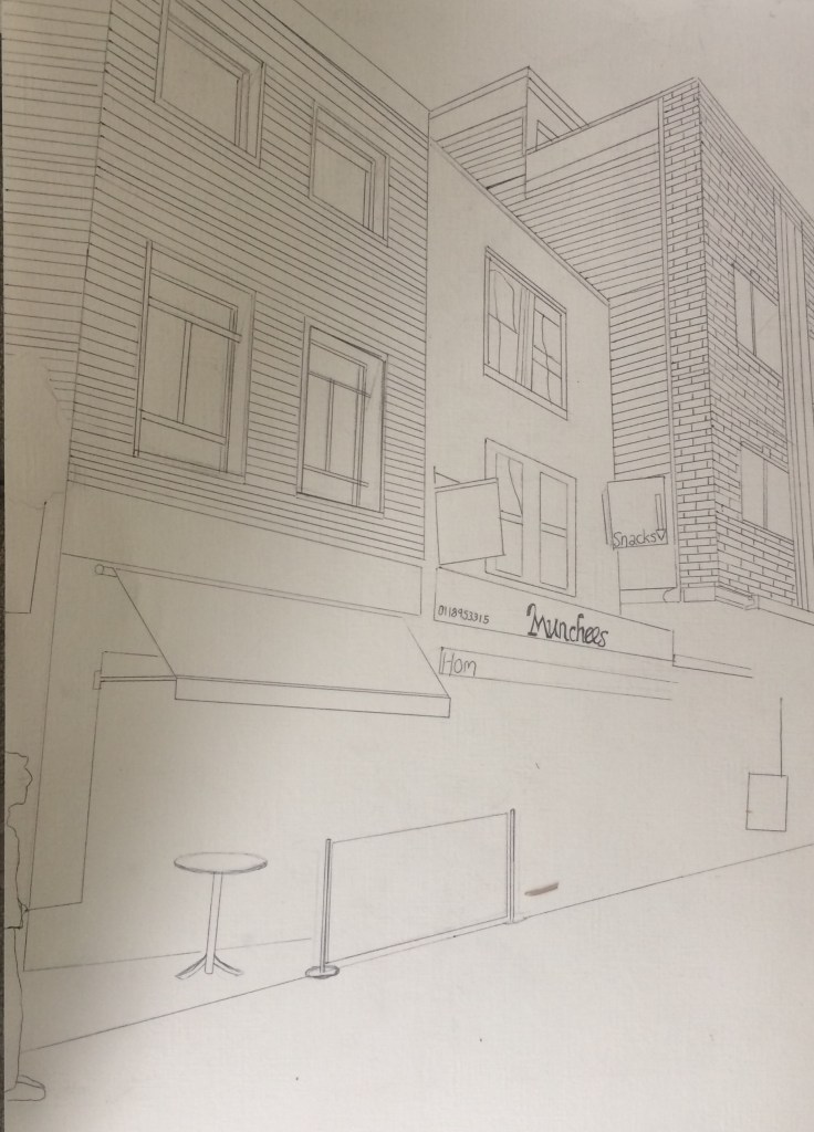
For this exercise I was asked to focus on a townscape. I decided to concentrate on Reading town as this is my closest town. I focussed on one view of a set of three buildings attached together down a quiet road in Reading. I positioned myself on a chair and table outside Starbucks.
The buildings I drew were a row of cafes, with what look like residential apartments above them.
My sense of the place, was mainly that it was a bit dirty, I was cold, and the cafes didn’t look like places I wanted to buy coffee from.
The buildings looked old and worn, they looked like they could do with a re paint as paint was peeling from the wall. The street itself was busy though and lively with a happy atmosphere of people getting on with their day.
I started this exercise by making a detailed study with a 3B pencil, in a 10cm square. I focussed on one of the windows above the cafe. I picked the grottiest looking window as I felt this gave the most atmosphere. It made me wonder what was behind the dirty glass and ragged curtain? I started the drawing by drawing the outline- I tried to draw in all the detail like a blue print before adding tone just like urban landscape artist Nathan Walsh whom I studied in my research point before this exercise.
I used a ruler so I could get the lines of perspective correct. (like I was taught in a previous exercise.)
Below is my drawing:
I then drew a second 10cm drawing only this time I focussed on shadow. I picked a different window & a different part of the building this time. I tried to show where the light fell across the building. The light and shadow was not that strong but I still managed to see the shadow. I again used a ruler but drew some lines of perspective wrong & it impacted the entire drawing. Luckily though as I was using a pencil this could be amended.
Below is my work:
When deciding on drawing these buildings I didn’t put much thought into it, it just so happened that I was facing this way when sat at my table in Starbucks. However when drawing and really focusing on every small aspect and detail of these buildings, I really started to appreciate how spectacular they actually were. I noticed every small detail of exciting architecture. Or every small dirty pipe or mark on the wall.
My next stage was to make several more drawings so I was able to make a more informed decision about my final piece. This helped me as it forced me to observe details I would ordinarily miss when just looking. I drew a bigger area than my original 10cm square drawings and I continued to work with pencil. Below are my drawings.
I then experimented with colour, I drew in biro first then added a wash of watercolour over the top.
After my work with colour I decided not to use colour for my final piece and to just draw in tone.
My next drawing was of a bigger area, as I felt my drawings with more detail and surface area were more successful. I worked in biro this time as I was starting to find that my pencil work was getting a bit smudgy. Because I was drawing a larger area I noticed that I was missing out detail and being more selective about what detail I was including. For example I left out people- I knew that including the people would be difficult as everyone was moving so fast and I didn’t want to get wrapped up in trying to draw people rather than concentrating on the buildings. I also left out things like piping and litter on the floor and lettering on the windows and actual lettering for the signs.
Below is my drawing,
This drawing I decided was going to be used as my composition for my final piece. I love the angles at which the building is facing and how my drawing really conjures up the atmosphere of the place at that given moment.
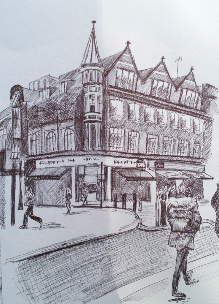
For my final piece I decided to work big- A2 size. Drawing big is something I struggle with so I wanted to practice. I decided to work with biro as I knew I would end up smudging my pencil work.
I wanted to take my time with this drawing and use a ruler to work out perspective and I wanted to draw out my drawing like a blue print with as much detail as possible before I added tone like urban artist Nathan Walsh. I found getting all the angles right very difficult and because I was using a biro my incorrect lines had to stay.
Below is my detailed line drawing.
I then began to add tone with my biro. This helped with my incorrect lines as I could ‘tone’ over them. I discovered as I was drawing how much detail I was leaving out. I only included one person, right at the edge of the work. In hindsight I wish I included more people to show the busyness of this street.
I really struggled with all of the angles and lines that were needed in order to make this drawing look accurate. Whilst I was successful in lots of these lines and angles there are a few that are incorrect that distract me from the finished piece.
Overall I am really pleased with my drawing. I am mostly pleased with my tonal work and I am very pleased with lots of my lines and angles.
For this research point I was asked to look at urban environment landscapes. I started by looking at John Virtue and the work he produced while associate artist in residence at the National Gallery between 2003 and 2005.
John Virtue is a landscape artist whose drawings look almost abstract. He often works from the landscape of where he happens to be living at the time, in this case it was London.
John Virtue works in black and white. He uses acrylic paint, black ink and shellac and works on canvas.
John Virtues London Paintings focus on the London skyline, where he often showed popular landmarks such as St Paul’s Cathedral.
Below is one example of his works from this time, landscape no. 664
This is a landscape drawing of a view along the river Thames. It shows a view of St Paul’s Cathedral and Blackfriars Bridge. At first these are the only two aspects of London I recognised, and the rest appeared to me like a vast amount of blackness. However over time and really looking that this image I began to notice other elements such as the boats on the river.
I find his drawings really emphasise the hazy and smoggy side of London, he shows this through his rich over use of black, and his works almost smudgy abstract appearance. I love the subtlety’s of his detail and the extravagant mood and atmosphere he manages to portray.
The next artist I looked at was Nathan Walsh. Nathan Walsh is an English artist who paints ultra realistic urban landscapes. One of the reasons I chose to look at him was because of his use of perspective in his work as this is what I have been studying recently.
Walsh often exhibits his detailed line drawings alongside his final paintings. It is obvious from these drawings that he firstly establishes his horizon line and then works with lines of perspective from there (exactly how this course has so far taught us to do.)
I love how his final pieces show a mixture of ultra photo realism and an illustrative element, for example the puddles on the pavement could be a photograph whereas the tree in the centre looks like an illustrative drawing.
The next artist I decided to look at was Craig McPherson. Craig McPherson is known for his urban landscape paintings of New York City. Below is an example of one of his works,
One of the reasons I chose to look at Craig McPherson’s work, was it showed striking similarities to John Virtues black and white paintings. However rather than using Acrylic paint and ink like John Virtue, Craig McPherson uses mezzotint, a type of print method used with copper or steel plates. This is a process I have never used before or even heard of so it was something I found exciting and fascinating.
I was really inspired by Craig McPherson’s Yankee Stadium at night. I love his use of vivid light and the amazing atmospheric perspective that is shown. (This is something I failed to achieve successfully in my own work on my previous exercise, so is a technique I am very interested in now.
I feel his work is very dramatic and I love it’s vast composition. Unlike John Virtues work Craig McPhersons detail is sharp and obvious. This works makes my eye travel around the piece at great speed it feels like I can’t get enough of every tiny aspect quick enough.
In conclusion all three artists show wildly different styles and techniques whilst still maintaining an exciting portrayal of urban landscapes. Moving forward I would like to be able to use their work to inspire my own drawings including John Virtues use of mood and atmosphere, Nathan Walsh’s incredible detail and realism and
The objective of this exercise was to create a sense of distance through aerial or atmospheric perspective in order to show that distant objects appear less distinct. I was to do this using tonal graduation.
I was asked to use a selection of drawing media, I used Charcoal and watercolour paint, Indian ink and water soluble crayons.
For this exercise I worked from old holiday photographs of landscapes that I considered to be quite beautiful. Due to the current pandemic working first hand will prove to be quite difficult.
For my first drawing I worked with charcoal, I tried to establish the horizon before plotting the basic forms of objects in the landscape from foreground to mid and far distance. My aim was for my foreground to appear sharper and darker and my background to have less detail and be lighter. Below is my drawing.
I felt that my drawing was not complete so I continued my drawing by adding watercolour paint. I made sure that the sky and hills in the background were light and dull with very little detail whilst all the colour intensity and detail was focussed on the trees in the foreground.
I feel I could have emphasised atmospheric perspective further by having the background hills even lighter and even duller.
For my next drawing I worked with Indian ink and an old fountain pen. I found using ink quite a difficult media to use when trying to show distance, especially the background. I used mark making to show texture and detail in the fore and middle grounds and left the background clear, my idea being to add water to the drawing to smudge the ink in order to create some atmospheric perspective. Below is my original ink drawing before adding water.
When I added water rather than show the atmospheric perspective I was hoping for I think I just managed to create a bit of a mess. I experimented for a while with this drawing adding more water and then working on top with more ink after it dried. Below is my work.
I don’t really feel I managed to show much atmospheric perspective here, mostly because I was not confident enough with the media I was using, I enjoyed being experimental though and hopefully next time my work with ink will be more successful.
For my final drawing I used water soluble crayons, I started my work by blocking on the basic forms of my objects (in this case trees & bushes) then I gradually built up gone and colour, focussing on making the fore & middle grounds more intense with colour whilst leaving the background quite pale in comparison. Below is my work
Overall I feel I learnt a lot from this exercise. Even though what I feel I learnt is not necessary evident in my work, I do feel hopeful that in my next drawings I can work upon this technique of showing distance and atmospheric perspective through tonal graduation.
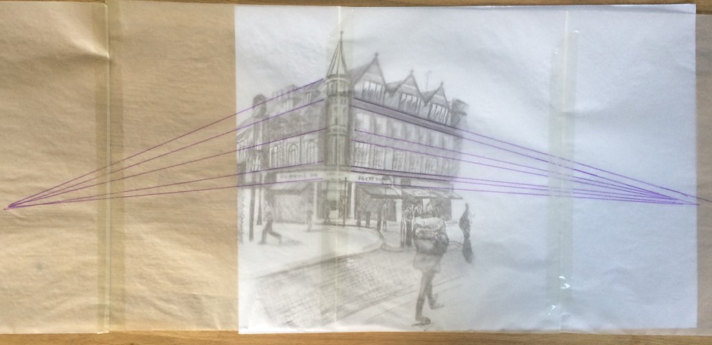
For this drawing, I drew a scene from Reading town centre. I picked a building that I could observe corner on. I used biro on thick cartridge paper and I worked a4 size. I tried to use every possible vertical or horizontal reference to ensure that receding lines were drawn at the correct angles. I tried to use the vertical corner of the building as the reference.
Below is my drawing:
When I finished my drawing I stuck together 4 pieces of a4 tracing paper and placed it on top of my drawing. I then drew all the parallel lines and tried to get them to meet their vanishing points.
I found using a ruler to check the angles and receding lines very effective in helping my perspective and accuracy of my drawings, this I see definitely a technique I intend to use going forward on all of my drawings.
For this exercise I was asked to draw a view through a doorway inside a building. I was fairly limited to where I could do this as we are currently on lockdown & I live in quite a small house. I decided to do my drawing at the entrance of my kitchen. I chose my kitchen because of the wood panels on my floor and the angular cupboards and table and chairs. I positioned myself on the floor to draw.
I drew in line and didn’t use a ruler. I drew on a3 paper in my sketchbook with a hb penciI.
After I finished my drawing I put tracing paper over the top of my drawing and drew over my parallel lines (mostly of the floor & sofa) using a biro to see if they all receded into a single vanishing point. Unfortunately they met in a variety of places. (I did make the mistake of adding lines of the sofa which was positioned at a different angle!) I then added the lines (pink) of the fridge and storage cupboards, this again showed similar results.
My next step was do the drawing again, only this time using a ruler and making sure all of my lines receded into a single vanishing point. Below is my ruler drawing:
This drawing is a lot more accurate than my original drawing, thus using a ruler and making sure all diagonal lines receded to the same point worked effectively. However this drawing feels more clinical than my first and seems to lack the charm of my original.
For this exercise I choose a photograph from my Aunts back garden, I used this garden for my previous exercise on 360 studies.
I worked a3 size on white cartridge paper and used a selection of different pencils. The aim of this exercise was to establish a foreground, middle ground and background. The photo I chose from my Aunts garden I felt showed this effectively
This way of organising space is characteristic of the French classical painters Nicholas Poussin and Claude Lorrain who in turn influenced the British landscape artist JMW Turner.
JMW Turner Italian Landscape with Bridge and Tower, 1827.
All of these landscape paintings show foreground, middle ground and background effectively, their common traits are mostly blurry backgrounds and much sharper foregrounds. This is something I am going to aim to do in my work.
I started my drawing by doing a line drawing of my photograph. I then started to add tone to the background, I worked with my softest 6b pencil and and aimed for very little detail, I then worked into my middle ground where I used my 2b pencil and aimed for slightly more detail, then for my foreground I used my sharpest HB pencil, I tried to focus on small detail with this part and used cross hatching and mark making to show tone.
Whilst working I felt like I was succeeding in this exercise, however when I finished I noticed that it wasn’t actually as obvious as I thought or would have liked? One problem I had whilst drawing was I was constantly smudging my work unintentionally with my hand whilst moving my pencil around the paper? I think in future maybe I should rest my hand on a piece of material or paper to try to prevent this smudging?
I also think in future I need to make the foreground, middle ground and background even more obvious. I believe this drawing would be more effective if I made all of the background completely blurry, then the middle ground less so and the fore ground extremely sharp.
I feel I have gained a lot from this exercise. Even though my drawing is not as obvious as I would like it to be, my subtle differences do show a small element of space and this is something I will continue to work on and think about in my future work.
For this research point I researched contemporary artists who work with landscape and a range of viewpoints and I compared their approaches with those of earlier artists.
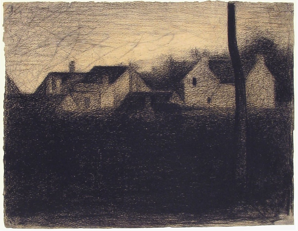
The first artists I looked at were Tacita Deans blackboard drawings and George Seurat’s landscape with houses.
Tacita Dean is a British artist born in 1965 in Canterbury. Her series of six multi-panel blackboards show the entire length of the river Kabul in Afghanistan. Each panel depicts a different viewpoint of the terrain. Below is an example of one of these works.
Georges Seurat was a famous French 19th Century Neo impressionist artist. He was mostly famous for his pointillism painting technique but he was also famous for his conte crayon drawings. Below is an example of one of them.
– Both drawings are monochromatic grey scale works with high levels of tonal contrast that use similar tonal arrangements and variations that both result in providing dramatic atmospheres.
– The foreground in each drawing is black which draws my eye to the main focal points in the drawings.
– In both drawings the focal points appear to be across the middle of the works.
– Both Landscapes have an undulating up and down rhythm. This is shown in Tacita Deans mountain levels and in the level of the rooftops in Georges Seurats landscape.
Differences between the two drawings:
– The first difference I noticed is the size and volume of the landscapes. Tactia Dean’s six huge blackboard drawings measure 6 feet x 15 feet each whereas Georges Seurat’s work is an individual piece measuring 24.9cm x 31.9 cm.
– Both landscapes are created using different media’s, Tacita Dean created her work using chalk on a blackboard whereas Georges Seurat used conte crayon on paper.
– Tacita Deans drawings are purely of natural forms whereas Georges Seurats drawing includes houses so it is more man made.
– Tacita Deans drawings are white chalk on a black blackboard whereas Georges Seurat’s drawing is black conte crayon on white paper.
– Tacita Dean’s work has a dark area to represent the sky, this contrasts with Seurat’s light tone to represent the sky on his work.
– It is likely that Georges Seurat completed his drawing at the scene and therefore probably in a relatively short amount of time, I think this because Seurat was known for his “plein air “ paintings where he completed his work outside. Whereas Tactia Dean’s work seems to have taken much longer and is also accompanied by a film and a book with information regarding the images. Her work was also created using photographs that she took of the landscape.
– Tacita Deans drawing looks almost photographic to me, whereas I think Georges Seurats looks very much like a drawing.
– The drawings were produced over 100 years apart.
In conclusion both drawings have huge similarities and equally huge differences, they are both exciting, Moody and evocative in their own seperate ways. They both evoke a sense of serenity in me.
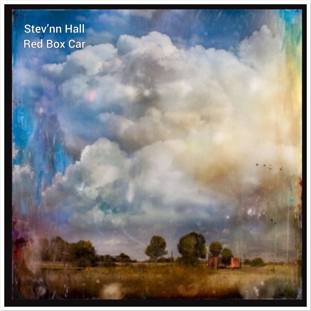
The next two artists that I decided to study were John Constables ‘The Hay Stack’ and Stev’nn Halls ‘Red box car.’ I decided to look at these paintings because I was fascinated by both paintings exciting dramatic clouds in the sky.
Stev’nn Hall is a contemporary Canadian artist who creates multimedia landscapes. The work I will be looking at is Red Box Car. Created with photo, oil, ink and resin on panel. It is 84cm x 84cm.
John constable was an English landscape painter ‘The Hay Stack’ is regarded as one of his most famous works. It depicts a rural scene on the river stour and was completed in 1821 using oil on canvas. It is 130.2cm x 185.4cm.
Both landscapes have exciting dramatic clouds and skies, that to me are the main focus.
Both paintings have landscapes of countryside fields with trees.
The colour schemes in both landscapes are similar, the blue tones of the sky and the heavy tones in the clouds are similar as are the yellow, brown and green tones of the countryside below.
Both landscapes give a realist depiction of what the landscape would have looked like.
Differences between the two artworks:
The materials used in both landscape works are extremely different, John constables uses the very traditional approach of oil on canvas whereas Stev’nn Halls works in a very unique and contemporary way for this landscape, he took photographs through the glass of his car window, he then re photographed his photgraphs, edited and distilled these images then enlarged them and scratched, distressed and painted on top of them finishing them off with a glaze.
The time apart from which they were created is an immense difference John constables work was created in 1821 whilst Stev’nn Halls work was created in 2008, 187 years later! There is no doubt that both of these artists lived and created their art in extremely different worlds.
The amount of sky John Constables’ landscape has appears to be a proportional amount for a realist depiction of a landscape. However Stev’nn Halls landscape seems to have a disproportional amount of sky in comparison to the amount of landscape portrayed. For me this is why I was so attracted to this work, having such a large proportion of sky really enforces it’s dramatic and exciting clouds.
John Constables ‘The Hay Stack’ is a landscape that depicts a rural scene on the River Stour. The Mill in the painting was owned by Constables father and the house on the left hand side of the painting was owned by his neighbour. This was therefore a very personal painting to the artist.
Stev’nn Hall’s landscape is replicating his childhood memories of going for drives sitting in the backseat of his parents red box car driving through rural Canada.
In conclusion both landscapes have huge similarities mostly in their subject matter, composition and colour schemes. Equally there are huge differences, namely in the physical processes in which they have both been created. Overall both landscapes are exciting and give a real sense of place making the landscapes come alive and evoke a real sense of atmosphere.
For this project I was asked to review my preparatory work from project 2 and select those that have elements that I would like to include in a larger drawing.
There were two aspects to the work that I completed in project two that I would like to bring forward into this exercise. The first being the sketchbook walk, even though I wasn’t especially pleased with my drawings, I did very much value the concept of drawing from different angles or places in the one space. Therefore for this exercise rather than use those original drawings I decided I would do another sketchbook walk.
The other aspect of the work I created in project two that I thought was successful was my 360 drawings in my Aunts garden. Even though these drawings were quick and sometimes unrefined I liked working with biro and a light wash of watercolour on top, I therefore would like to try to develop this idea further and use these techniques again.
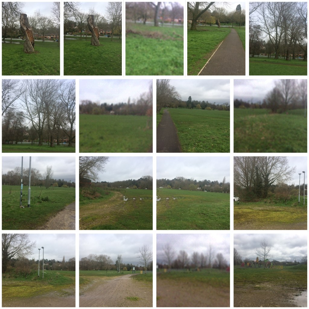
This time I walked along the River Thames in Caversham, this is a walk I take regularly so I am very familiar with its views.
Before I decided on what to draw I decided to take lots of photographs just so I could really accustom myself with composition ideas. (These photographs were only taken on my very old iPhone, so are not of a good quality, but they still served the purpose of getting me to really look at the views around me). Below are my photographs:
My next stage was to complete some drawings, I used a4 cartridge paper and worked with a biro, this time I tried hard to be as accurate as possible. I tried to show texture with mark making and cross hatching and I tried to show light on this bright sunny day.
Below are my drawings:
I then needed to think of a final composition so I went out the next day to find an area that I found interesting. I had so far enjoyed my work on trees and I enjoyed using the park bench as a focal point in my sketchbook walk. I found an area that I found interesting with a background framed by trees and a fence, with a park bench being a focal point. It was a partly cloudy March day with lols of light and shadows being created. Below is my drawing for my final composition.
My next stage was to think further about the media I wanted to use and the techniques I wanted to use for my final piece, so I experimented with some different techniques and media in the trees bel ow:
In my opinion the most successful tree was the mixture of all 3 media’s: biro, Charcoal and Watercolour wash.
When starting my final landscape drawing, I decided to work on a2 paper. For some reason I have struggled with drawing on a larger scale and I know the only way to combat this is to practice.
Instead of going back to Caversham to draw from life, I decided to use my drawings to help inform me for my final piece, I worked in biro first and filled in the main focal points, the park bench, the fence and the trees.
I then worked into my drawing using charcoal and a wash of water colour, I used my sketchbook walk photographs in order to help inform me for colour, texture and tone.
My clouds were informed by my cloud drawings from part two, just like in some of my experiments I used a light watery wash of black Watercolour to hint at the partial cloudy day.
Below is my final piece:
One of the things I noticed whilst working was my a2 paper quality was not as good as my sketchbook cartridge paper, and for that reason my watercolour wash didn’t look as effective as it did on my smaller drawings. Next time I work on a larger scale I will need to buy some better quality paper.
I also found filling such a huge space very difficult, I found working to scale difficult and I felt that any mistakes I made in accuracy or proportion were magnified. I made a small mistake on the bench but in trying to fix it I seemed to make it worse and worse, in the end it was best just to leave it before I made it even worse.
I am pleased that I attempted to work on a large scale as I do think the more I practice the better I will become, however I do t feel I am not quite there yet.