For this research point I was asked to look at urban environment landscapes. I started by looking at John Virtue and the work he produced while associate artist in residence at the National Gallery between 2003 and 2005.
John Virtue is a landscape artist whose drawings look almost abstract. He often works from the landscape of where he happens to be living at the time, in this case it was London.
John Virtue works in black and white. He uses acrylic paint, black ink and shellac and works on canvas.
John Virtues London Paintings focus on the London skyline, where he often showed popular landmarks such as St Paul’s Cathedral.
Below is one example of his works from this time, landscape no. 664
This is a landscape drawing of a view along the river Thames. It shows a view of St Paul’s Cathedral and Blackfriars Bridge. At first these are the only two aspects of London I recognised, and the rest appeared to me like a vast amount of blackness. However over time and really looking that this image I began to notice other elements such as the boats on the river.
I find his drawings really emphasise the hazy and smoggy side of London, he shows this through his rich over use of black, and his works almost smudgy abstract appearance. I love the subtlety’s of his detail and the extravagant mood and atmosphere he manages to portray.
The next artist I looked at was Nathan Walsh. Nathan Walsh is an English artist who paints ultra realistic urban landscapes. One of the reasons I chose to look at him was because of his use of perspective in his work as this is what I have been studying recently.
Walsh often exhibits his detailed line drawings alongside his final paintings. It is obvious from these drawings that he firstly establishes his horizon line and then works with lines of perspective from there (exactly how this course has so far taught us to do.)
I love how his final pieces show a mixture of ultra photo realism and an illustrative element, for example the puddles on the pavement could be a photograph whereas the tree in the centre looks like an illustrative drawing.
The next artist I decided to look at was Craig McPherson. Craig McPherson is known for his urban landscape paintings of New York City. Below is an example of one of his works,
One of the reasons I chose to look at Craig McPherson’s work, was it showed striking similarities to John Virtues black and white paintings. However rather than using Acrylic paint and ink like John Virtue, Craig McPherson uses mezzotint, a type of print method used with copper or steel plates. This is a process I have never used before or even heard of so it was something I found exciting and fascinating.
I was really inspired by Craig McPherson’s Yankee Stadium at night. I love his use of vivid light and the amazing atmospheric perspective that is shown. (This is something I failed to achieve successfully in my own work on my previous exercise, so is a technique I am very interested in now.
I feel his work is very dramatic and I love it’s vast composition. Unlike John Virtues work Craig McPhersons detail is sharp and obvious. This works makes my eye travel around the piece at great speed it feels like I can’t get enough of every tiny aspect quick enough.
In conclusion all three artists show wildly different styles and techniques whilst still maintaining an exciting portrayal of urban landscapes. Moving forward I would like to be able to use their work to inspire my own drawings including John Virtues use of mood and atmosphere, Nathan Walsh’s incredible detail and realism and
For this assignment I was expected to pull together the observation and practice I have done in part 2. I was asked to either work on a Still life or an interior scene or to do a combination of these.
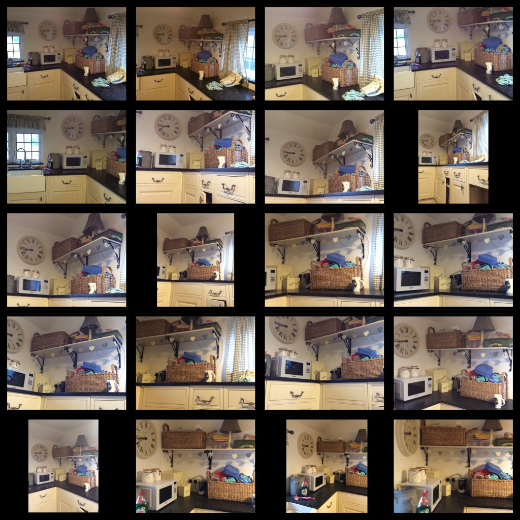
I decided to start the assignment by taking some photographs around my house of interior scene’s with collections of objects. I felt this was a good way of incorporating an interior scene and a still life at the same time. Below are some snap shots I took on my phone to get me started.
From these snap shots the image I felt most excited about was my recycling bin. I love the mixture of both colour and texture shown in this image so I decided to experiment with it further.
I did this by completing a few quick rough sketches of the bin from different angles and viewpoints.
Next I completed a drawing of my intended layout for my final piece I did this with biro and pencil. Rather than a finished drawing this was more of a line drawing/sketch so I could work out the best way to present my drawing.
My next step was to experiment with media. I have really enjoyed some of the experiments I have done with both mixed media and paint in part two so thought I should experiment further with these techniques.
My first experiment was white ink on black paper, I used this media in one of my earlier experiments having been inspired by artist/student Carol Smith. However I didn’t think this work of mine was very successful. My drawing looks flat and I haven’t really managed to show texture or tone effectively. I think this is a media I need to work on and develop further, so I decided to not complete my assignment in this media this time.
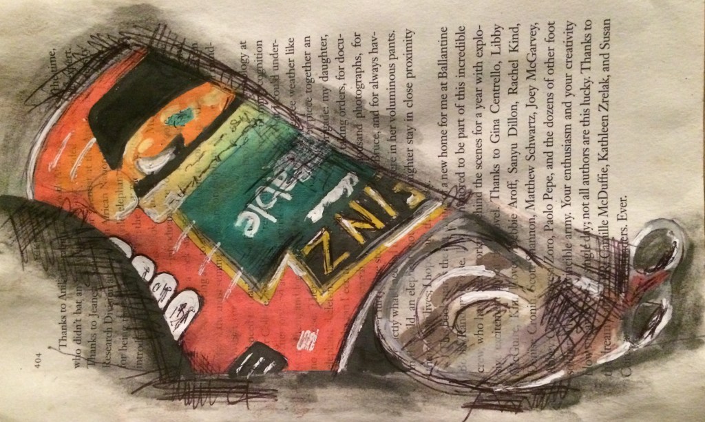
For my next media experiment I focussed on the tin of vegetable soup. I used watercolour and biro and worked on top of a book page in order to try to show a bit more depth.
I am quite happy with the result. I like my technique of the mixture of the book page, the watercolour paint and the biro, however some of my accuracy needs to be developed. My ‘vegetable’ writing for example is wonky and really alters the success of this drawing.
For my next media experiment I used a mixture of scrap materials (from my recycling bin) paint and biro. I am pleased with this drawing and feel the scrap materials really add to the texture and depth of the drawing. I also think my use of bold bright colours really links back to the earlier Interior work I studied on Van Gogh’s bedroom series and Hockneys Montcalm interiors.
This is a technique I would like to experiment with further.
For my next experiment I tried to develop my technique further, by this time working on top of corrugated cardboard and adding layers by applying extra cardboard for higher layers and pulling away cardboard to reveal the corrugated card for lower areas.
I then applied paint, I used a mixture of oils and acrylic and tried to keep my colour and style more expressive and bold like Hockneys and Van Gogh’s work rather than a more realistic style.
Whilst I am pleased with this experimentation for my final piece I think it would be more successful if I included a bigger variety of materials rather than just cardboard as I feel my previous experiment was more exciting.
For my final piece I worked a2 size and began my drawing by lightly marking out the outline. Once I was happy with the accuracy and proportions of my drawing, I then began to add collage. I tried to stick to materials I would usually find in my recycling bin to try to give the piece more meaning.
Earlier on in the project I looked at some of Picasso’s paper collages. Even though my work is not cubism I feel I have still drawn inspiration from his exciting still life work.
I decided to work in acrylic paint, one because it dries quickly and two because it doesn’t blend as well as oil paint does I found it was more effective in making more expressive brushstrokes like Van Gogh uses in his bedroom scenes.
After applying my paint I worked on top of my piece using black biro in order to show more mark making and more texture.
So far I am pleased with my work, I do feel however that it needs further work. Some areas are quite flat and look quite unfinished. I decided to work into my drawing using charcoal in order to add some more depth and tone to my drawing. Below is my final piece:
I feel I have achieved what I set out to do. I have managed to hopefully demonstrate a growing understanding of colour and yet stay expressive and creative at the same time. I am pleased with my observational skills and depiction of form however I am aware that this can still be improved further.
Throughout part two I have studied numerous different artists. I feel I have been greatly influenced by all of the artists and work I studied especially Van Gogh’s, use of colour and expressive brushstrokes, Hockneys use of bold, bright colour and Picasso’s paper collages.
Reflection on assignment 2:
Demonstration of technical and visual skills- materials, techniques, observational skills, visual awareness, design and compositional skills.
Throughout this project I have displayed technical and visual skills which show my visual awareness.
This is mostly evident in my finished drawings that I spent longer on including my flower bud drawing from earlier on in the project and then my a2 kitchen drawing which I spent a considerable amount of time on. Some of my quicker drawings however, particularly some of the drawings in my house are lacking some accuracy in these technical and visual areas.
For my assignment work my final mixed media drawing displays a huge range of materials comprising mostly of found two dimensional scraps that were mostly found in my recycling bin. It is also made up of both paint and biro that is used to highlight both tone and texture. This wide range of materials is also evident in my preliminary drawings leading up to my final piece including using textured cardboard in order to create an almost three dimensional effect and experimentation with tone and colour as well as different background surfaces.
Compositionally, for my assignment I experimented with drawing my objects from different angles before I decided on my final design. I tried to take into consideration the viewpoint and angle I was drawing from and in my final piece I tried to show light and tone within my work.
I do feel that the majority of my work manages to show atmosphere and energy and this is particularly true for my final piece.
Throughout this project I have tried to experiment with different techniques, including mark making and line with different materials such as charcoal, paint, biro, ink and collage materials including cardboard, pages from books, celephane, foil, and scrap fabrics. I have also tried to experiment with different tonal techniques, including using white ink on black paper with chalk, and experimenting with trying to produce tone by mixing materials, such as cardboard with paint and biro with charcoal.
Quality of outcome- content, application of knowledge, presentation of work in a coherent manner, discernment, conceptualisation of thoughts, communication of ideas.
Throughout this project and throughout this assignment I have tried to communicate my thoughts and ideas in a coherent manner.
I started my assignment by taking a series of photographs then from these photographs I completed a series of quick drawings around my recycling bin in order to realise the most effective viewpoints and angles. I then completed some experimental preliminary work which included experimenting with both materials, composition and texture.
These preliminary experimental drawings gradually led to and informed the development of my final piece.
Demonstration of creativity- imagination, experimentation, invention, development of a personal voice.
I really enjoyed being imaginative and creative throughout this project and assignment. I haven’t really experimented with mixed media or collage before so this work felt really exciting. I found that I worried less about making mistakes and more about being experimental and trying out new things. Looking back and reflecting on my work though I do feel like I could have taken this experimentation further, I could have aimed for my experimentation to be subtler? I could have used a wider range of materials or maybe even tried less collage materials and more line?
I am happy with the energy in my final piece, I particularly like some of the textural effects including the texture and tone of the water bottle next to my recycling basket.
Overall I am pleased with my work, I feel I have achieved what I set out to do. I have managed to hopefully demonstrate a growing understanding of colour and yet stay expressive and creative at the same time.
I am pleased with my observational skills and depiction of form however I am aware that this can still be improved further. Especially in areas like the soup can and some of the smaller areas.
Context reflection- research, critical thinking and learning logs.
Throughout part two I have studied numerous different artists. Earlier on in the project I looked at some of Picasso’s paper collages. This work has greatly inspired my final assignment work. Even though my work does not show influence from his cubism works, it was his exciting still life collages that inspired me during my initial thought process.
I was also inspired by Hockneys use of bold and bright colours and I drew inspiration from Van Goghs brush strokes and colour palette in his bedroom scene. I feel like my brush strokes appear even more pronounced when layered on top of textured collage materials.
in my learning log I tried to be honest and tried to document both my though process and ideas in a coherent way. I tried to be reflective of my work throughout and to think critically on how to improve and how to develop further.
For this research point I was asked to look at paintings that focus on domestic interiors.
The first work I looked at was Anthony Greens ‘study for Mrs Madeline Jocelyn with her son’ 1987.
In this image the viewer looks down on the scene and is able to look at the room from many angles. It looks almost like a box has been unfolded and opened to reveal an exciting interior of a living room. Since I began drawing interiors of my house I have realised that in order to include everything in the room it would take me a lot of drawings as drawing just the four corners of my rooms excluded the majority of the room. I feel that this drawing is an exciting and intimate exploration into somebody’s entire room.
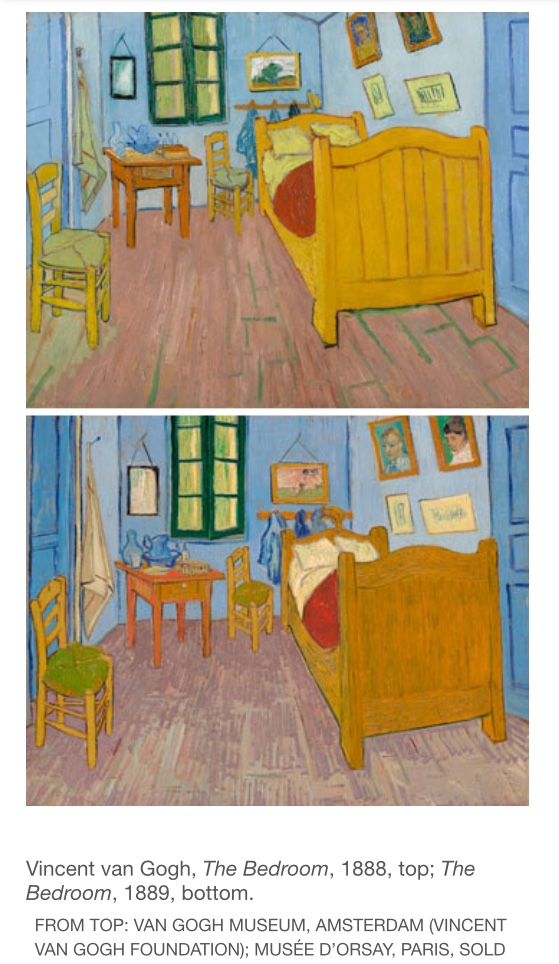
I then looked at Van Gogh’s ‘The Bedroom’ -1888, 1889 and 1889, these are paintings of Van Goghs bedroom. They each contain his bed, a windows, a small table, two chairs and a selection of pictures on the wall. It really allows me, the viewer a sense of intimacy into Van Goghs world. I think there is something very personal about somebody’s bedroom, and these images allow me to feel a very personal connection with Van Gogh.
The most fascinating thing about these paintings however are the fact that these three separate paintings of his bedroom in Arles France are actually different. At first glance I thought they were the same painting, however upon further inspection I noticed extremely subtle differences such as different paintings on the wall and different items of clothing on the hooks behind the bed. This reminded me of my own work, especially my kitchen studies where I encountered differences such as my baskets or tins at different angles or food items added or missing. For my work this indicated the passing of time, if only by a few hours or days, but for Van Goghs work that passing of time was across a year and the fact his wall paintings were different shows real decisions of choice, taste and ideals changing over such a short period.
The next artist I decided to look at was David Hockney.
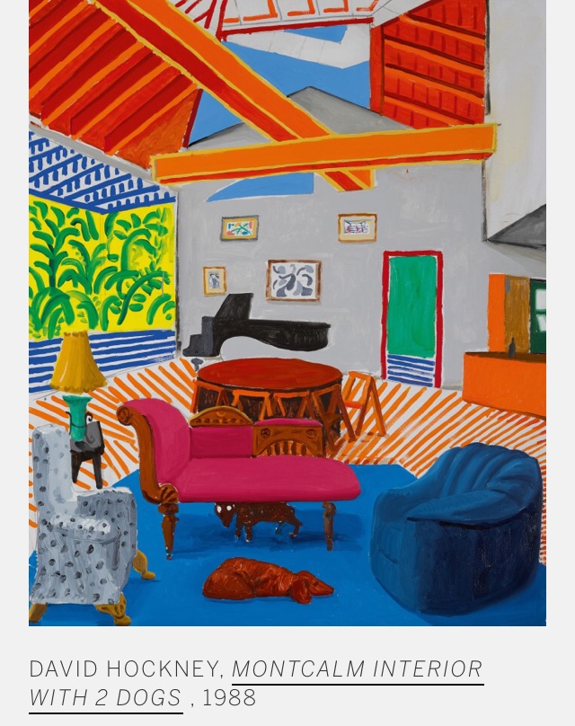
The work I chose to look at is ‘Montcalm Interior with 2 Dogs’ 1988
This is a piece of work that was painted after the artist moved from the north of England to California.
I love Hockneys use of bright and vibrant colour in this painting. I am led to wonder if his move to sunny California from the north of England was inspiration for the glorious brightness of this work?
I also love how his bold use of pattern forces the eye to travel all around this piece. I find that the orange stripes on the floor are almost like arrows directing my eye.
I am also fascinated by its compositional structure- the way he has managed to show his very high ceiling and his angular beams along with his triangular high window makes the entire composition very exciting.
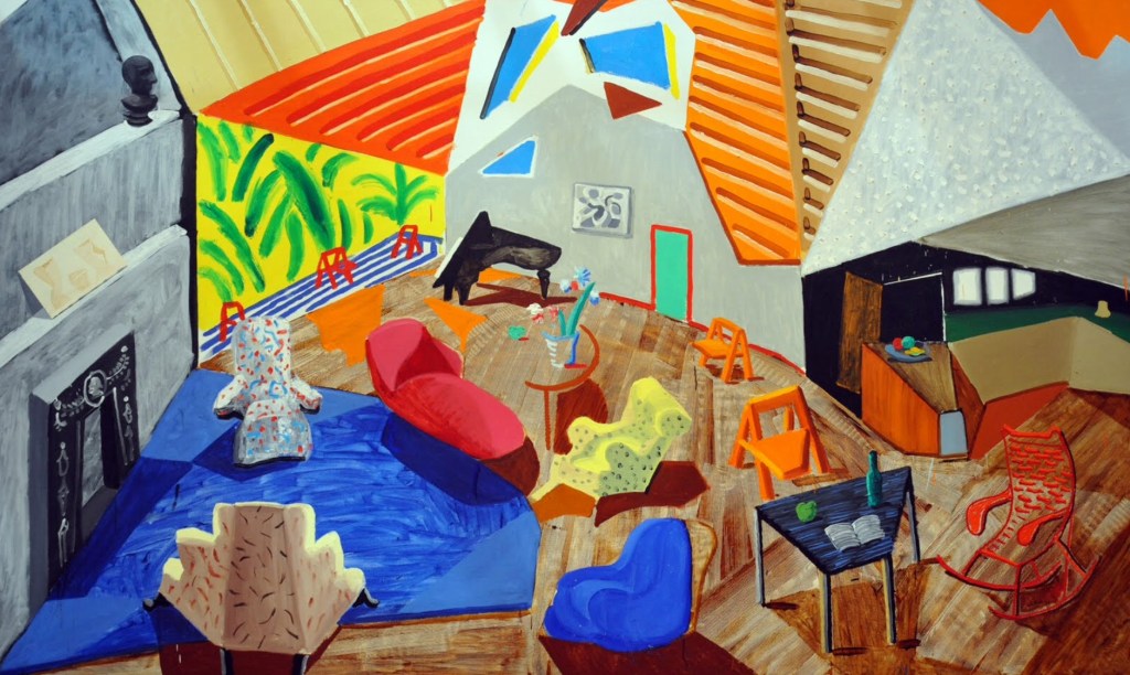
I then found out that Hockney actually featured this Californian home in a number of his works.
The other piece that I am going to look at is entitled ‘large interior, Los Angeles’ (1988). It is considered the ‘sister’ painting of ‘Montcalm Interior with 2 Dogs’ 1988.
This painting also depicts Hockney’s high-ceilinged living room. However this painting shows his living room from a slightly different viewpoint or angle. It looks at the room from above, from the vaulted ceiling. However it appears that some of the furniture has been moved around (again showing the passage of time just like Van Gogh’s bedroom work.)
Another link I can see with David Hockneys living room and with Van Gogh’s bedroom work is the expressive brushwork and use of bright colour.
Like Anthony Greens study for ‘Mrs Madeline Jocelyn with her son’ 1987. What I find fascinating about Hockneys paintings is how he manages to fit such a large percentage of the room in just one two dimensional painting.
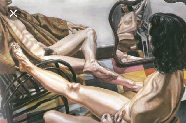
The next piece of work I am looking at is Philip Pearlsteins, ‘male model with kimono, female model with mirror’ 1985.
This painting is of male and female nudes sitting in chairs across from each other, the males head is not in the picture and the female has her head tilted so we are unable to see her face. Opposite the female lies a mirror. (For me this is the most exciting part of the painting as it allows me, the viewer to see parts of the image I feel I am not entitled to see. It makes me feel like I am almost inside the room).The mirror also takes the painting away from just being about a portrait of the nudes to being a painting of the interior of the room, through this mirror the viewer not only gets to see the woman from a different angle but also gets to explore the rest of the room or living space.
I love the almost diagonal viewpoint of this painting. Having the nudes positioned on their chairs opposite one another really allows this diagonal viewpoint to be so effective. The mirror also adds a more distanced frontal view of the woman, which just adds to the depth of this painting.
This painting links to both Hockneys work and Pearlstein and Greens work in that it offers more of the room to the viewer than you might originally expect.
From this research I would really like to experiment with different viewpoints further in my work and try to be more exciting and experimental in my approach to viewpoints.
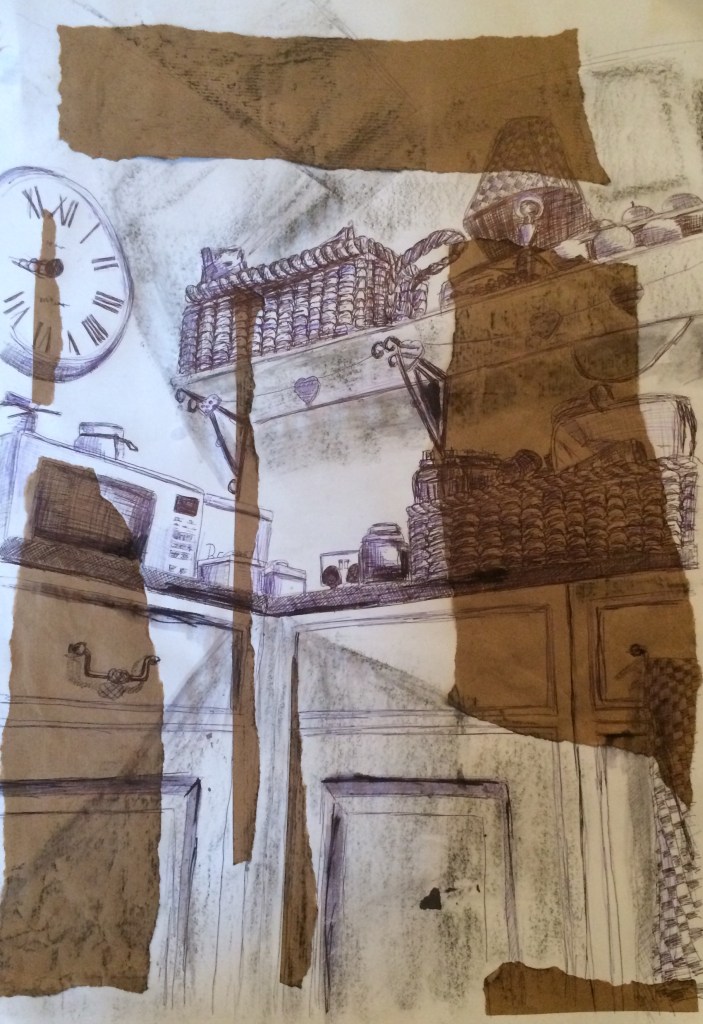
Following on from exercise two I now have a clear idea of the basic elements of the drawing I intend to create in this exercise.
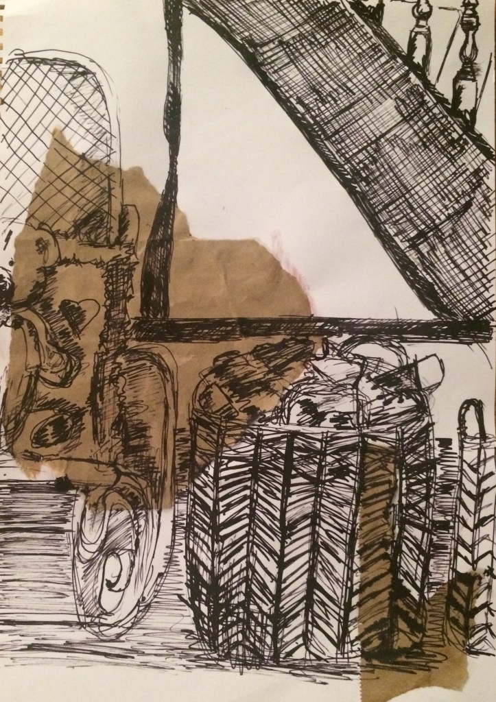
I decided to focus in on the corner of my kitchen where my microwave is, as I find this corner interesting because it is so busy. I decided to sit on the floor and look up for my drawing as I really liked the angles it created.
I decided to work a2 size and I drew out my composition using black biro as I like the thin, strong line biro can create. However biro does come with its own difficulties as mistakes can not be erased. In order to map out my composition I started by using light marks from my biro so mistakes could easily be covered.
I tried to use all of the paper space, however I again found working on such a large scale quite a challenge. Below is an image of my line drawing.
My next stage was to start to add tone and texture. I continued to use my black biro and I didn’t find this too difficult as there is a big variety of texture in this corner of my kitchen. Below is an image of my work so far.
I then added more texture with my blue biro, I felt this added a bit more depth to my drawing.
I decided to use charcoal to show light and shadow. I tried to look carefully at how the light fell across my kitchen corner. I half closed my eyes to help me see the broad tonal areas and map them onto my drawing. However I am not pleased with the result. I think I captured the light in the correct places however using charcoal didn’t seem to be effective.
I tried to work into this further to improve my shadow work by using biro and Indian ink. I think I improved it marginally however I also think I would have been better off just sticking to biro for the entire drawing.
For this exercise I decided that my chosen interior would be my kitchen. Aside from being very small my kitchen is over 400 years old and was historically used as the horses stables. My kitchen is full and very busy and thus I felt it would be my most exciting room to draw.
For this exercise I was to make some quick sketches of my kitchen in order to prepare me for a finished drawings.
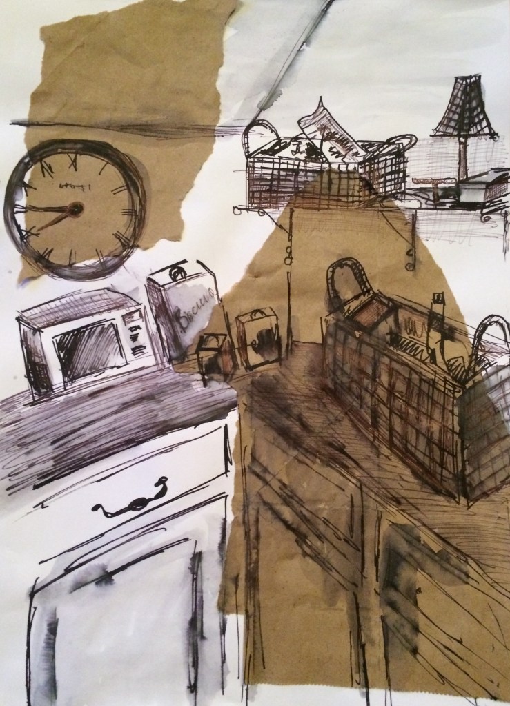
I looked carefully at the angles and areas of my kitchen noting where objects are placed. I decided to focus on the corner of my kitchen above my dishwasher where my microwave is placed. This area is busy with lots of objects and is in my opinion visually very interesting.
Even though I decided to focus on this area to draw, I decided to shift my viewpoint slightly until I found different compositions that pleased me. I looked for strong tonal contrasts, textures, linear qualities and strong positive and negative shapes.
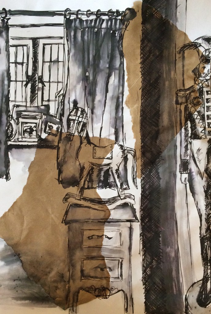
I worked A4 size, again using collaged brown paper in the background and I used a mixture of ink with a sharp stick and biro. I also experimented working portrait and landscape. Sometimes I couldn’t fit in all of my subjects, but I found that this actually added dynamism and interest to my compositions.
The drawings I was most pleased with were the drawings where I was sat on the floor and was looking up. I found the angle on this work really exciting.
Above is my final composition sketch for my final drawing. I used less brown paper this time so as not to take away too much from the actual compositions and I worked in biro as I could be more accurate and less scratchy. I love the angle it is at and the busyness of the piece.
For this exercise I was asked to make quick sketches in each room in my house. I live in a very small 400 year old thatched cottage that has lots of wonky low beams, it is a very higgledy piggeldy cottage where no door frames or windows or even walls are straight. I love my cottage and feel like it is a real piece of art in itself so I thoroughly enjoyed this exercise.
For my first two drawings I drew my sitting room. I worked a3 size and I used charcoal. However I found using charcoal very messy and I kept leaning on my work and smudging it.
I decided for my next drawings I would work in ink using a sharp stick. I also decided to collage some scraps of brown paper down on the paper before hand to try to take away from the bright white backgrounds. After my first drawing using ink I decided to add water using a paintbrush to my work, just to try to add more tone and texture to my work. On most of my drawings this worked well however on a couple of my drawings I added too much water and my ink smudged too much. On these drawings I worked on top of my smudged areas with biro, to try to replace the texture I lost. I felt this worked as it gave another dimension to my drawings.
I think the main problems I had with my drawings was getting all the angles right. Because I tended to focus on the corners of the rooms the furniture tended to be positioned in opposing angles. As I was drawing quickly I noticed at the end of my drawings where I had gone wrong with angles. I think really in future the best way to ensure my angles and proportions are correct is to work slower and to take more care figuring out exact placements and proportions.
That being said I really enjoyed the quick speed in which I worked, I enjoyed the looseness of my work and their expressive nature.
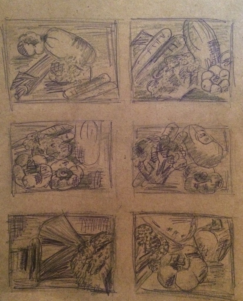
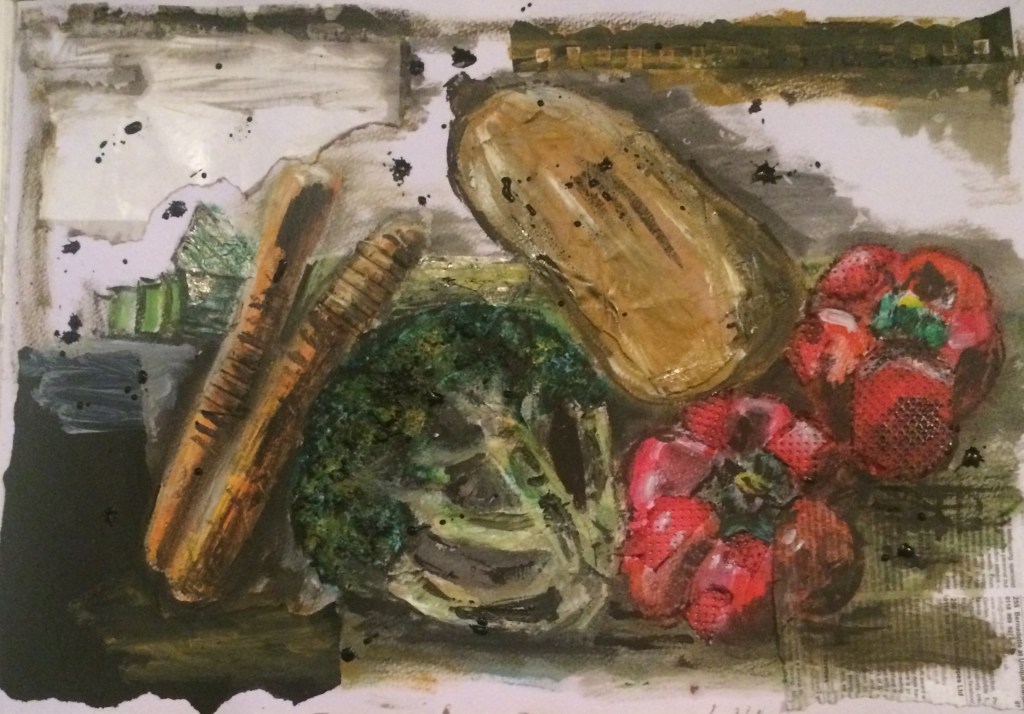
For this exercise I set up a still life of vegetables from my fridge, I found the form of these foods interesting and theirs colours vibrant and exciting- especially when placed together.
I again experimented with their layout and took lots of photographs of them in different positions.
In order to get a clearer idea of the layout I wanted to use, I completed some very quick rough sketches of compositions and viewpoints. This helped me further to see visually how my drawing may look.
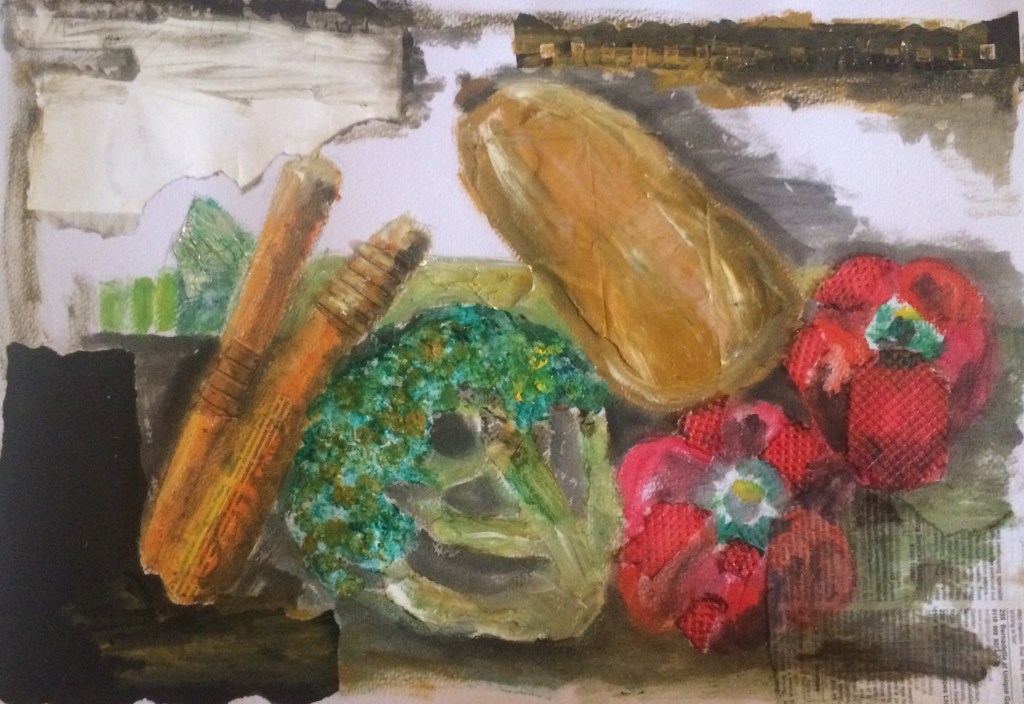
I started my drawing using pencil to draw out the rough shapes on a3 paper.
I then added bits of scrap paper, foil and card to try to collage in sections of my drawing. I even added some crushed up Rice Krispies.
I then added more colour with my children’s wax crayons.
I found this looked quite ineffective, so I began to work on top with oil paint.
To finish my drawing I used Indian ink. This gave a very different effect to what I was expecting as I was working on top of oil paint. It just seemed to settle on the surface of the paint?
I really enjoyed creating this drawing. I felt I was able to be expressive and creative. And because I was working with a range of materials and media’s I didn’t worry so much about small details and accuracy.
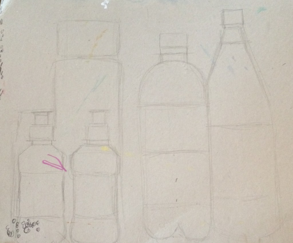
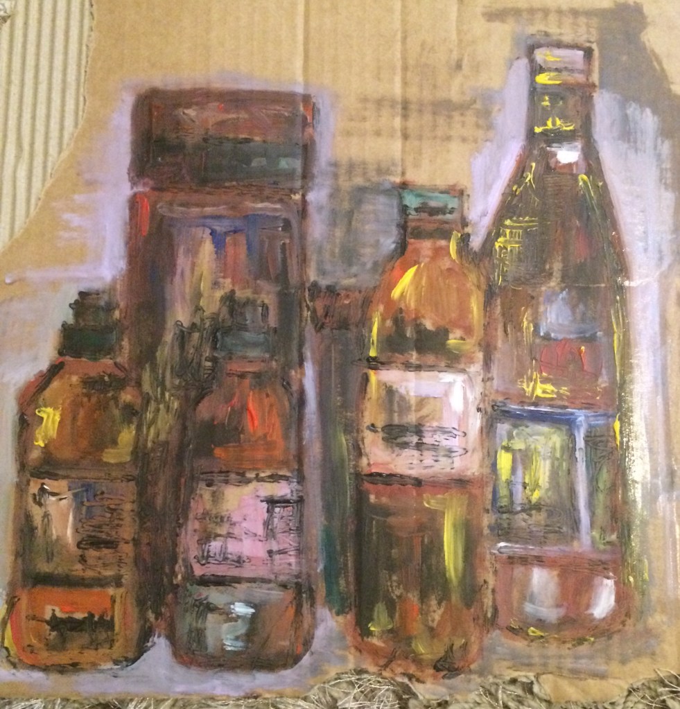
For this exercise I set up another Still life group. This time I used a selection of plastic and drink bottles. I wanted to go for something completely different. I also really like the reflections the plastic bottles make and hope it will make an interesting drawing.
I started by setting up a few different compositions and taking photos of them. I also tried taking photos from different viewpoints and angles.
I found it helpful to then review my photos to see which ones worked best.
As I was still unsure of my favourite layout and viewpoint I experimented with some quick rough thumbnail drawings to try to work out the best set up.
I started my drawing by drawing it’s rough outline using pencil.
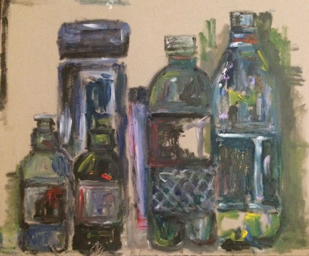
I decided to use oil paint on cardboard. I decided to use oil paint as it is quite permanent and I didn’t want to spend my time hung up on or worrying about accuracy and mistakes. I started my drawings by using blue tones. I tried to really focus on the lightest and darkest areas first then as my work progressed I tried to add in more tones of colour.
I found this exercise quite difficult as I naturally wanted to use the colours I saw rather than using colour to show tone. For example I wanted to paint the red bottle red and the green bottle green.
I tried to work quickly to keep my drawing energetic but I think this in turn made it look a bit messy. However I did really enjoy creating this painting.
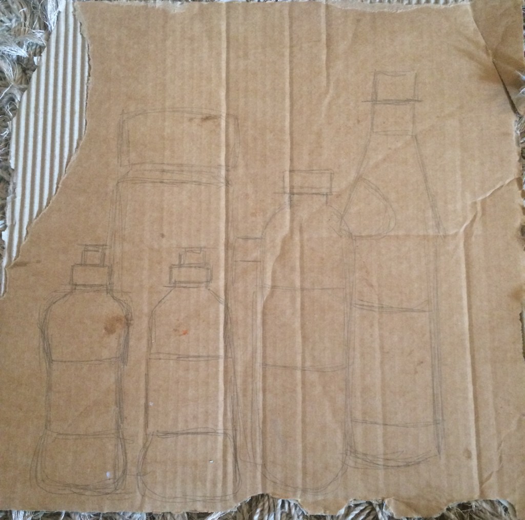
I didn’t feel I’d made the best use of line, tone and colour on my first drawing so I decided to create another drawing this time I decided to use red tones as I didn’t want my work to be too similar.
I again really enjoyed creating this drawing, I felt like I was being expressive and free. Again my final result is quite messy, and lacking in small detail but I am still pleased with my final result.
Overall I really enjoyed this exercise, it made me think about using colour differently. I am so used to using colour as I see it that I have never considered it as a tool to show tone or depth before.
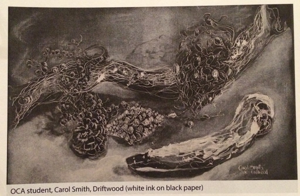
For this exercise I set up a Still life with a selection of natural objects that myself and my three year old son found in my back garden. We then arranged them on some black paper where I took photographs of them from differing angles.
I was inspired by the student example in my handbook by oca student carol smith ‘driftwood’ (white ink on black paper.)
I just love how effective her striking white lines were and I wanted to try something similar myself.
I worked a3 size with white ink on black paper. I tried to make a drawn study that shows my understanding of the forms and the connections and spaces between the forms.
I completed two drawings, and for a first attempt at using this media I wasn’t too displeased. I enjoyed making marks using white, but as I am so used to drawing with a dark media on white paper I did find myself getting a little confused at times.
I think for my drawings my main area for improvement would have to be the arrangement of my objects. In hindsight I think I could have arranged them in a more interesting way or drawn them from a more exciting viewpoint. I would however really like to experiment with using these media’s again in the future.
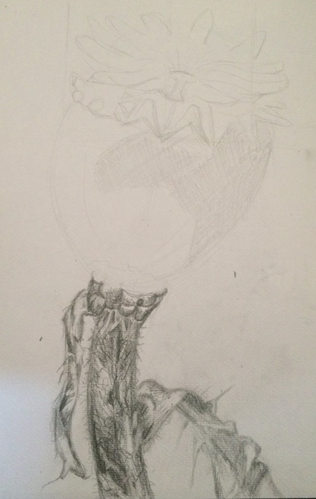
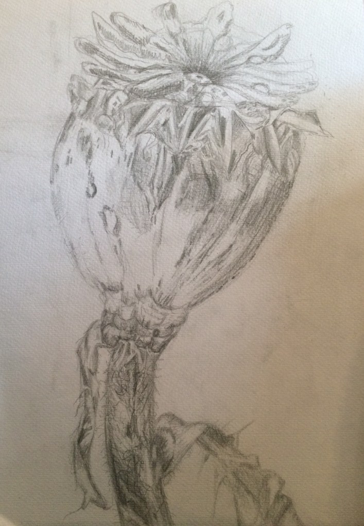
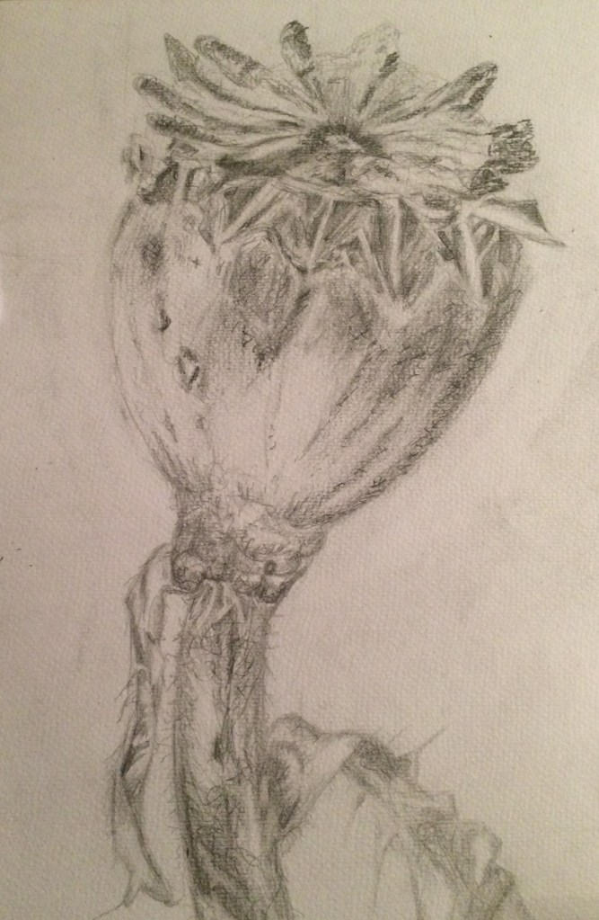
For this exercise I was asked to select a single natural object. I chose a dead rose bud from my garden. I chose this because I love all of its tiny beautiful detail, the closer I look at it the more detail I can see. I tried to introduce contrast into my drawing by using strong darks and very light tones.
I used a3 paper and a variety of soft- medium pencils. I lightly sketched in the outline of my object then I screwed up my eyes to identify the darkest areas. I firstly worked on the stem and leaves and I began to tone in the darkest areas of my drawing. I made sure I worked all around the area so that I could compare the tones of different areas of the drawing. I practiced building up dark, medium and light tones, using my pencils and using a range of mark making techniques. I tried to get a varied effect by combining soft and medium grade pencils and altering the direction of the strokes I made.
I tried to constantly review my drawing by stepping back from it and asking myself if I had sufficient contrasts and variation in marks.
I am not sure if I am pleased with my final result. I found it very difficult enlarging such a small object to such a large scale, in doing this I think I lost some of its accuracy. I also am not very pleased with my pencil work in some areas. Some areas my pencil work is too heavy and some of my small detail appears to be outlined. This results in some areas of my drawing looking quite flat.
I am pleased with some areas of detail and texture, but overall I would really like to see my pencil work develop and improve over the duration of this course.