Category Archives: Project 1: Composition

Research point 2: Positive and negative space

For my next research point I have tried to explore the importance of positive and negative space. I have done this by looking at a range of artists to see how they incorporate positive and negative spaces in their work. 

The first artist I looked at was Gary Hume

Gary Hume is a contemporary English artist best known for his paintings of everyday objects.

His work often looks abstract and simple with little detail and large areas of flat colour. 

One example of Gary Humes work is ‘Capital’

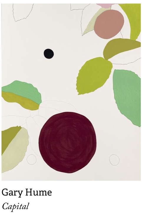
‘Capital’ is a screen print on paper that was produced as part of a portfolio of twelve other prints by British artists for the 2012 olympics and Paralympics. 

In this work Gary Hume has abstracted elements from an image of a wheelchair- tennis player. He has  included a selection of leaves and he has used a range of soft and subtle colours. 

The big burgundy circle at the bottom of the page looks like the wheel of the player’s wheelchair and the black circle above looks like it could be the tennis ball. 

Gary Hume believes that the most important aspects of his work are the edges, he wanted them to be clear and crisp and this is certainly evident in this work. With such crisp edges and such dominant colours and pale backgrounds Gary Humes use of positive and negative space is very obvious. In fact I think it is his use of negative space that makes his work so exciting. Because not only am I drawn to his painted objects but I am drawn to his plain backgrounds and the shapes that are made even more dominant.

The next artist I decided to look at was Patrick Caulfield. 

Patrick Caulfield was a British painter and printmaker whose works show simple images and bold flat colours combined with different social and political images or messages. 

I decided to look at Patrick Caulfields ‘Still life with dagger’ (1963)

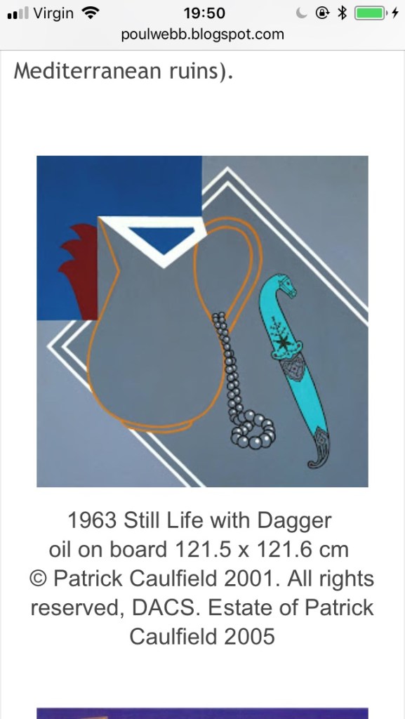
This painting comprises of a mostly grey background with a top left hand square of dark blue. Geometric shapes seem to make up the vast majority of the negative space. Central to the piece is a drawing of a jug with an orange outline. On the handle of the jug is a set of beads with slightly more detail than the jug and on the right hand side of the piece is a more detailed dagger with what looks like a horses head as it’s handle. 

The painting shows no visible brushwork and it has very little detail and the objects are simplified to a basic outline. These objects are also quite mundane. What does however make this work exciting though is it’s composition and use of space. I find that the lack of detail and simple outlines mean that the positive space blends into the negative space and there is no clear distinction of where the positive spaces begins and the negative space ends? 

The next work I decided to look at was ‘Inside a Weekend Cabin’ (1969) 

This piece shows the interior of a cabin with a bench, three stools and a table. The entire background scene of the cabin is painted brown and has no detail bar the black outline of the wood of the cabin and the bench and stools. On the table, in high contrast to the rest of the piece there is a bright white tablecloth. This immediately draws the viewers eye to the tablecloth. 

This piece I think shows an element of architecture. And in my opinion makes for an exciting interior piece. However the vast amount of brown used in this piece creates an atmosphere of melancholy.

I love Caulfields use of negative space in his work, at first glance it feels awkward or wrong, but to me that is what makes it so exciting. I am not sure where the positive space is? Is it the table cloth? Is it the brown interior? I think his lack of detail and tone really enforce this feeling of confusion when it comes to its space and composition? 

The final artist I decided to look at was Noma Bar. Noma Bar is an Israeli illustrator who is known for his use of simple outlines, minimal detail and flat colours. His work mostly carries double meanings that are created by his very clever use of negative space. His work often carries political or social messages and are often very thought provoking. 

Noma Bars work relies on the negative space that surrounds the subject in order to provide shape and meaning. 

The first piece of Noma Bars work that I decided to look at is called ‘Gun Crime’ this is an illustration of a flat black gun with no detail set against a flat beige/buff background. On the trigger there is a drop of red blood. Upon looking at this illustration a second time round it becomes apparent that Noma Bar has used his negative space around the gun trigger to create a sad face with blood coming out of his mouth. This really enforces the message of the effect of gun crime. In this instance Noma Bar has used his negative space to relay an important message and to give his work a double meaning. 

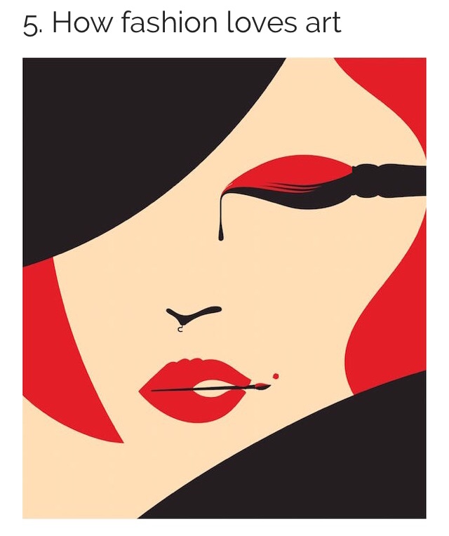
The next piece of work I looked at is called ‘How fashion Loves Art’ 
This piece shows the face of a woman using only three flat colours, beige, black and red. Just like ‘Gun Crime’ Noma Bar uses his negative space to enforce the images meaning. When you look closer at the image you can see that the basic shapes of the woman’s features are actually made up of art materials or practices. The woman’s red lips are made up of a hand holding a paintbrush painting in her beauty mark. Her eye is actually a dripping paintbrush and her nose is an upside down clothes hanger. Again Noma Bar has made clever use of his negative space to create an exciting illustration with a double meaning. 

The final piece of Noma Bars work that I decided to look at is called ‘Final Cut’ this is an illustration of a directors black cutting board set against a grey black ground with droplets of blood. Upon a second glance at this illustration it becomes apparent that through Noma Bars clever use of negative space that there is in fact a knife dripping with blood between the background and the cutting board. This could be used to symbolise the cut throat nature of the film industry? But either way Noma Bar has managed to create an eye catching piece of work by employing the untouched space surrounding the cutting board and turning it into a knife. 

In conclusion I have discovered how positive and negative spaces play a vital role in determining the overall composition of a piece of art. I also discovered that In order to create a sense of balance across a drawing both positive and negative spaces share equal importance. 

Bibliography:

Tom (Bored Panda Staff). (2012) Negative Space Art by Noma Bar. At:

(Accessed 17/08/2019).

Wikipedia. (2019) Noma Bar. At: https://en.m.wikipedia.org/wiki/Noma_Bar (Accessed 17/08/2019).

Webb, P. (2012) Patrick Caulfield – part 1. At: http://poulwebb.blogspot.com/2012/07/patrick-caulfield-part-1.html?m=1(Accessed 17/08/2019).

Tate. (2019) Gary Hume Capital. https://www.tate.org.uk/art/artworks/hume-capital-p13277 (Accessed 17/08/2019).

Artnet Artists. (2019). Gary Hume. At: http://www.artnet.com/artists/gary-hume/6 (Accessed 17/08/2019).

Sheerin, M. (2013) Patrick Caulfield and Gary Hume paired up for complementary shows at Tate Britain. At: https://www.culture24.org.uk/art/painting-and-drawing/art438003 (Accessed 17/08/2019).

RICHMAN-ABDOU, K. (2019) 40+ Striking Works of Art That Creatively Make the Most of Negative Space. At: https://mymodernmet.com/negative-space-art/ (Accessed 17/08/2019).

Research point 1: Still life genre.

For this research point I have been asked to research into the still life genre. 

I firstly discovered that still life is a work of art that depicts a collection of objects. Still life has origins in the Middle Ages and in ancient Roman times however it really emerged as a distinct genre in western painting in the late 16th century, and has remained significant since then. 

I started by looking at some traditional approaches by sixteenth and seventeenth century Dutch painters

I discovered that the term still life is derived from the Dutch word stilleven. 

I found out that still-life paintings, particularly before 1700, often contained religious symbolism relating to the objects. 

Often the scenes were somber and are read symbolically through the lens of Christian religious traditions. They often represented the cycle or transience of life. For example, rotting fruit or withered flowers would be used to show this. This type of still life was often described as ‘Vanitas’ which is a term used to describe a still life painting of a 17th-century Dutch genre containing symbols of death or change as a reminder of their inevitability.

I decided to look at Jacques De Gheyns, Vanitas Still Life, 1603.

This painting is considered to be one of the the earliest known still life painting of a vanitas subject. 

Colour wise this is a dark somber piece that evokes feelings of fear or depression in me. Central to the piece is a large bubble with what looks like a wheel of torture floating inside it. Below the bubble is a skull with flowers and a smoking urn either side of it. This could all refer to the shortness of life? Along the bottom of the piece are Spanish coins and a Dutch medal that could refer to the foolishness of the human race?  The figures next to the arch’s are said to be Democritus and Heraclitus, the laughing and weeping philosophers of ancient Greece.

As the century developed and Holland became richer the Dutch  people became more interested in material goods and representations of wealth. This led to a change in still life painting. Society now wanted art that showed their new found luxury’s. One example of this is Dutch artist Abraham Van Beyeren’s painting ‘Still life with lobster and fruit.’ 

Like Jacques De Gheyns, Vanitas Still Life, 1603. This painting feels quite dark. (Maybe because both backgrounds are black?) However unlike the vanitas works, Abraham Van Beyeren’s painting ‘Still life with lobster and fruit’ feels rich and luxurious. It’s richness of colour and exquisite detail makes me feel hungry and as if this heavily laden table full of lush fruits and lobster is a banquet for for a king! I love Abraham Van Beyeren’s use of reflective surfaces of both glass and metal it just seems to emphasise these luxurious food items further. The painting doesn’t just boast of luxurious food but shows imported goods such as the blue and white porcelain bowl from China. (During this time imported goods were a sure sign of wealth.) 

I then moved on to nineteenth century artists and tried to explore how the genre was interpreted by artist Paul Cexanne and modernist artists like the cubists Picasso and Braque. 

Cézanne has been described as one of the greatest masters of the Post-Impressionist movement. He developed his own style, which has been described as architectural or sculptural. 

He wanted to break away from the realistic works of the impressionists before him, he wanted his work to be more abstract. He wanted his work to look like a painting rather than be an exact replica of the work his was producing. He did this by reducing his objects into their simplest forms and shapes and doing the same with colour. 

I decided to look at Cézanne’s Dish of Apples, 1879.  This is a painting of a metallic looking dish of red apples, they are positioned on a bright white table cloth on a table next to a patterned teapot. The brightness of the white table cloth  really emphasises  the red colour of the apples. In the background is what appears to be a beautifully elaborated cupboard or chest of drawers.

In this painting Cézanne’s style is evident. The apples are basic sphere shapes made up of scales of colour, with very little attention to detail or accuracy.
This painting is less realistic than the last couple of paintings I have looked at and the brushstrokes are more obvious or expressive. In turn this makes me think that I am looking at a painting of a dish of apples rather than an actual dish of apples. Which is exactly what Cézanne was hoping to achieve. 

Cézanne’s new style has been said to set the stage for Cubists, Fauvists, and avant-garde art movements. 

I decided to move on, to look at how Picasso & Braque depicted this still life genre in their cubist works. 

I discovered that both artists forged a close relationship both as friends and as rivals and together they began the cubist movement. 

Both Picasso and Braque wanted to move away from the very realistic paintings of the past and they were both inspired by Cézanne. They did this by transforming everyday objects into geometric shapes. 

While their Cubist works look very similar, Picasso and Braque often strove for different results – Braque wanted his works to keep a sense of balance while Picasso wanted the opposite and tried to to disrupt this harmony.

Below are some examples of their work: 

Finally I looked at how contemporary artists today are working with still life. I discovered the work of Audrey Flack, an artist best known for her photo realist still life paintings. I questioned how her approach differs from traditional practice in terms of subject matter, materials and composition. 

Audrey flack was one of the first artists to use photographs as the basis for painting. Audrey Flacks work takes its cues from Pop art by bringing in everyday household items like tubes of lipstick and perfume bottles. She was however also inspired by the works of Dutch 17th century still life paintings too. 

I decided to look at her 1977  Marilyn painting. This was a painting that was part of a collection titled ‘Vanitas.’

The painting comprises of an image of Marlyn Monroe, surrounded by a rose, a selection of whole and cut fruit. An hourglass, a pocket watch, a calendar, a blue drinking glass filled with a pearl necklace, paint pots, a candle, a mirror reflecting Marlyn’s face and make up  all resting upon a rich red fabric. 

Flack has clearly been inspired by 17th century Dutch artists here by creating a modern day ‘Vanitas’ she has tried to show life’s transient nature by including conventional vanitas symbols such as an hourglass a candle and a flower. She has also included modern symbols too such as a photograph of Marlyn Monroe and a calendar. 

Bibliography: 

Manchester Art Gallery. (2019) Inside a weekend cabin. At: https://artuk.org/discover/artworks/inside-a-weekend-cabin-204651 (Accessed 13/07/2019).

Wikipedia. (2019) Marilyn (Vanitas). At: https://en.m.wikipedia.org/wiki/Marilyn_(Vanitas) (Accessed 13/07/2019).

Morgan, R.C. (2019) AUDREY FLACK and the Revolution of Still Life Painting At: https://brooklynrail.org/2010/11/artseen/audrey-flack-and-the-revolution-of-still-life-painting (Accessed 13/07/2019).

Tate. (2019) All about cubism. At: https://www.tate.org.uk/art/art-terms/c/cubism/all-about-cubism (Accessed 13/07/2019).

Wikipedia. (2019) Audrey Flack. At: https://en.m.wikipedia.org/wiki/Audrey_Flack (Accessed 13/07/2019).

Pablo Picasso.org. (2019) At: https://www.pablopicasso.org/still-life-with-chair-caning.jsp (Accessed 13/07/2019).

Master works fine art. (2019) Georges Braque and Pablo Picasso. At: https://www.masterworksfineart.com/blog/georges-braque-and-pablo-picasso/ (Accessed 13/07/2019).

Muscato, C. (2019) Paul Cezanne’s Still Life Paintings At: https://study.com/academy/lesson/paul-cezannes-still-life-paintings.html (Accessed 13/07/2019).

Met Museum (2019) Vanitas still life 1603. At: https://www.metmuseum.org/art/collection/search/436485 (Accessed 13/07/2019).

Liedtke, W. (2003) Still-Life Painting in Northern Europe, 1600–1800. At: https://www.metmuseum.org/toah/hd/nstl/hd_nstl.htm (Accessed 13/07/2019).

Wikipedia. (2019) Still Life. At: https://en.m.wikipedia.org/wiki/Still_life (Accessed 13/07/2019).

Fiore, J. (2018) In Dutch Still Lifes, Dark Secrets Hide behind Exotic Delicacies. At: https://www.google.co.uk/amp/s/www.artsy.net/article/artsy-editorial-dutch-lifes-dark-secrets-hide-exotic-delicacies/amp (Accessed 13/07/2019).