Category Archives: Part 3 – Expanse

Research point 8: Contemporary artists who work with landscapes.

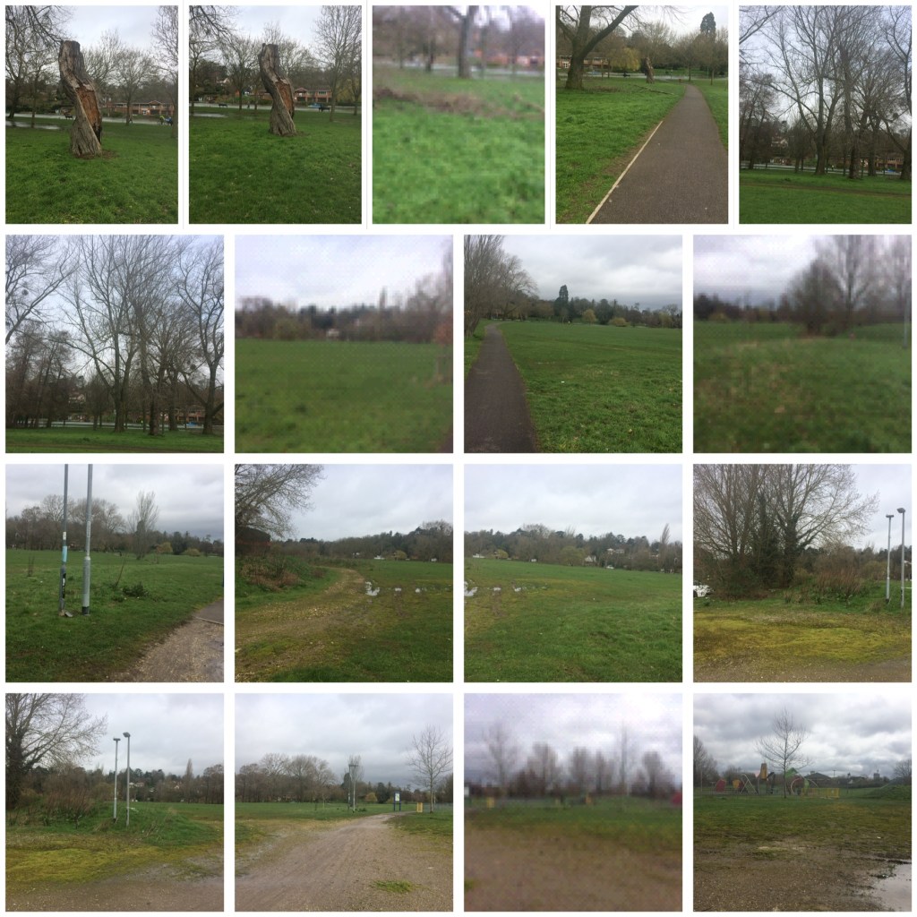
For this research point I researched contemporary artists who work with landscape and a range of viewpoints and I compared their approaches with those of earlier artists.

The first artists I looked at were Tacita Deans blackboard drawings and George Seurat’s landscape with houses.

Tacita Dean is a British artist born in 1965 in Canterbury. Her series of six multi-panel blackboards show the entire length of the river Kabul in Afghanistan. Each panel depicts a different viewpoint of the terrain. Below is an example of one of these works.

Tacita Dean , Fatigues, 2012 (chalk on blackboard)
https://www.mariangoodman.com/artists/39-tacita-dean/works/28967/
(Accessed 17/03/20)

Georges Seurat was a famous French 19th Century Neo impressionist artist. He was mostly famous for his pointillism painting technique but he was also famous for his conte crayon drawings. Below is an example of one of them.

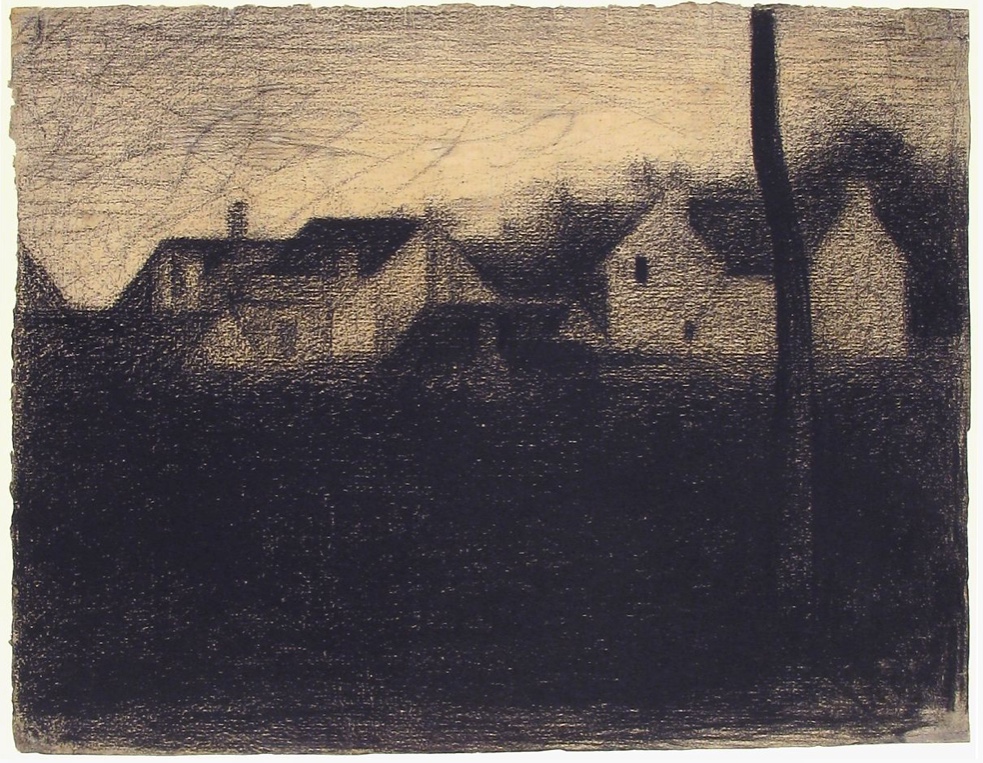
Georges Seurat, landscape with houses, 1881-82 (conte crayon) 
https://www.metmuseum.org/art/collection/search/337676
(Accessed 17/03/20)

Similarities between the two drawings:

– Both drawings are landscapes.

– Both drawings are monochromatic grey scale works with high levels of tonal contrast that use similar tonal arrangements and variations that both result in providing dramatic atmospheres. 

– The foreground in each drawing is black which draws my eye to the main focal points in the drawings. 

– In both drawings the focal points appear to be across the middle of the works. 

– Both Landscapes have an undulating up and down rhythm. This is shown in Tacita Deans mountain levels and in the level of the rooftops in Georges Seurats landscape. 

Differences between the two drawings:

– The first difference I noticed is the size and volume of the landscapes. Tactia Dean’s six huge blackboard drawings measure 6 feet x 15 feet each whereas Georges Seurat’s work is an individual piece measuring 24.9cm x 31.9 cm.

– Both landscapes are created using different media’s, Tacita Dean created her work using chalk on a blackboard whereas Georges Seurat used conte crayon on paper.

– Tacita Deans drawings are purely of natural forms whereas Georges Seurats drawing includes houses so it is more man made. 

– Tacita Deans drawings are white chalk on a black blackboard whereas Georges Seurat’s drawing is black conte crayon on white paper. 

– Tacita Dean’s work has a dark area to represent the sky, this contrasts with Seurat’s light tone to represent the sky on his work. 

– It is likely that Georges Seurat completed his drawing at the scene and therefore probably in a relatively short amount of time, I think this because Seurat was known for his “plein air “ paintings where he completed his work outside. Whereas Tactia Dean’s work seems to have taken much longer and is also accompanied by a film and a book with information regarding the images. Her work was also created using photographs that she took of the landscape. 

– Tacita Deans drawing looks almost photographic to me, whereas I think Georges Seurats looks very much like a drawing. 

– The drawings were produced over 100 years apart. 

In conclusion both drawings have huge similarities and equally huge differences, they are both exciting, Moody and evocative in their own seperate ways. They both evoke a sense of serenity in me. 

The next two artists that I decided to study were John Constables ‘The Hay Stack’ and Stev’nn Halls ‘Red box car.’ I decided to look at these paintings  because I was fascinated by both paintings exciting dramatic clouds in the sky. 

Stev’nn Hall is a contemporary Canadian artist who creates multimedia landscapes. The work I will be looking at is Red Box Car. Created with photo, oil, ink and resin on panel. It is 84cm x 84cm. 

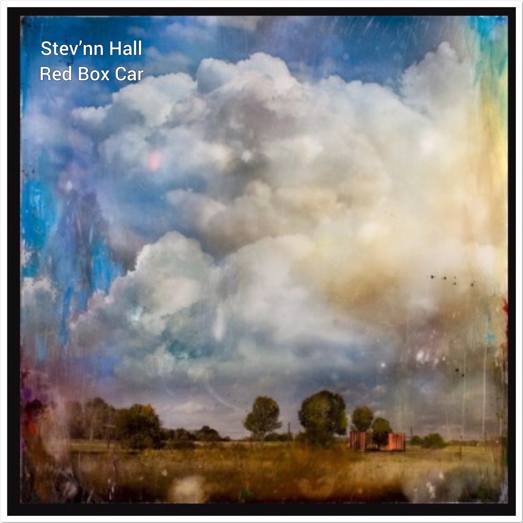
Stev’nn Hall Red Box Car 
http://www.stevnnhall.com/mixed-media-2008.php#red%20box%20car (accessed 21/03/20)

John constable was an English landscape painter ‘The Hay Stack’ is regarded as one of his most famous works. It depicts a rural scene on the river stour and was completed in 1821 using oil on canvas. It is 130.2cm x 185.4cm.

John Constable The Hay Stack 
https://mymodernmet.com/contemporary-landscape-painting/ (accessed 21/03/20)

Similarities between the two artworks:

Both works are landscapes

Both landscapes have exciting dramatic clouds and skies, that to me are the main focus.

Both paintings have landscapes of countryside fields with trees.

The colour schemes in both landscapes are similar, the blue tones of the sky and the heavy tones in the clouds are similar as are the yellow, brown and green tones of the countryside below. 

Both landscapes give a realist depiction of what the landscape would have looked like. 

Differences between the two artworks: 

The materials used in both landscape works are extremely different, John constables uses the very traditional approach of oil on canvas whereas Stev’nn Halls works in a very unique and contemporary way for this landscape, he took photographs through the glass of his car window, he then re photographed his photgraphs, edited and distilled these images then enlarged them and scratched, distressed and painted on top of them finishing them off with a glaze.

The time apart from which they were created is an immense difference John constables work was created in 1821 whilst Stev’nn Halls work was created in 2008, 187 years later! There is no doubt that both of these artists lived and created their art in extremely different worlds. 

The amount of sky John Constables’ landscape has appears to be a proportional amount for a realist depiction of a landscape. However Stev’nn Halls landscape seems to have a disproportional amount of sky in comparison to the amount of landscape portrayed. For me this is why I was so attracted to this work, having such a large proportion of sky really enforces it’s dramatic and exciting clouds. 

John Constables ‘The Hay Stack’ is a landscape that depicts a rural scene on the River Stour. The Mill in the painting was owned by Constables father and the house on the left hand side of the painting was owned by his neighbour. This was therefore a very personal painting to the artist. 

Stev’nn Hall’s landscape is replicating his childhood memories of going for drives sitting in the backseat of his parents red box car driving through rural Canada. 

In conclusion both landscapes have huge similarities mostly in their subject matter, composition and colour schemes. Equally there are huge differences, namely in the physical processes in which they have both been created. Overall both landscapes are exciting and give a real sense of place making the landscapes come alive and evoke a real sense of atmosphere. 

Bibliography:

Marian Goodman Gallery. (2020) Tacita Dean. At: https://www.mariangoodman.com/artists/tacita-dean/ (accessed 17/03/20) 

Corwin, W. (2013) Tacita Dean. At: https://frieze.com/article/tacita-dean-2 (accessed 17/03/20)

Wikipedia. (2020) Georges Seurat. At: https://en.m.wikipedia.org/wiki/Georges_Seurat (accessed 17/03/20) 

Abdou, K. (2017) Art History: The Evolution of Landscape Painting and How Contemporary Artists Keep It Alive. At: https://mymodernmet.com/contemporary-landscape-painting/
(Accessed 21/03/20)

Stevnn Hall. (2020) Red box car.http://www.stevnnhall.com/mixed-media-2008.php#red%20box%20car (accessed 21/03/20)

KM fine arts. (2020) Stevnn Hall. At: https://www.kmfinearts.com/artist/Stev’nn_Hall/biography/ (accessed 21/03/20)

Exercise 1: Developing your studies

For this project I was asked to review my preparatory work from project 2 and select those that have elements that I would like to include in a larger drawing. 

There were two aspects to the work that I completed in project two that I would like to bring forward into this exercise. The first being the sketchbook walk, even though I wasn’t especially pleased with my drawings, I did very much value the concept of drawing from different angles or places in the one space. Therefore for this exercise rather than use those original drawings I decided I would do another sketchbook walk.

The other aspect of the work I created in project two that I thought was successful was my 360 drawings in my Aunts garden. Even though these drawings were quick  and sometimes unrefined I liked working with biro and a light wash of watercolour on top, I therefore would like to try to develop this idea further and use these techniques again. 

This time I walked along the River Thames in Caversham, this is a walk I take regularly so I am very familiar with its views. 

Before I decided on what to draw I decided to take lots of photographs just so I could really accustom myself with composition ideas. (These photographs were only taken on my very old iPhone, so are not of a good quality, but they still served the purpose of getting me to really look at the views around me).
Below are my photographs: 

My next stage was to complete some drawings, I used a4 cartridge paper and worked with a biro, this time I tried hard to be as accurate as possible. I tried to show texture with mark making and cross hatching and I tried to show light on this bright sunny day. 

Below are my drawings: 

I then needed to think of a final composition so I went out the next day to find an area that I found interesting. I had so far enjoyed my work on trees and I enjoyed using the park bench as a focal point in my sketchbook walk. I found an area that I found interesting with a background framed by trees and a fence, with a park bench being a focal point. It was a partly cloudy March day with lols of light and shadows being created. 
Below is my drawing for my final composition. 

My next stage was to think further about the media I wanted to use and the techniques I wanted to use for my final piece, so I experimented with some different techniques and media in the trees bel ow: 

In my opinion the most successful tree was the mixture of all 3 media’s: biro, Charcoal and Watercolour wash. 

When starting my final landscape drawing, I decided to work on a2 paper. For some reason I have struggled with drawing on a larger scale and I know the only way to combat this is to practice. 

Instead of going back to Caversham to draw from life, I decided to use my drawings to help inform me for my final piece, I worked in biro first and filled in the main focal points, the park bench, the fence and the trees.

I then worked into my drawing using charcoal and a wash of water colour, I used my sketchbook walk photographs in order to help inform me for colour, texture and tone.

My clouds were informed by my cloud drawings from part two, just like in some of my experiments I used a light watery wash of black Watercolour to hint at the partial cloudy day. 

Below is my final piece:

One of the things I noticed whilst working was my a2 paper quality was not as good as my sketchbook cartridge paper, and for that reason my watercolour wash didn’t look as effective as it did on my smaller drawings. Next time I work on a larger scale I will need to buy some better quality paper. 

I also found filling such a huge space very difficult, I found working to scale difficult and I felt that any mistakes I made in accuracy or proportion were magnified. I made a small mistake on the bench but in trying to fix it I seemed to make it worse and worse, in the end it was best just to leave it before I made it even worse. 

I am pleased that I attempted to work on a large scale as I do think the more I practice the better I will become, however I do t feel I am not quite there yet. 

Research point 7: Historic and contemporary landscapes.

For this research point I was asked to research some historic and contemporary artists who work in series with the landscape. 

The first artist I looked at was Monet. He is widely considered to be one of the leading impressionist landscape artists. Impressionists tended to focus on visible brushstrokes and accurate representations of light. 

I decided to look at Monets ‘Coup de Vent’ (Gust of wind.) (1881)

‘Coup de Vent’ depicts a windy corner of the Normandy coast on a sunny day. It is one of a small group of four works that Monet painted at the end of the summer of this year. 


Below are the other paintings. 

These paintings show a variety of views of the coast, a view of the beach at low tide, a sea scape and another view of a grassy hill with the sea meeting the sky in the distance, with its main focus being a wind blown tree. I find it really interesting to see such different paintings of the same place, it really gives me, the viewer a feel for the place in its entirety.

In ‘Coup de Vent’ Monet has shown the summer season through his smooth brush strokes of the clear, light blue sky. These smooth brushstrokes appear to contrast with his multi directional expressive brushstrokes on his trees and long grass in order to portray the blustery wind. 

I love ‘Coup de Vents’ use of perspective, how he has managed to show the sloping hills leading down into the sea and the subtlety of how the sea meets the horizon of the sky. I love his wide never ending sky that shows just a hint of the sun hiding in the shadows. But mostly I love how his use of impressionist brushstrokes give the painting atmosphere, I can almost feel the wind with those brushstrokes. The painting makes me feel alone but in a good way. More alone with nature rather than lonely? Maybe this is because Monet hasn’t included any people or anything manmade. 

The next landscape artist I looked at was Cezanne. 

Unlike the works of other impressionists Cézanne didn’t paint his work in the open air and observing from life, instead he painted them the way he wanted them to look. 

His work often comprised of broad views of the landscape he was exploring. Below are some examples of his landscape work.

https://www.nationalgallery.org.uk/artists/paul-cezanne

The painting I decided to look at was ‘Intérieur de forêt (Forest Interior) (1898–99),


https://eclecticlight.co/2015/11/17/trees-in-the-landscape-6-paul-cezanne-and-constructive-strokes/

This is a painting of the inside of a forest. With tall trees and a clearing of rocks at the bottom of the painting. These trees appear to be on a hill with the rocks sloping downwards. 

Like Monets ‘Coup de Vent’ Cézannes ‘Intérieur de forêt’ uses very unique brushstrokes, his short brushstrokes seem almost like angular shapes each filled with an intense colour. However unlike Monet, Cezannes brushstrokes appear almost abstract, as does the landscape he is trying to portray. The branches on his trees seem to be apart from their trunks and the rocks look more like simple forms or shapes rather than rocks. 

Cezannes use of colour in this painting feels repetitive, almost like he is trying to portray or interpret a mood or feeling about the landscape rather than reproduce exactly what he saw. 

Even though this painting doesn’t feel like an exact replica of what he saw, I feel like maybe this is an exact replica of how he felt? I love his simple composition and I love how his use of colour makes me think of autumn with the changing colours of the leaves and foliage. And I love how his use of rounded and abstract shapes make me feel like this is a safe and welcoming place to be. 

The next landscape artist I looked at was David Hockney.  Below is one example of his work. ‘Winter tunnel with snow’ oil on canvas 2006.

https://www.google.com/amp/s/amp.theguardian.com/artanddesign/2012/jan/16/david-hockney-landscapes

This painting ‘Winter tunnel with snow’ centres on a path filled with snow, with trees and branches lining the path and two fields either side of the path. The brushstrokes in this painting seem quite stylised, with what appears to be lots of dabbing and flicking to represent the trees, branches and grass. The colours are quite bold and flat and they seem to be missing both texture and depth. I like Hockneys use of shadow on the snowy path under the trees, it is bold and obvious and even though I feel his use of colour isn’t realistic I still get a feel for the cold snowy path and the isolation of the whole painting. I love the way Hockney manages to show a sense of distance with the path, starting off wide and gradually closing in at the end and almost disappearing into the horizon, it makes me wonder about what lies at the end of the path? 

I discovered that this painting is actually part of a series of paintings painted in the same location over different seasons and weather situations. Below are two more examples of Hockneys other versions. It is clear from these series of paintings that Hockney is interested in seasons and how the light in the different seasons and different times of the day create difference colours and experiences of the same place. 

The next landscape artist I looked at was Peter Doig, a younger contemporary landscape artist who spent his life between the UK and Trinidad. 

The painting I decided to look at is ‘White canoe oil on canvas 1990-1991’

This is a painting of a white canoe on a lake at night. The canoe is seen twice in the painting having been reflected in the lake along with the clouds and the stars and the foliage and branches of the trees. Even though this is a painting of night, the piece is filled with vibrant colour and a stillness which is doubled in the reflection of the lake. 
My first impression of this painting is that it is reminiscent of a Jackson pollock piece with its vibrant seemingly splats of colour filling the space. 

The colours used range from hues of orange and reds to blues and greens. These colours look almost fluorescent or ‘lit up’ against the background of the black night sky. 

This painting does not look like a realistic portrayal of the actual view being depicted, instead it feels like a captured moment in time or an enchanted daydream of nature. 

To me this painting oozes idilic  tranquility  and makes me feel reminiscent of warm summer nights on holiday.

The next artist I looked at was John Virtue, an English artist who specialises in monochrome landscapes. Below are some examples of his work. 

http://www.sothebys.com/en/auctions/ecatalogue/lot.274.html/2016/bowie-collector-part-ii-modern-contemporary-art-day-auction-l16148

https://www.tate.org.uk/art/artworks/virtue-landscape-no-624-t07915

https://www.tate.org.uk/art/artworks/virtue-landscape-no-624-t07915

These monochrome landscapes are paintings of different landscapes/cityscapes of places that were personal to John virtue in England. They are all completed using acrylic paint and ink on canvas. They are all a very similar style and look as though dense layers of black ink have been built up and worked on across the canvas. I love the large bold marks Virtue makes, they are exciting and dramatic and really manage to create mood and portray emotion. 

On first glance of Virtues work his paintings almost look abstract, but when you look closer there are often shapes that make out real buildings or trees, which prevents this work for being fully abstract.

John virtue is known for taking walks and making rough sketches as he walks then once back in his studio creates these massive landscape paintings of his experiences. This may be the reason for his paintings appearing semi abstract, maybe he was focussed on the mood or emotion of the piece rather than its physical representation? 

I love John Virtues work I think his paintings are exciting and fresh. I love that he works in monochrome, to me it really sets his work apart from many of the landscape artists of the past.

The final artist I looked at was Nicholas Herbert and his series of drawings of the Chiltern Hills. These landscapes are special to me and close to my heart because this is where I live. Below are a selection of these works from his ‘Silent spaces’ exhibition:

http://www.nicholasherbert-drawings.co.uk/portfolio/2016-16.html

These works are a series of landscapes that have been inspired by the Chiltern Hills. They have been created with a mixture of media including graphite, pencil, acrylics, gouache, chalk, soft pastel and soluble crayon on paper. 

I love the way Nicholas Herbert uses texture in his paintings and I love the way that texture manages to conjure up such atmosphere in his landscapes? 

The colours used are mostly dull natural tones that to me summarise not only the Chiltern Hills but the British weather too. They make me feel like I’m outside on a cold blustery day. 

Nicholas Herbert has said of his work

“I use my physical and emotional experiences of this area to capture within these works the essence of the landscape, its enduring mass, transient atmospherics and ephemeral qualities of light, as well as to express my own meditative thoughts, personal memories and those subconscious responses that I inevitably take from having been there.” 

(Nicholas Herbert, (2018) (online) available from url: 
http://www.nicholasherbert-drawings.co.uk/index.html
Accessed 27th February 2020)

To me these works are timeless and permanent, they really make me question the passing of time, how life moves on so quickly, yet these views of the Chiltern Hills stay the same? These landscapes make me feel solitude and silence? (Perhaps it is the title of the exhibition that makes me think this?) 

To summarise, I have looked at a number of different and opposing historical and contemporary artists who work in series with the landscape including, Monet, Cezanne, Hockney, Doig, Virtue and  Herbert. 
I hope from this research that I have broadened my own knowledge on landscape art and I hope my inspiration from these exceptional works can influence my own work further. 

Bibliography: 


Christies. (2019) Claude Monet (1840-1926). At: https://www.christies.com/lotfinder/Lot/claude-monet-1840-1926-coup-de-vent-6155244-details.aspx (Accessed 20/10/2019).

The National Gallery. (2019) Paul Cezanne. At: https://www.nationalgallery.org.uk/artists/paul-cezanne (Accessed 22/10/2019).

Pioch, N. (2002) Cezanne, Paul: Landscapes. At: https://www.ibiblio.org/wm/paint/auth/cezanne/land/ (Accessed 22/10/2019).


Searle, A. (2012) David Hockney landscapes: The wold is not enough. At: https://www.google.com/amp/s/amp.theguardian.com/artanddesign/2012/jan/16/david-hockney-landscapes (Accessed 25/10/2019).

Icon-Icon. (2017) The White Canoe, Peter Doig’s Symbol. At: http://www.icon-icon.com/en/the-white-canoe-peter-doigs-symbol/ (Accessed 25/02/2020).

Artsper magazine. (2020) Peter Doig: Master of Landscape. At: https://www.google.com/amp/s/blog.artsper.com/en/a-closer-look/peter-doig-master-landscaping/amp/ (Accessed 25/02/2020).

Sothebys. (2020) John Virtue. At: http://www.sothebys.com/en/auctions/ecatalogue/lot.274.html/2016/bowie-collector-part-ii-modern-contemporary-art-day-auction-l16148 (Accessed 26/02/2020).

Tate. (2020) John Virtue. At: https://www.tate.org.uk/art/artworks/virtue-landscape-no-624-t07915 (Accessed 26/02/2020).

Nicholas Herbert. (2020) Landscape l948. At: http://www.nicholasherbert-drawings.co.uk/portfolio/2016-16.html (Accessed 27/02/2020).

Exercise 3: 360 studies.

For this exerise I was asked to choose an expansive landscape where I have a view in all directions.

I decided to draw my Aunts garden. Her home sits on two acres of garden and growing up, this stunning garden was very important to my sisters and I. It felt never ending and we would play for hours getting lost in its sheer expanse. 

I positioned myself in what felt like the middle of the huge garden and turned around on the spot to observe the views around me. I came equipped with a4 paper, a black and yellow biro and some watercolour paint.

I was asked to complete a selection of 15 minute drawings looking in all directions. 

(Admittedly I ended up spending more than 15 minutes on each drawing probably closer to 30 minutes.) 

Below are my drawings.

The first thing I would like to comment on is how originally I felt this garden was nothing but a vast expanse of space, however when really looking at it I realised that it was in fact very busy, with lots going on from every viewpoint, be it an old unused greenhouse, a collapsed brick den or lots of trees, bushes and plants. 

One of the reasons I chose to work in biro was so I wouldn’t get too hung up on any mistakes I make as it is not possible to rub them out, I had to just keep drawing. This was beneficial to me in a timing aspect, however it has also meant that I am not happy with all aspects of my drawings.

I worked predominantly in black line, using mark making to create texture. I tried to highlight lighter areas using my yellow biro and I gave each of my drawings a wash of watercolour to highlight different general areas of colour.

I enjoyed this exercise, not only did it force me to draw quickly, it allowed me to really take in, appreciate and absorb fully the area I was in. This exercise showed me how the landscape view can change by just shifting my viewpoints slightly. Even though My Aunts Garden is big and vast I learnt that by just shifting my viewpoint slightly I could see entire different worlds in this small 360 degree space.  

I am relatively pleased with my drawings however I understand that I have a way to go yet in respect of accuracy with proportions, lighting and perspective. I think I would have been happier with my work if I had spent more time on my drawings and if I had of allowed myself to rub out mistakes or inaccuracies.

Exercise 2: Sketchbook walk

For this exercise I was asked to go for a walk around somewhere I would usually walk or spend time. I chose to walk around my garden. We have a beautiful big garden that my retired father spends most of his days in gardening and making spectacular. 

I was asked to make four quick sketches focussing on different points of interest. I was asked to draw quickly and to not worry about making mistakes, and I was asked to think of my sketching as taking notes. 

I used my hands as a viewfinder and I worked with a pencil on textured white paper. 

My first drawing was of my dad’s homemade shed/storage wall. I focussed on drawing the two wheelbarrows and two spades hanging on the wall. Even though from my drawing this area looks like it is inside it is merely against a fence wall. The weather conditions were bright and sunny as I hope I have managed to portray in the light areas of my drawing.  I worked quickly so didn’t manage to focus on too much detail or texture and when you look closely you can see my inaccuracies. I do feel I managed to describe the basics though of the objects in front of me. 

My second drawing was of the white fence between my driveway and my garden. The weather was still bright and sunny. I tried to describe the area in front of me quickly and thoroughly. This time I tried to show texture as this is something I missed out on my first drawing. I also tried to show where the light was shining through darker and lighter areas.

My third drawing was of the bins in my driveway. Because the drawing was quick I misjudged the space and didn’t manage to fit everything in. It was again a bright day and the sun was shining directly on the bins. I feel I have managed to describe the area with my drawing however I have noticed that when drawing quickly my use of form can sometimes be inaccurate I think this is especially true for my first drawing of the bin. I am hoping with practice I am able to draw more accurately at a quicker pace? 

My fourth drawing was of a stack of old plant pots. These are placed near my porch under a dark covering so very little light was shining onto them mostly shadow. I tried to show this through my use of heavier tones. 
I again worked quickly and upon reflection I could do with working into some areas to create a more accurate portrayal of form, especially on the lower plant pot. Also some of my tonal areas appear to resemble heavy outlines, this is something I was not aiming for but upon reflection it is something I need to work on. 

Exercise 1: Cloud formations and tone

For this exercise I was asked to concentrate on drawing clouds in the same way as I concentrated on trees. I was asked to create comprehensive tonal studies using a selection of different mediums. 

I started off using my pencil on a relatively sunny and still day with only a few clouds in the sky. 

I found this difficult as I didn’t anticipate how rapidly the cloud formations would actually move and change. Thus my plan to focus on exact positioning and tonal qualities was quashed. Instead I had to work quickly. I tried to build up tone in the darker areas and I used my rubber to make the lighter areas lighter. I also tried to show movement in my marks. I do though feel my drawings are a bit flat and Completing these drawings certainly made me appreciate the work of both Vija Celmins ‘Sky’ 

And Lorraine’s landscape paintings that involve sky and clouds. 

Both of which manage to show the light soft form that clouds embody. 

I decided to use oil pastels next. This is not a medium I am comfortable with, however my oil pastels are also soluble and can be worked over the top with water and a paintbrush so I thought I would give them a try. 
This time there were a few more clouds in the sky and the wind was blowing quicker so I had even less time to complete my drawing, every time I seemed to look up the formations changed. I tried to this time detect colour from the tone of the clouds.

I am again not especially happy with my drawings, I found oil pastels difficult to work with, there only saving grace being they are water soluble. My drawings again look flat, this is clearly something I need to work on as I must not be adding the right tones in the right places? 
My more successful drawings I think are where my use of colour is more subtle and where only a bit of colour is shown. 

My next drawings were in charcoal, this time the sky was low and the clouds were heavy, their formations were moving and changing but not as rapidly as before. I enjoyed working in charcoal more than my previous mediums, perhaps this is because I felt more confident in building up deeper tones? I tried to give volume to my clouds by using circular movements with my putty rubber and I tried to look at the way the light hit the top of the clouds and filtered through the gaps. 

Even though I am not especially pleased with all of my results I found it a great exercise in observation, the moving formations really made me concentrate in a way I am not used to. If I took my eyes off the clouds even for a second everything had changed. 

Exercise 3: Study of several trees

For this exercise I was asked to work in a wood or to study a group of trees.  I was on holiday in Croatia at the time and found a beautiful clearing by a wooded area. 

I decided I still wanted to look at Odilon Redons work and try to capture some of his mood and emotion in my own work. 

I worked a2 size and used charcoal.  I drew the scene out very roughly in biro first so I could sus out the logistics of where everything goes. This proved to be a mistake as the blue biro next to the black charcoal clearly doesn’t work so I would not do this again. 

I felt quite overwhelmed by the large a2 sized paper and throughout my drawing wished I was working smaller. 

I tried to distinguish different  species of tree from another by using different marks and by pressing harder or lighter on my charcoal stick, I also experimented with putting my charcoal stick on its side or using a pencil sharpener to sharpen it in order to create wider or thinner lines. 

I tried to handle light areas by leaving areas blank from the white of my page or by using my putty rubber (sometimes this would just smudge my work though and look quite ineffective.) 

Just like my last tree drawing I found it difficult to keep up with where all of the branches went and how they all interacted with each other I found myself getting confused quickly . In the end I just tried to get a feel of the overall direction they were going in. I also decided to stop worrying too much about making sure each branch was exact and instead tried to aim towards creating an atmosphere of the scene just like Odilon Redon manages to do. 

Overall I am generally pleased with my drawing. I do think that I managed to create an atmosphere and a mood, (maybe not quite to the same extent as Odilin Redons work) but it is a start I feel. 

However there are plenty of areas of my drawing that could do with improvement. Some areas of my drawing have lines which are too heavy. There are also areas that look clumsy and too deliberate. There are also areas of my drawing that have been overworked and just appear as quite messy and un refined. Also as I mentioned before my use of blue biro doesn’t work at all.

I think in future I need to keep my lines light and thin and then work up into creating tone, in order to avoid clumsy heavy lines. I also think I should avoid mixing my media’s for a while until my use of form and lines improves at least.

I did really enjoy this exercise and I am starting to become more aware of how I can improve my work and where I am going wrong.

Research point 6: Vija Celmins

For this research point I was asked to look at the artist Vija Celmins and to consider how her approach to drawing natural elements can help me with my cloud drawings in this project. 

It was suggested that I watched the following video on Vija Celmins: 
www.vimeo.com/22299024
This is a short film of Vija Celmins explaining some of her work, her work on the night sky that she feels is all moving and all turning and all spinning, she says she has a fascination for these moving elements and tries to capture it in her work. 

She also discusses her other work on rocks that she would find on the beach and then copy their colours and pattern and texture  exactly onto other rocks so they look like replicas. She believed that by focusing on every small detail and replicating these rocks their images would be stored in her memory forever. She said that her approach to replicating these stones revolves around the idea that her work is not copying something but simply re-describing something that she sees as her own interpretation and giving it a new lease of life. She also suggests in her video that there are inaccuracies within each stone which separates it from the original. However these pieces are so detailed these inaccuracies  are not evident to the viewer only her. 

Below are some examples of images of these rocks: 

From researching her work on the Internet I discovered that she is a photorealist and often focusses on natural elements such as the sea, the sky, the inside of shells, close ups of rocks and spider webs. 

Below are some examples of her work: 

I noticed that Celmin tends to work exclusively in grey tones and her work is mostly monochromatic. She also appears to be Exploring negative space in her beautiful use of detail too with her white spaces that could be created with erasers or blank areas of the surface she works on. The other thing I notice about her work is the viewer seems to be only given a partial view of the scene? Which makes me wonder what else is happening outside of the frame? 

Her work makes me feel inspired,  I find her intricate detail phenomenal, however her work looks like it must take an exceptionally long time to complete. It makes me think that she must be almost obsessive with the accuracy of her details and the repetition in her marks? 

I discovered that most of her work was copied from photographs or images from magazines or newspapers rather than first hand from life. I wonder if she feels the same about copying images as she did with rocks? That she wasn’t actually copying or replicating but instead describing what she is looking at in order to give them a new lease of life and trying to memorise these images forever? This makes me wonder if she is actually trying to question reality because it certainly makes me question which work is the ‘real’ work? 

I hope that in my own work on clouds I can follow Vija Celmins spectacular style, by trying to follow the tiny moving detail of the clouds by using negative space and her incredible tonal range. 

Bibliography:

Wikipedia. (2019) Vija Celmins. At: https://en.m.wikipedia.org/wiki/Vija_Celmins (Accessed 23/08/2019).

Tate. (2019) Vija Celmins. At: https://www.tate.org.uk/art/artists/vija-celmins-2731(Accessed 23/08/2019).

MoMa. (2019). Vija Celmins. At: https://www.moma.org/collection/works/100210 (Accessed 23/08/2019).

Research point 5: Research landscape artists

For this research point I was asked to research artists from different eras who use landscape as their main subject.

I started with Albrecht Durer, a German artist who lived between 1471 and 1528. He is known for being one of the first European landscape artists and his landscapes are some of the earliest recordings of the northern renaissance world. 

One of his most famous works is ‘The Willow Mill’ (1498) 

The view is said to be from the 
north bank of the River Pegnitz, on the outskirts of Nuremberg. 

This is a watercolour painting of a landscape  in what appears to be the early hours of the morning. (Due to its yellow and orange sky that appears to be breaking out from the   Stormy clouds of darkness.)

On the right hand side is a beautiful tall tree in full leaf that dominates the painting, due to its size and prominent colouring. Behind this spectacular tree is another one, much less dominant this time that almost blurs into the background. They are positioned on a grassy bank next to a river or lake. On the left hand side and behind the footbridge over the water are a number of buildings that appear to be houses or as the title suggests maybe one of them could be ‘The Willow mill’. The water is yellow in colour, reflecting the early morning sky, but it also reflects the buildings and trees behind it. 

One of the things I love about this painting is the atmosphere it manages to create, I love the dramatic colours in the sky and the way Albrecht Dürer manages to reflect everything in the water. I also love how elements of his painting are drawn in fine detail such as the buildings and the main tree and how these seem to be in high contrast to rest of the painting (such as the foreground and the sky.) Which seems to be painted using much looser brushstrokes. All this I feel just adds to the paintings dramatic and exciting atmosphere. 

The next landscape artist I looked at was a French painter of the Baroque era called Claude Lorraine (1600-1682).

Lorraine is another early artist to concentrate on landscape painting. 

Below are some examples of his work: 

Unlike Dürer, his landscapes often include figures (sometimes painted by other artists.) His landscape scenes would also often represent a a scene from the Bible or classical mythology (unlike Dürer who tended to focus on observed locations.) 
One of the things Lorraine was recognised for doing was introducing the Sun into many of his paintings, unusually this had been rare before. See ‘The Disembarkation of Cleopatra at Tarsus’ and ‘Seaport at Sunset’. 

Lorraine was also known for creating his work in pen or monochrome wash. (See Harbour Scene.)

Lorraine’s landscapes rarely contain ‘just’ the landscape, often they are next to a castle or a port or a town, maybe this was to appeal to the public at the time rather than his own passion? During his time Landscape paintings were Not fashionable and did not fit in with Renaissance art movement. 

It seems to me that Claude Lorraine’s real passion was landscapes, all of his notes and sketchbooks tend to contain just the landscapes? (As evidenced by some of his sketchbook drawings of a view from the Monte Mario, exhibited at the British Museum.)

For me, it is the landscapes in his paintings rather than the focal point of the people or port or town, in his paintings that make his work so special. To me it feels like his focal points are almost thought about after the fact? I love his use of colour and shadow and depth to his landscapes and the way he makes his land, sea and sky come alive. 

Claude Lorrain’s work has definitely inspired me and it is a style I would like to work on in my own future work. 

Contextually it has been said that Lorraine has inspired a lot of future landscape artists including Turner whose copy of Lorraine’s Seaport with the Villa Medici’ is currently displayed on the Tate gallery’s website. 

John Constable once described Claude Lorrain as “the most perfect landscape painter the world ever saw”, and declared that in Claude’s landscape “all is lovely – all amiable – all is amenity and repose; the calm sunshine of the heart”. (From Wikipedia)

Moving forward into the twentieth century, the next landscape artist I looked at was L.S Lowry (1887-1976) 

L.S. Lowry is famous for his images depicting Pendlebury and Salfords industrial life. These urban landscape paintings are famous for showing a very down to earth representation of life at that time.

These paintings started when Lowry moved with his family from 
a leafy Manchester suburb to Pendlebury, a factory town. “At first I detested it,” he wrote. “Then, after years, I got obsessed by it.”
Jackie Wullschlager wrote
(https://amp.ft.com/content/d2534a80-dd8e-11e2-a756-00144feab7de

His paintings seem to have a very 
distinctive style and are populated with very simplistic grey toned people, with lots of industrial chimneys in grey dark landscapes. 

Even though Lowry’s people appear quite simple, to me they are the main focus of all of his work. He seems to identify a mood and a feeling of the time and he manages to make me the viewer feel nostalgic about this way of life.

The first painting I looked at is called ‘The pond’ this is a painting of an industrial landscape containing terraced houses, smoking chimneys, the Stockport Viaduct and lots of grey people scattered around appearing to be going about their daily lives. The overall stand out colour to me is white. This whiteness evokes a feeling of coldness to me. It makes me think back to times where I have been out on cold bright days unable to escape to chill in the air. 

The next painting I looked at was ‘Coming out of school’

I found out from the Tate gallery website that this painting is not an actual depiction or observation of any particular location but instead is based on memory’s of different schools seen in Lancashire. This imagining of a location makes him vastly different from both Dürer who observed his landscapes first hand and Lorraine who although was known for inventing people and buildings, rarely invented the landscape itself. 

I wonder if Lowry’s imaginative abilities added a sense of intimacy to these paintings as he was painting a feeling as well as a physical observation? 

The next painting I looked at was ‘Industrial landscape’ 


This is another painting that contains the Stockport viaduct, smoking chimneys, factories and roads. Just like ‘coming out of school’ the main colour dominating this painting is white, which to me emphasises the bleakness & the cold in the air of the urban environment. And Just like ‘Coming out of school’ this painting is also imagined. 

The thing l love most about Lowry’s paintings are the mood and the emotion they make me feel, the bleakness and desperation of the time and area they are painted in. Even though I have never spent any time in the places he has painted or in the era he painted them they trigger a feeling of nostalgia in me. 

The next artist I looked at was George Shaw, a contemporary British artist who shows the reality of urban environments in English suburbs. 

Shaw grew up in the 1970s and 80s on Tile Hill estate on the outskirts of Coventry. This location is the focus of the majority of his paintings.

Tile Hill estate was originally supposed to be a housing estate that blended modern planning with nature. From observing George Shaw’s work the Tile Hill estate looks very different today from its original intentions. 

The first piece of work I decided to look at of George Shaws is ‘The Great Lover’ 2018
I was immediately drawn to this painting because at first glance I thought It was a photograph, and a fairly depressing photograph at that! ‘The Great Lover’ is a painting of what looks like the back of a small building, maybe a garage or part of a school or shop building? The building looks 60s style with white and burgundy cladding. Graffitied on the white cladding is what looks like a teenagers drawing of a green penis and green breasts. To me it looks like a typical piece of graffiti I may see in any run down area. It gives me the sense that someone else had spent time there and makes me try to picture the scene in which the graffiti was being sprayed? 

This painting makes me feel lonely and isolated. Knowing that Shaw tended to paint his boyhood scenes I wonder if this is how this area was when he was a boy or has this area been ruined by social change? 

The next painting I looked at was ‘Coming up for air’ 2017


This is a similar styled painting with the main focus being the back or side of a house with graffiti on it. Behind the main house is what looks like a normal English suburban road of houses and trees. I was attracted to this painting as I felt the viewpoint was so ugly! To me it feels like any other angle or viewpoint of this area would have been more aesthetically pleasing than this one. So I am left asking the question why this viewpoint? 

The big windowless house dominating the painting makes me feel almost locked out from the rest of the estate, almost like a giant wall? With the graffiti just making it feel more hostile. Could this be the way George Shaw was feeling upon returning to his childhood home? 

From research I discovered that George Shaw felt unable to recognise his childhood home and he felt like the place had moved on without him. 

I think this is especially true for this painting going on title alone, I discovered that ‘Coming up for air’ is also coincidently the title of George Orwell’s 1939 novel about a boy who returns to his childhood home that he left when he was a teenager to find that everything had changed beyond recognition. 


I really like George Shaws paintings they have really inspired me into a new way of thinking about landscape. Each painting tells a story and each story is relatable to me. I love the notion that a painting doesn’t have to be beautiful to have meaning and integrity. 

The last artist I decided to look at was Sarah Woodfine, an artist who is known for taking on an imaginative approach to drawing spaces and places.

Sarah Woodfine’s landscape work takes on a very different approach to the other artists I have looked at. Her landscapes are often made up of or presented as a 3D construction. 

Sarah Woodfine trained as a sculptor, and this is evident in her landscape work. Her drawings are often put together as 3 dimensional models. Her observations are beautifully drawn in pencil before they are turned into a 3D model. Below are some examples of her work: 

The first piece of work I looked at is ‘How to grow an apple tree’ (2014)


This piece of work consists of a white flowerpot on-top of a white stool with a rolled up piece of white paper inside the plant pot with a beautifully observed pencil drawing of a sprouting twig, with what looks like a drawing of a small snake wrapped around the base of the twig. 

I Think that because everything is white and sculptural I am drawn even more to the delicacy and sensitivity of the pencil drawing. 

The use of white and precise folds and angles also makes this work feel almost architectural? Like a ‘mock up’ plan of a building? Only it’s not a building? It’s a tree? It’s nature? I wonder if this mix of man made objects presented in an architectural way is somehow pointing towards a link or an irony to man made verses nature? 

The next piece of work I looked at was ‘When all the birds are in the sky’ (2015) 

This is a pencil drawing of what looks like a long branch on a long narrow strip of paper but maybe on a second look it could look be a snakes head at the end of the branch? I have noticed that the snake theme is carried across a wide number of her works.

This strip of paper is hanging off a long nail on the wall. It is the presentation of this piece that makes it appear sculptural and that makes this piece so exciting. Whereas presenting the drawing itself in a different way could alter the entire perception of this piece of work. 

Unlike the past artists I have looked at who all try to encompass an entire scene into their work Sarah Woodfine focuses on just one element of her landscape, yet to me she still my anages to evoke a feeling of place. 

Bibliography:

McLaren, D. (2013) The Path Out. At: http://www.scenesfromthepassion.co.uk/styled-11/index.html (Accessed 18/08/2019).

Jones, J. (2019) George Shaw review – the only artist who can unite England. At: https://www.theguardian.com/artanddesign/2019/feb/07/george-shaw-a-corner-of-a-foreign-field-review-england-brexit-holburne-bath (Accessed 18/08/2019).

The Electric Light Company. (2015) Favourite Paintings 2: Albrecht Dürer, The Willow Mill, 1498 or after 1506. At: https://www.google.co.uk/amp/s/eclecticlight.co/2015/02/10/favourite-paintings-2-albrecht-durer-the-willow-mill-1498-or-after-1506/amp/ (Accessed 18/08/2019).

Wikipedia. (2019) Claude Lorrain. At: https://en.m.wikipedia.org/wiki/Claude_Lorrain (Accessed 18/08/2019).

Claude Lorrain.org. (2017) BIOGRAPHY OF CLAUDE LORRAIN (GELLEE). At: http://www.claudelorrain.org/biography.html (Accessed 18/08/2019).

Wikipedia. (2019) L.S Lowry. At: https://en.m.wikipedia.org/wiki/L._S._Lowry (Accessed 18/08/2019).

Volta. (2019) Sarah Woodfine. At: https://ny.voltashow.com/archive/2015/exhibitors-2015/sarah-woodfine/ (Accessed 18/08/2019).

Kren, E & Marx, D. (2019) Willow Mill. At: https://www.wga.hu/html_m/d/durer/2/16/1/15willow.html (Accessed 18/08/2019).

The British Museum. (2019) The Collection. At: https://www.britishmuseum.org/collection (Accessed 18/08/2019)

Tate. (2019) L.S. Lowry The Pond, 1950. At: https://www.tate.org.uk/visit/tate-liverpool/display/constellations/ls-lowry (Accessed 18/08/2019).

Artnet. (2019) George Shaw. At: http://www.artnet.com/artists/george-shaw-2/the-great-lover-a-RWgRwnYXrz__5cxhiCGejg2 (Accessed 18/08/2019).

Arnaud, S. (2019) Sarah Woodfine. At: http://www.daniellearnaud.com/artists/artists-woodfine.html (Accessed 18/08/2019).

Victoria and Albert Museum. (2019) ‘Newfoundland’ by Sarah Woodfine, 2005. At: http://www.vam.ac.uk/content/articles/n/newfoundland-by-sarah-woodfine/ (Accessed 18/08/2019).

Exercise 2: Larger observational study of an individual tree

For this exercise I was asked to spend some more time really looking at my tree in detail. I was asked to spend at least an hour on this drawing. 

The media I chose to work with was charcoal. In some of my past drawings my charcoal work hasn’t been too effective and I wanted to rectify this. Especially after studying  Odilon Redons work earlier on in the course with his dramatic use of tonal contrasts. 

I worked A3 size on white paper. I decided to focus in on a smaller area of the tree, the splitting of the trunk into two branches. This is always the area that fascinates me the most, where the trunk divides. I also feel that focusing on a smaller section of the tree where I can really observe the small detail will help me in the long term when I come to drawing the entire tree. 
I found this exercise difficult as I kept getting lost in the detail and where everything was positioned. The problem with so much detail was I seemed to get confused easily. 

Overall I am pleased with my drawing. It seemed such a daunting task when I started especially as I was working my way observing the small busy detail. Not only am I pleased I managed to complete this drawing but I am pleased that it does resemble the parting of my tree trunk and it does show the size and strength of this old tree.

I am also pleased that I managed to successfully work in charcoal. I feel that the charcoal allowed me to capture some really dark shadowy areas that I may not have successfully achieved with other media’s. I was also able to lift out some much lighter areas with my putty rubber and add the fine detail of the bark with my sharpened charcoal. 

Even though I haven’t quite managed the same technique as Odilon Redon, I still feel this is a good start. 

critically speaking I would say that there are some areas of form in my drawing that still look quite flat, this is something I need to work on and develop so all of my work is consistent. 

For future work I would like to continue to study Odilon Redons work, as I love how he manages to capture such heightened moods with his dramatic tone