Category Archives: Project 4: Perspective

Research point 8: Urban Environments

For this research point I was asked to look at urban environment landscapes. I started by looking at John Virtue and the work he produced while associate artist in residence at the National Gallery between 2003 and 2005.

John Virtue is a landscape artist whose drawings look almost abstract. He often works from the landscape of where he happens to be living at the time, in this case it was London. 

John Virtue works in black and white. He uses acrylic paint, black ink and shellac and works on canvas.

John Virtues London Paintings focus on the London skyline, where he often showed popular landmarks such as St Paul’s Cathedral.

Below is one example of his works from this time, landscape no. 664 

Art UK. (2020) Landscape No.664 John Virtue. At: https://artuk.org/discover/artworks/landscape-no-664-29490 (Accessed 16/04/2020).

This is a landscape drawing of a view along the river Thames. It shows a view of St Paul’s Cathedral and Blackfriars Bridge. At first these are the only two aspects of London I recognised, and the rest appeared to me like a vast amount of blackness. However over time and really looking that this image I began to notice other elements such as the boats on the river. 

I find his drawings really emphasise the hazy and smoggy side of London, he shows this through his rich over use of black, and his works almost smudgy abstract appearance. I love the subtlety’s of his detail and the extravagant mood and atmosphere he manages to portray. 

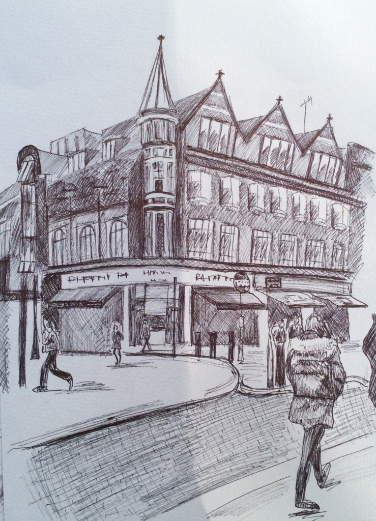
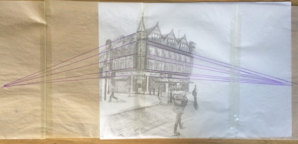
The next artist I looked at was Nathan Walsh. Nathan Walsh is an English artist who paints ultra realistic urban landscapes. One of the reasons I chose to look at him was because of his use of perspective in his work as this is what I have been studying recently. 

Below is an example of his work: 

Walsh often exhibits his detailed line drawings alongside his final paintings. It is obvious from these drawings that he firstly establishes his horizon line and then works with lines of perspective from there (exactly how this course has so far taught us to do.) 

I love how his final pieces show a mixture of ultra photo realism and an illustrative element, for example the puddles on the pavement could be a photograph whereas the tree in the centre looks like an illustrative drawing. 

The next artist I decided to look at was Craig McPherson. Craig McPherson is known for his urban landscape paintings of New York City. Below is an example of one of his works,

Craig Mcphearson (2020.) Yankee Stadium at Night. At: http://craigmcpherson.net/mezzotints/Yankee-Stadium-at-Night-detail.html (Accessed 16/04/2020).

One of the reasons I chose to look at Craig McPherson’s work, was it showed striking similarities to John Virtues black and white paintings. However rather than using Acrylic paint and ink like John Virtue, Craig McPherson uses mezzotint, a type of print method used with copper or steel plates. This is a process I have never used before or even heard of so it was something I found exciting and fascinating. 

I was really inspired by Craig McPherson’s Yankee Stadium at night. I love his use of vivid light and the amazing atmospheric perspective that is shown. (This is something I failed to achieve successfully in my own work on my previous exercise, so is a technique I am very interested in now.

I feel his work is very dramatic and I love it’s vast composition. Unlike John Virtues work Craig McPhersons detail is sharp and obvious. This works makes my eye travel around the piece at great speed it feels like I can’t get enough of every tiny aspect quick enough. 

In conclusion all three artists show wildly different styles and techniques whilst still maintaining an exciting portrayal of urban landscapes. Moving forward I would like to be able to use their work to inspire my own drawings including John Virtues use of mood and atmosphere, Nathan Walsh’s incredible detail and realism and

Craig McPherson’s use of atmospheric perspective. 

Bibliography:

The National Gallery. (2020) John Virtue. At: https://www.nationalgallery.org.uk/learning/associate-artist-scheme/john-virtue (Accessed 16/04/2020).

Wikipedia. (2020) John Virtue. At: https://en.m.wikipedia.org/wiki/John_Virtue (Accessed 16/04/2020).

Schama, S. (2005) This is London in all its rain-sodden, beery-eyed, nervy exhilaration. At: https://www.google.com/amp/s/amp.theguardian.com/artanddesign/2005/feb/28/art (Accessed 16/04/2020).

Yale Centre for British Art (2020) John Virtue. At: https://britishart.yale.edu/exhibitions/london-john-virtue (Accessed 16/04/2020).

Art UK. (2020) Landscape No.664 John Virtue. At: https://artuk.org/discover/artworks/landscape-no-664-29490 (Accessed 16/04/2020).

Exercise 3: Aerial or atmospheric perspective.

The objective of this exercise was to create a sense of distance through aerial or atmospheric perspective in order to show that distant objects appear less distinct. I was to do this using tonal graduation.

I was asked to use a selection of drawing media, I used Charcoal and watercolour paint, Indian ink and water soluble crayons. 

For this exercise I worked from old holiday photographs of landscapes that I considered to be quite beautiful. Due to the current pandemic working first hand will prove to be quite difficult. 

For my first drawing I worked with charcoal, I tried to establish the horizon before plotting the basic forms of objects in the landscape from foreground to mid and far distance. My aim was for my foreground to appear sharper and darker and my background to have less detail and be lighter. Below is my drawing.

I felt that my drawing was not complete so I continued my drawing by adding watercolour paint. I made sure that the sky and hills in the background were light and dull with very little detail whilst all the colour intensity and detail was focussed on the trees in the foreground. 

I feel I could have emphasised atmospheric perspective further by having the background hills even lighter and even duller. 

For my next drawing I worked with Indian ink and an old fountain pen. I found using ink quite a difficult media to use when trying to show distance, especially the background. I used mark making to show texture and detail in the fore and middle grounds and left the background clear, my idea being to add water to the drawing to smudge the ink in order to create some atmospheric perspective. Below is my original ink drawing before adding water. 

When I added water rather than show the atmospheric perspective I was hoping for I think I just managed to create a bit of a mess. I experimented for a while with this drawing adding more water and then working on top with more ink after it dried. 
Below is my work. 

I don’t really feel I managed to show much atmospheric perspective here, mostly because I was not confident enough with the media I was using, I enjoyed being experimental though and hopefully next time my work with ink will be more successful. 

For my final drawing I used water soluble crayons, I started my work by blocking on the basic forms of my objects (in this case trees & bushes) then I gradually built up gone and colour, focussing on making the fore & middle grounds more intense with colour whilst leaving the background quite pale in comparison. Below is my work

Overall I feel I learnt a lot from this exercise. Even though what I feel I learnt is not necessary evident in my work, I do feel hopeful that in my next drawings I can work upon this technique of showing distance and atmospheric perspective through tonal graduation.

Exercise 2: Angular Perspective.

For this drawing, I drew a scene from Reading town centre. I picked a building that I could observe corner on. I used biro on thick cartridge paper and I worked a4 size. I tried to use every possible vertical or horizontal reference to ensure that receding lines were drawn at the correct angles. I tried to use the vertical corner of the building as the reference. 


Below is my drawing: 

When I finished my drawing I stuck together 4 pieces of a4 tracing paper and placed it on top of my drawing. I then drew all the parallel lines and tried to get them to meet their vanishing points.

I found using a ruler to check the angles and receding lines very effective in helping my perspective and accuracy of my drawings, this I see definitely a technique I intend to use going forward on all of my drawings.

Exercise 1: Parallel perspective- an interior view

For this exercise I was asked to draw a view through a doorway inside a building. I was fairly limited to where I could do this as we are currently on lockdown & I live in quite a small house. I decided to do my drawing at the entrance of my kitchen. I chose my kitchen because of the wood panels on my floor and the angular cupboards and table and chairs. I positioned myself on the floor to draw. 

I drew in line and didn’t use a ruler. I drew on a3 paper in my sketchbook with a hb penciI. 

After I finished my drawing I put tracing paper over the top of my drawing and drew over my parallel lines (mostly of the floor & sofa) using a biro to see if they all receded into a single vanishing point. Unfortunately they met in a variety of places. (I did make the mistake of adding lines of the sofa which was positioned at a different angle!) I then added the lines (pink) of the fridge and storage cupboards, this again showed similar results.

My next step was do the drawing again, only this time using a ruler and making sure all of my lines receded into a single vanishing point. Below is my ruler drawing: 

This drawing is a lot more accurate than my original drawing, thus using a ruler and making sure all diagonal lines receded to the same point worked effectively. However this drawing feels more clinical than my first and seems to lack the charm of my original.