Category Archives: Project 4: Structure

Exercise 2: Three figure drawings.


For this exercise I was asked to complete three drawings of my model- standing, sitting and lounging. I was asked to work large scale and to spend between 30 minutes to an hour on each drawing. I was also asked to use a selection of different tools and materials. 

My model for this exercise was my 6 year old son Leo. 

Before I started my a2 longer study drawings I spent time looking at my sons stance and posture in different positions. I tried to move around Leo assessing different viewpoints and I also looked for interesting foreshortening positions. I tried to make some quick drawings of these poses and positions whilst experimenting with a range of different media’s including, charcoal, chalk pastel and acrylic paint. 

below are my drawings. 

These drawings helped me to become accustomed to my sons lines and angles, even though I know him visually, drawing him is a different matter and something I am not used to. 

My next stage was to begin my large scale longer drawings. Due to my son being 6 (and him being my best option for a model as life drawing classes have all been cancelled due to the pandemic.) I decided to work from photographs as I knew he would struggle to stay still.

My first study was of my son lounging on the sofa watching tv. For this study I worked with a palette knife and acrylic paint on pink sugar paper. This is a media I used in my previous exercise and I wanted to experiment with it further. 

Below is my study:

I really enjoyed using the palette knife and the colour, it was hard to strive for accuracy but this made the drawing experience feel freer. I enjoyed exaggerating colour and using expressive marks. I think though if I was to do this again I would like to experiment with oil paint instead as the acrylic seems to have a shiny finish to it? One of the things I liked about using paint is I felt like my lines didn’t need to be permanent, if something looked wrong, I just applied more colour on top. 

I found doing the face difficult as I know my sons face so well I am very critical of any tiny mistake I make. 

This is a study that I think I could spend a lot longer on, I would like to be able to build the colours up. I think the shorts look quite flat and the heavy outlines around the legs don’t work. 

Overall I am fairly happy with how I depicted Leos proportions. His pose shows an element of foreshortening with the feet being the closest body part to me therefore appearing bigger than his head. I think I captured these sizes fairly accurately in relation to each other.

For my next study, I asked Leo to stand up. This time I worked with a mixture of acrylic paint and chalk pastels. These are not two medias I would normally put together, however I thought it might be interesting to experiment. 

With this drawing I again struggled with the face, and even after lots of re working and re working, it is still off slightly. His eyes are too big and are slightly different to each other and his face just looks older than the six years it is. The rest of his proportions seem to be fairly accurate, I think in particular I captured the shape and size of his legs correctly as I did with his slouched pose. However it is clear that I have spent a much longer time on his face than the rest of the body, even though the face is off slightly it is far more polished than the rest of the body. 

My final drawing was of Leo sitting on the sofa. For this drawing I worked on beige sugar paper and I used charcoal and chalk. 

I am pleased with my proportions in the drawing, however I wonder if his right hand is slightly too small? I again struggled with his face, and ended up spending more time on that than any other area. 

I really enjoyed this exercise and I am finding that capturing shapes and proportions is becoming slightly more natural to me. I feel like I am starting to understand the basic structural principles of the human body and I am able to incorporate this into my drawings. 

Research Point 13: The structure of the body.

For this research point I was asked to research artists who explore the structure of the body.

The first artist who immediately came to mind was Leonardo Da Vinci. Da Vinci is an artist who is famous for his drawings on the mechanics of the human body. 

One of Da Vinci’s most famous works is The Vitruvian Man completed in 1490. 

This is a pen and ink drawing on paper that depicts a man in two  positions within a circle and a square. It is accompanied by notes on the ideal proportions of the human body based on the work of the Roman architect Vitruvius. Such as how big a hand should be in relation to its fingers and how big a foot should be in relation to its hand. 

In this drawing Da Vinci demonstrates the mechanics of the male human body, he shows that this man can both simultaneously fit  within the four sides of the square when he stretches out his arms and when in a spread eagle position he can fit inside a circle. 

The Vitruvian Man is just one example of Da Vinci’s exploration of the mechanics of the human body.

Da Vinci is also known for exploring the mechanics of the human body by dissecting corpses. He would dissect dead human remains and then draw what he saw. 

His studies were presented as drawings of parts of the human body surrounded by notes and observations about how they function.

Below are some examples:

The first thing I notice about these drawings is how they are exquisitely detailed and seemingly perfectly accurate. The notes describe how the bones and the muscle fit together and the mechanisms of how everything works. I found this fascinating to look at and I felt almost like I was looking at a medical journal. 

In order to learn more about Da Vinci’s anatomy drawings I watched an episode of The Culture show on the BBC called ‘Leonardo Da Vinci- The Anatomist.’ This show was hosted by art critic Alastair Sook who looked at Da Vinci’s anatomy drawings. Here I discovered that Da Vinci through his drawings of the mechanisms of the human body actually made many medical discoveries, including the first accurate depiction of the human spine as well as the first known description of cirrhosis of the liver.

This television show states that these anatomy drawings by Da Vinci lay undiscovered for hundreds of years- (possibly because cutting up corpses was illegal at the time unless you were a physician.) 

It also explores the theory that if Da Vinci’s drawings were discovered earlier they could have transformed the history of medical knowledge. 

I found researching Da Vinci both fascinating and inspiring, and I have been inspired to learn more. I look forward to completing my own drawings using his methods of proportions and measuring each body part in relation with each other in order to strive for accuracy. 

The next artist I decided to look at explores the mechanisms of the human body in a much more contemporary, but equally fascinating (if not a more gruesome way) than Da Vinci. 

Gunther Von Hagens is a German anatomist who is known for displaying dead bodies without their skin, often taking part in a sporting activity. Below are some examples of his work: 

https://www.google.com/amp/s/www.independent.co.uk/news/uk/home-news/gunther-von-hagens-human-body-corpse-worlds-exhibition-london-corpse-display-a8570581.html%3famp

Gunther Von Hagens invented the technique ‘plastination.’ This is a technique that uses polymer chemistry to preserve biological tissue by replacing water in cells with plastic material. Each body can take 1500 hours and  can cost an approximate twenty five thousand pounds.

Gunther Von Hagens wanted to bring life back to anatomy. He also wanted people to know and understand anatomy and the mechanisms of the human body. He wanted people to understand themselves. He felt that displaying real dead bodies in this way was the most effective way of achieving this. 

One of the things Gunther Von Hagens wanted to do was to show the viewer what happens to the human body if it is mistreated, for example the comparison between a smokers lungs and a non smokers lungs. This was to emphasise the importance of a healthy lifestyle. 

It has been questioned whether Gunther Von Hagens work can be considered art or whether it is purely science? 

I wonder if the fact people had to die in order for these works to be created has any influence over this answer? 

I feel that Gunther Von Hagens work is clearly the science of anatomy and has an amazing learning aspect to it, however I can also see how it can be considered art as well? His works are deliberate and exhibited? He clearly spends a great deal of time presenting his work, making sure everything is smooth, and looking good. If these works were purely for science, making the bodies look good may not be as important? The bodies are also arranged in different positions, again if this was just science would there be a need for this? 

I found lots of similarities between the two artists I have looked at. Namely both artists being anatomists, and both anatomists presenting their findings in exceptionally artistic ways, both managing to keep their bodies alive after death. Ways in which both shocked their audiences of their time and causing great controversy. Da Vinci worked illegally and secretively dissecting dead bodies, whilst Gunther Von Hagens displayed dead bodies in exhibitions without their skin, for all to see- something never to have been done before. 

Bibliography:

Wikipedia. (2020) Vitruvian Man. At: https://en.m.wikipedia.org/wiki/Vitruvian_Man (Accessed 02/08/2020). 

The Art Crime Archive. (2013) Leonardo da Vinci and Dissection. At: https://www.artcrimearchive.net/post/2013/04/24/leonardo-da-vinci-and-dissection (Accessed 02/08/2020).

The culture show. (2013) Leornardo Da Vinci The Anatomist: BBC Culture. At: https://www.bbc.co.uk/programmes/n3csvj8j (Accessed 02/08/2020). 

Wikipedia. (2020) Gunther Von Hagens. At: https://en.m.wikipedia.org/wiki/Gunther_von_Hagens (Accessed 02/08/2020). 

Jeffries S. (2002) The naked and the Dead. At: https://www.google.com/amp/s/amp.theguardian.com/education/2002/mar/19/arts.highereducation (Accessed 02/08/2020). 

Gambarotto T. (2018) Terminally ill ‘Dr Death’ Gunther von Hagens wants his corpse displayed in exhibition of dissected human bodies. At: https://www.google.com/amp/s/www.independent.co.uk/news/uk/home-news/gunther-von-hagens-human-body-corpse-worlds-exhibition-london-corpse-display-a8570581.html%3famp (Accessed 02/08/2020). 

Badiee B. (2006) The Art (or not) of Gunther von Hagens. At: https://www.researchgate.net/publication/313846700_The_Art_or_not_of_Gunther_von_Hagens (Accessed 2/08/2020). 

Exercise 1: The structure of the human body

For this exercise I was asked to sketch some of the structures that make up the human body.

I used my own body for reference and took a selection of photographs of different parts of my body.

My first drawing was of my left foot. I took the photograph looking down at my foot. I worked with pencil on white a4 cartridge paper.

4BE9F3D0-08B9-4005-8551-FD345A548959

I tried to learn about my foots measurements  and mechanics by measuring each toe in relation to each other, and each toe nail or crease in my toe with each other. I tried to show light by leaving blank spaces and shadow by toning in areas with my pencil. I don’t often spend time looking at my feet, but one of the things I noticed were the small lines and patterns that make up the skin on my foot. I tried to show this small detail through loose scribbles across the main surface area of my foot.  I tried to show the form of my three dimensional foot by using my pencil to show tone.

My next drawing was of my hand, I again photographed it first and I again used a pencil on white a4 cartridge paper.

D4AD35A4-7065-43DE-9229-A72A18FFCD99

Throughout this project I have found drawing hands difficult. I therefore decided to get some inspiration from artists who are known for drawing the hand successfully.

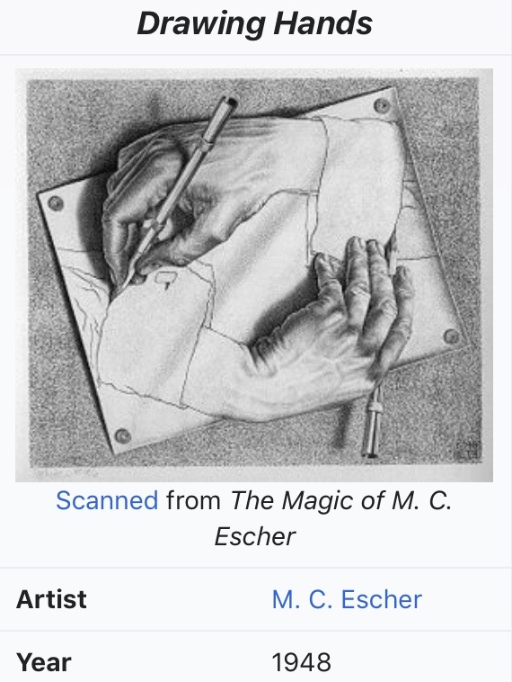
I looked at M.C Eschers ‘Drawing Hands’.

E8AA7584-3CCC-4420-8AF1-C2DA0A44FBB6

https://en.m.wikipedia.org/wiki/Drawing_Hands

I love how he uses tone to show the form of the hands and I noticed how he uses shadow to show the hands are not flat against the surface. These are qualities I will try to put into my own drawings.

Even with M C Eschers influence I found drawing my hand difficult. I tried to measure and compare each finger or joint with each other and where they were in relation to each other. I tried to use shadow to show that my hand was not flat against the table and I tried to show the ‘netty’ and lined texture of my skin. I am pleased that I persevered with this drawing, however I did find it difficult and am aware there are some errors of accuracy and form.

I decided for my next drawings to change the media in which I was working and I decided to work in colour using chalk pastels. I again worked from photographs that I took on my iPhone. All of which coincidently turned out to be highly unflattering, but quite interesting compositions to draw from. Below are my drawings of, my stomach taken whilst looking down, my neck and the side of my face and ear and  my knee taken with my leg in the air.

47499950-B181-4EE4-AA30-94A4D47486928E74C265-7982-4223-A32A-D6B9A504FE990048865A-4D4E-4F01-B9F2-7DCBAAB1598E

These were quicker drawings than my pencil drawings and due to the very thick nature of my chalk pastels, it was harder to achieve fine detail. However I enjoyed working with colour and feel that using colour added another dimension to my drawings.  Whilst completing these drawings I looked back on my research on Jenny Saville and noted how she uses a variety of different colours to accentuate the fleshy appearance of skin. This inspired me to be brave with my own drawings and to include colours that felt un natural such as blues and greens.

F6B3B969-2D64-4FAB-8B12-E8BBABA4FED3

For my next drawings I used acrylic paint and a palet knife, I photographed my legs and feet whilst sat down learning forward and worked from that photograph. I also photographed my elbow as I felt that the rough skin on my straightened elbow would make an interesting drawing. The good thing about working from a photograph was I noticed my head was positioned in the background of the photograph which made for a far more interesting composition than just my elbow.

28E1AFBD-0386-45A9-9DD8-2FAB08781E3B2048FE44-2D18-491F-A569-2284D09FE7F3

Like the chalk pastels my palette knife didn’t allow for much detail but it did allow me to be experimental with both colour and texture which I thoroughly enjoyed. My first drawing was the one of my legs. I think I probably went too far with colour in this piece however by the time I got to my second drawing my use of colour and ability in actually using the palette knife was much more refined.

I really enjoyed using the palette knife with the paint, this is definitely a technique or way of working I would like to continue and try to develop further.

Overall I really enjoyed this exercise. I enjoyed learning about the structure of the human body- mine in particular. I am often ashamed of my post pregnancy belly, however I was excited to draw it and to show its fleshy nature full of curves and rolls. I think a taught beautiful belly may have been less interesting to draw.

I enjoyed working from photographs also and more of my body parts appear foreshortened in some way because of the angle of my phone whilst taking my photographs. I found this a really exciting way to explore the structure of my body.

Research point 12: Foreshortening.

For this research point I was asked to lounge on a couch facing a mirror from the foot end and to draw my body as I saw it in the mirror. The idea being that my feet would be huge in comparison to the rest of my body.

Because of where my couch is and where my mirrors are, I needed to ask my husband to hold a mirror on the couch whilst I took a photograph of myself.

I drew from a photograph as it wasn’t possible to draw in the position I was asked to draw from. In a way it was easier as I was drawing from an image that had already been flattened and I could easily see the proportions of where everything was in relation to everything else. However I feel like when I draw from a photograph my drawing always look flatter and more prescribed. It doesn’t look as loose or as expressive as when I draw from life.

I worked with charcoal and chalk on orange sugar paper and it was a fairly quick drawing. I did notice my feet next to the mirror were bigger than my head which was further back and my non reflected foot and leg were even bigger.

B3AF7BC5-1776-47B6-AB54-F48C24C6E940

Foreshortening in art is the technique that depicts a distance to appear shorter than it actually is in a drawing because it is angled towards the viewer. It can also depict parts of an object or parts of a figure to appear larger or smaller due to an illusion that is created by space.

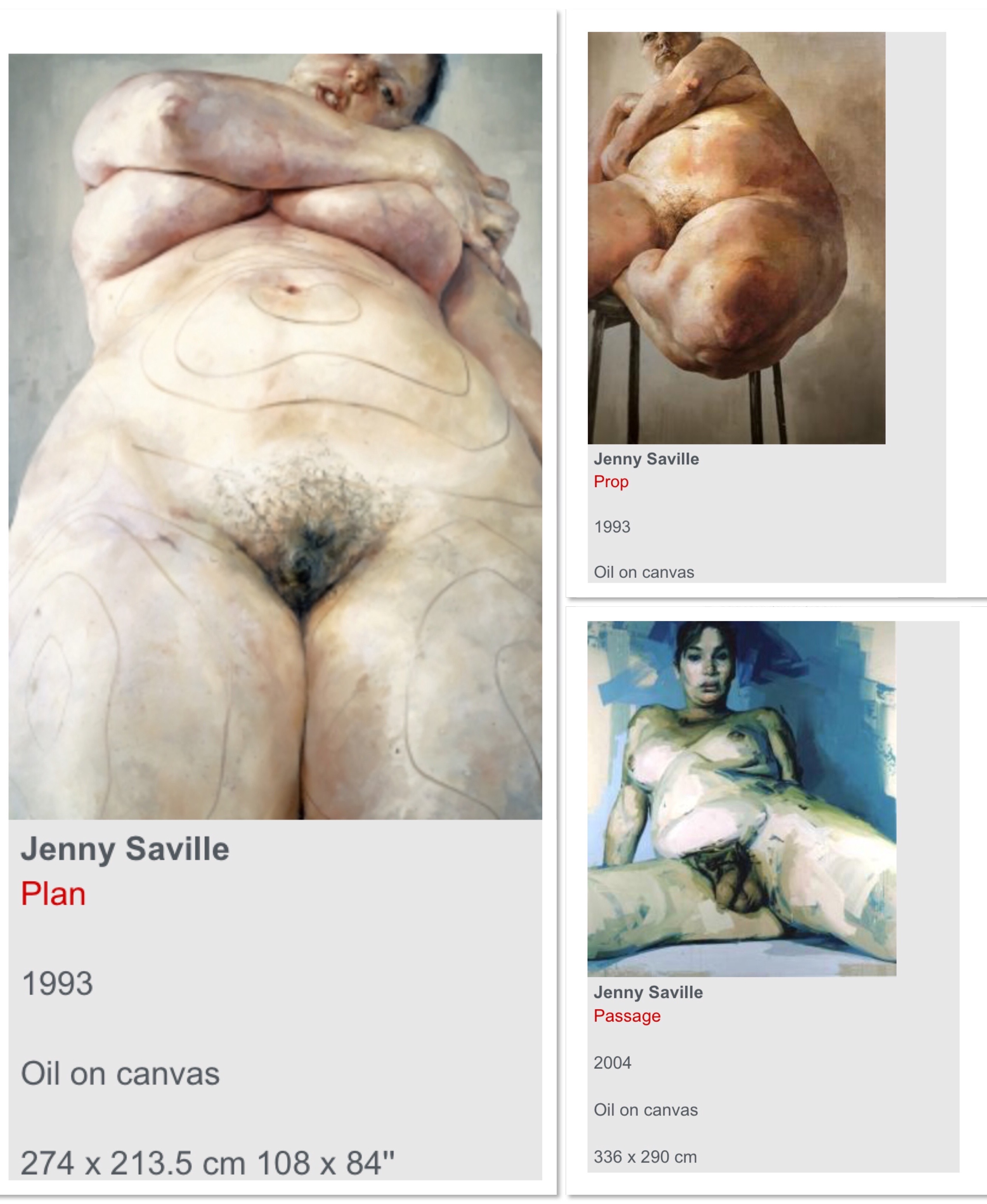
I decided to look at Jenny Savillle as she is known for using foreshortening in her portraits. Savilles portraits are often large oil paintings of female nudes who challenge society’s stereotype of beauty. She paints big women and focusses on flesh. Often these are painted in a sexualised way with the pubic areas or the breasts being in the foreground of the paintings. She often uses the technique of foreshortening to emphasise these areas. Below are some examples of her work.

F6B3B969-2D64-4FAB-8B12-E8BBABA4FED3

Saatchi Gallery. (2020) Jenny Saville. At: https://www.saatchigallery.com/artists/jenny_saville.htm. (Accessed (05/07/2020).

I looked at Savilles 1993 painting ‘Prop’. This is an example of foreshortening that has been used to emphasize scale and mass. The nude figure is positioned balancing on a stool at an angle with her left knee and thigh in the foreground. The rest of her body is positioned leaning away from the viewer and gets progressively smaller and smaller until finally we reach her head which in comparison with her knees is tiny.

Through Savilles use of foreshortening the viewer is forced to observe the enormous scale of the nudes legs. This size is exaggerated through Savilles use of foreshortening. Saville is therefore encouraging the viewer to challenge their perception of what is considered beautiful or sexual in today’s world?

Another artist I looked at who is known for using the foreshortening technique is Duarte Vitoria. His use of foreshortening is extreme.

Below are some examples of his work:

C03EEF4A-50D6-4F95-B3B0-E41BDD248185

Kurze. C. (2020) Vibrant Portraits by Duarte Vitoria. At:

https://www.ignant.com/2014/04/09/vibrant-portraits-by-duarte-vitoria/ (Accessed 05/07/2020).

The feet in these paintings seem to have been drawn from an insects perspective rendering them huge in comparison with the rest of the body. Not only does Vitorias technique of foreshortening exaggerate the expression of the body but his use of large brushstrokes also seems to enlarge every detail. I love how exciting and expressive these portraits are and I love how foreshortening is able to exaggerate the anatomical correctness of these bodies.

Both Vitorias portraits and Savilles portraits explore, challenge and confuse the notion of beauty and they use foreshortening as a way of doing this.

Foreshortening is definitely a technique I look forward to using in my future work.

Bibliography

Tate. (2020) Foreshortening. At: https://www.tate.org.uk/art/art-terms/f/foreshortening (Accessed 04/07/2020).

The Art Story Foundation. (2020) Jenny Saville. At: https://www.google.com/amp/s/www.theartstory.org/amp/artist/saville-jenny/artworks/ (Accessed 05/07/2020).

Kurze. C. (2020) Vibrant Portraits by Duarte Vitoria. At:

https://www.ignant.com/2014/04/09/vibrant-portraits-by-duarte-vitoria/ (Accessed 05/07/2020).

Saatchi Gallery. (2020) Jenny Saville. At: https://www.saatchigallery.com/artists/jenny_saville.htm. (Accessed (05/07/2020).