For this exercise I was asked to create two interesting images of my own head.
I started this exercise by looking at myself in the mirror and trying to complete some quick 5 minute studies of my head. I tried to put my head in different positions in order to draw different angles. Below are my drawings.
For my first drawing I used charcoal and chalks, however this ended up taking me much longer than 5 minutes as I couldn’t get it to look like me, I kept working and re working it until it did resemble me. For my second drawing I was adamant it needed to be a quick study, so I tried to be less precious about my marks, and it did end up looking more like me than my first drawing. For my third drawing I decided to use biro, there were less options for mistakes aside carrying on with a biro so naturally I was quicker. This drawing was a fairly good likeness except I made my eyelashes too long.
My next task was to complete a longer more detailed drawing of my head. I worked again with charcoal and chalk on white paper. My drawing was of me looking straight on. I started my drawing by blocking out my features and the approximate shape of my face, I then started to add tone by adding dark and light areas and thinking about the direction of the lines on my face. Below are the different stages of my drawing:
I worked and re worked with my charcoal and chalk to try to show the texture of my skin and try to show the form of my head.
Below is my drawing:
In the end I do feel like this drawing does actually look like me, however I did find that because I had so many layers of charcoal, the white chalk was less effective. Next time I need to try to use the white paper to show the lighter areas as it should look brighter and more effective. Also I have drawn my eye lashes too heavy and this takes away from the realism of my drawing. I also think my hair needs more work, it looks very two dimensional as it is and I could do with building up my tones in order for it to look more realistic.
For my second drawing I used a blue biro, I had already experimented with a biro in my quick initial drawings and this worked fairly well. I wanted this drawing to be completely different to my previous drawing so I put my glasses on and a hat and turned my face to an angle. This entire pose was wholly unflattering but I felt it would be both interesting and a challenge to draw. I found this hard. I found using a biro to build up tone in order to show form on my face hard. I have used biro before on townscape drawings and on quick figure drawings but it felt difficult on a portrait. I tried to to keep my pen moving around my drawing and I tried to keep working in shadows and lines. I found however that my lines were too obvious and it felt messy. I feel like to make it look better my lines need to be more refined and sensitive. Below are the different stages I went through:
Over all my drawing does look like me (on a bad day.) However I think my biro lines have added quite a few years on me. I am pleased with my use of shadow in the drawing particularly the shadow my glasses are making and that I have managed to show texture particularly in my hair and areas of my nose. However the area between my nose and lips is wrong and I have made my nose and chin area look quite masculine.
I found this exercise difficult as I know my face very well, therefore I was highly critical of all of my mistakes, however after completing my portraits I feel more confident to continue and excited about my next portrait.
For this research point I was asked to look at contemporary as well as historic artists who work on the face in different ways.
I started by looking at Graham Little, a contemporary portrait artist who is known for using gouache and coloured pencils. His focus appears to be beautiful elegant women who look expensive and radiate luxury. Images that were often copied from glossy magazines.
Below is an example of one of his drawings, Blue Bulb Lady.
This portrait shows an attractive woman facing forward and leaning on a table next to a blue light bulb. The woman is dressed in what appears to be expensive 1980s fashion, with a short 1980s hairstyle. When zooming in on the portrait you can see Littles subtle use of fine lines and repeated fine marks. This intricate and detailed technique manages to create beautiful patterns and texture whilst at the same time creates a realistic interpretation of the model. I would imagine that this effective process would be highly time consuming and that each portrait could take months to complete.
Below are more examples of his work that show beautiful, strong, confident women in this similar style:
Even though these women are all highly attractive, the one thing that seems to be missing is their personalities. Maybe this is because of the absence of their expressions? Or their exaggerated un realistic poses? They all seem to be very similar with no real differences between them? I also noticed in the naming of these works they are mostly named as ‘untitled’.
Upon researching Graham Little I discovered that the reason he focusses his work on these beautiful women is because during his childhood, he wished he was a woman himself.
I then looked at the portrait work of Elizabeth Peyton.
Elizabeth Peyton is a contemporary American portrait artist who is known for creating stylised portraits of people she loves or admires, these are often hugely successful, famous and sometimes historical figures. These works are in huge contrast to Graham Little who tended to select random models from glossy magazines.
Her portraits are often small scale and are completed mostly in oils with glazes that can drip. She also uses watercolour paints and completes drawings and etchings too.
These stylised portraits show a more fluid blocking in of tone than that of Graham Little. They are devoid of intricate detail and pattern like Littles work. However Elizabeth Peyton unlike Graham Little manages to capture a personality in her faces almost like a moment in time. The individuality of these portraits appears to be captured in the expression of these faces.
The next artist I looked at was Frank Auerbach a German-British artist who is best known for his portraiture made up of layers upon layers of thick oil paint.
I chose to look at Auerbachs work as it is so different from both Little and Peytons work. Both Little and Peytons portraits show a sense of realism, their portraits look like the people they are trying to portray, whereas for Auerbach, his sitters external detail appears to be less important? His portraits appear to be so full of paint they are almost abstract. Below are some examples:
Auerbach is known for developing intense relationships with the people he paints, he tends to just focus on painting the same small amount of people repeatedly and often these people could sit for him every week for years and years.
Unlike Peyton who is trying to capture a moment in time Auerbach appears to want to capture the movement of time, this is evident in his repeated works of the same sitter year after year. It lfeels like the more he gets to know his sitters the more fascinated he is with them.
I love Auerbachs style, his thick layering of paint makes his portraits feel almost 3 dimensional like they are alive. This thick paint makes me think of all of the layers of the person he is trying to capture.
This is definitely a style of working that I would love to experiment with.
The next artist I wanted to look at was Stanley Spencer, this is an artist whose work I have loved for many years. Stanley Spencer was an English artist best known for his biblical paintings. However it is his portraits, his self portraits in particular that I am interested in.
The first self portrait I wanted to look at was his first self portrait in oils in 1914.
This self portrait is face on set in a very dark background. It’s tones are dark and rich with a strong sense of light falling across the left hand side of the face. His gaze is fixed and direct and The skin tones and features are painted realistically. It reminds me old master paintings. Such as Gainsborough and Da Vincini.
When this portrait was painted in 1914 he was about to enlist for the war. Could this be the reasoning behind the dark somber tones and shadows? Could he have been worried about the possibility of death?
The next self portrait of Spencer’s I decided to look at was his 1959 portrait. This self portrait is very close up with incredible attention to detail with every line or mark on his skin being recorded. His use of colour and light is also far brighter than his 1914 portrait.
This portrait was completed when he knew he was dying of cancer. Like his 1914 portrait he was again facing the possibility of death. However there is a difference in his expression. His gaze is more intense, when looking at this portrait I as the viewer see more than just his external skin, I am drawn to what’s inside him, his thoughts, his processes.
His eyes have been painted larger than they probably were, this could be because they were magnified by his glasses, but these over sized eyes make me think of fear, could this be linked to his own impending death?
His skin tones are bright, mostly pink tones however he has used a small amount of green tones which give the skin an element of translucency. Perhaps this adds to the viewer seeing past the skin and looking inside?
The final artist I wanted to look at was Raffaello Sanzio, in particular his portrait drawings. Raffaello Sanzio was a historical Italian Renaissance artist. His drawings were mostly used to plan his compositions for his final paintings. However I am fascinated by these beautiful portrait drawings even more so than his finished paintings. I love their precision and the sensitive nature of these carefully drawn faces.
The first drawing I looked at was a self portrait of when he was just 14.
This drawing is both serene and harmonious. It is simple, yet precise. His accuracy makes up for limited tone or detail, which is shown through a small amount of hatching around the edges of the face and the shadow created by his nose. The eyes however are mesmerising. They are detailed and show a powerful gaze out towards the world. The small amount of detail and tone on the rest of the face makes the eyes stand out even more. His expression is captivating and I as a viewer am drawn in straight away to wonder what this boy is thinking. For me it is the sensitivity of this drawing that makes it so special.
It is likely that Raffaello Sanzio used silverpoint and ink to make this drawing as this was a medium he mostly cherished.
Below are some more examples of his portrait drawings that all display the same attentiveness, grace and elegance as his self portrait at 14 did.
From my research, I’m hoping I have gathered enough information and inspiration in order to influence my own experiments and drawings.
For this exercise I was asked to draw facial features. I drew a selection of different features from my own face and from images I found on the Internet. I tried to bear in mind tonal variation to show form and the use of mark making to show texture.
Below are my drawings:
I found these drawings quite difficult as drawing features on their own apart from the rest of the face felt un natural and un realistic. However hopefully it has helped me to understand the form of these features and will help my full face drawings to be more accurate.
I then drew the entire head. I copied a photograph of my 9 month old baby’s face. I really focussed on drawing his features and tried to make sure my positioning of his features were accurate.
Below is my drawing:
I am pleased with my proportions, and I am especially pleased that my drawing does actually look like my son.
However I do feel that I have over used heavy pencil lines. I need to somehow try to make my drawing look less like a drawing and more realistic? I could do this by trying to form more sensitive lines and tones with my pencil? And by working on my pencil work to give the face and skin a better sense of form.
I also struggled with the hair, I tried to draw the hair in shapes of light and dark areas rather than individual hairs however I think I need to work on this further as I have managed to show the darker and lighter areas and where the light is shining, but I haven’t managed to really capture the texture of his silky smooth hair.
For this exercise I was asked to draw groups of people. To observe their movement and interaction. This exercise is almost impossible to complete during the Pandemic, whilst some restrictions have been lifted it would be very difficult to find a crowd of people. (And if I could it wouldn’t feel very safe!)
My best option was to trawl through past photographs, where I can remember the atmosphere and energy of the place I captured.
However it turns out I don’t tend to take photographs of anonymous crowds so I had very little to work from. I therefore decided to remember an atmospheric place I had been to and find photographs from the internet to work from.
I decided to choose Reading festival.
Being from Reading myself this is somewhere I have been a significant number of times and it is a place with an unforgettable electric atmosphere and energy.
The main things about Reading festival, are that people are generally happy, there is loud music everywhere, people are dancing, having fun with their friends and watching their favourite bands play their favourite tunes. People are often intoxicated and this festival allows people to unwind and take a break from their real lives.
The atmosphere and energy of festivals are unlike any other place and the huge crowds they attract just make that atmosphere and electricity even more vibrant.
My first drawing was of a crowd in front of an empty stage, it was still fairly busy but people were more relaxed.
I worked quickly to try to get the sense of movement and I worked with a blue biro in my sketch book.
Below is my drawing:
I then decided to add colour- to try to create more atmosphere, I used colouring pencils and added some black biro to my drawing.
Below is my drawing:
By adding colour I feel like I have lost some of the charm of the drawing. I feel like it looks more like an illustration of the crowd now rather than capturing the vibrant energy of the moment. Reading festival feels free and exciting, whereas my drawing looks static and still.
For my next drawing I tried to capture atmosphere. I left it simple with just a black biro and I worked quickly. Below is my drawing:
In this drawing even though it was very quick I feel more like I have captured a moment and each of my figures are as interesting as the next. Technically my accuracy is off, but I feel in this particular drawing that is not so important. To me this shows the end of the festival, where most people have slowed down but there is still a handful of keen party goers.
For this exercise I was asked to draw moving figures in my sketchbook.
This felt like the perfect exercise to do with three moving children. I did however find this exercise hard.
I discovered that my children never stop moving!
I literally managed to do a line or two at a time. Doing anything more would involve me making it up.
My first page is a collection of drawings of my just turned seven year old son. My second page is of my four year old son and my third page is of my eight month old baby.
The main benefit I feel I got from this exercise was my looking and observing the lines and angles of my children rather than the actual drawing of them. However when re looking at my drawings later, I am able to recognise small traits of my children in these lines, I think it would be impossible for someone else to see these, but as their mother I can.
As I felt like I did not manage to create a sense of the moving figure I decided to try to find some inspiration in artists who do manage this.
The first artist I looked at was Richard Hambleton a Canadian/ American street artist. Below are some examples of his work:
These drawings manage to show movement very effectively and when observing these works I really feel like I’ve encountered a moment of speed. These works show high energy in their fast brush strokes that seem to echo the speed of his figures.
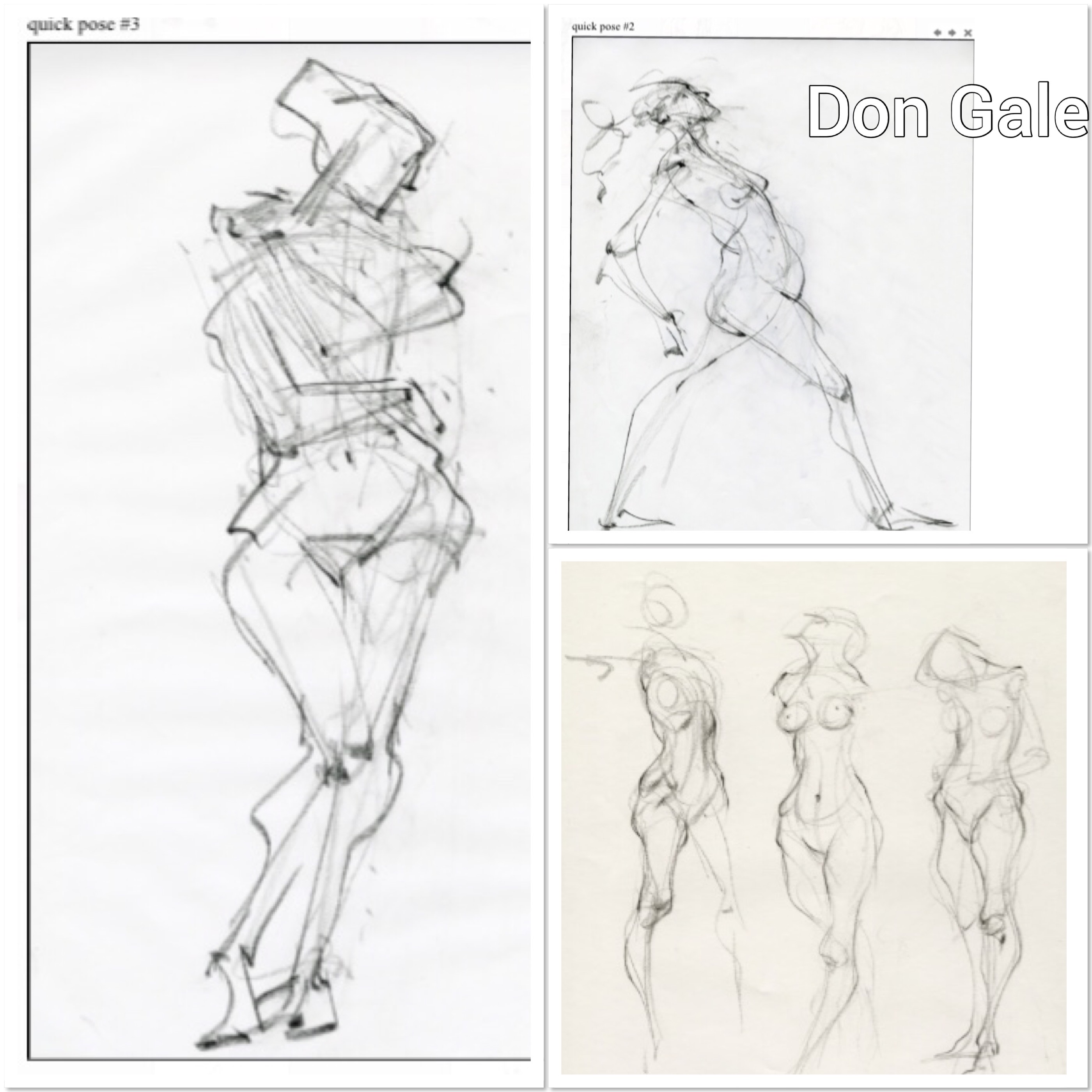
The next artist I looked at was Don Gale. I was attracted to his work as he captures a wonderful element of energy in the movement of his figures. Below are some examples of his drawings.
These drawings look like they could almost start with a line of movement and then the rest of the body parts and features are added after. These drawings appear to have rhythm and capture the moving figure beautifully. Don Gale uses quick exploratory lines to express this rhythm and flow and manages to capture the figures energy through stance and mark making.
As I don’t feel like I succeeded in creating a sense of moving figures so far in this exercise I decided to start again, this time under the influence of Richard Hambleton and Don Gales work. My aim this time was to try to capture more of the figure than just the two or three lines I managed in my original drawings. My aim also was to try to show fluidity in my marks in order to show movement.
I started with my (now 9 month old) baby, Bertie. I tried this time to draw even quicker and try to capture his energy as I drew. Bertie moved constantly- every split second! so when drawing him I found he was moving so quickly I was almost imagining where my lines would go. This page of drawings however was a significant improvement of my two lines a portrait in my first attempt.
I then drew my second son Teddy who is four years old. He moves just as quickly and just as often as his baby brother. I tried to use quick lines to show his movement and again I didn’t worry if he had already moved before I had finished drawing.
My third set of drawings were of my eldest son, 7 year old Leo. By this stage I had gotten into the flow of drawing quickly and I started to really enjoy it. I took away any worry of trying to capture anything but movement and energy, however upon reflection I do feel like I captured his character in my drawings too.
I feel like this exercised allowed me to loosen up, I couldn’t worry about mistakes or try to get a perfect reproduction as my children move so quickly. However in the future if I was to attempt to draw any of my children again I think I would be better off drawing from a photograph.
For this exercise I was asked to complete three drawings of my model- standing, sitting and lounging. I was asked to work large scale and to spend between 30 minutes to an hour on each drawing. I was also asked to use a selection of different tools and materials.
My model for this exercise was my 6 year old son Leo.
Before I started my a2 longer study drawings I spent time looking at my sons stance and posture in different positions. I tried to move around Leo assessing different viewpoints and I also looked for interesting foreshortening positions. I tried to make some quick drawings of these poses and positions whilst experimenting with a range of different media’s including, charcoal, chalk pastel and acrylic paint.
below are my drawings.
These drawings helped me to become accustomed to my sons lines and angles, even though I know him visually, drawing him is a different matter and something I am not used to.
My next stage was to begin my large scale longer drawings. Due to my son being 6 (and him being my best option for a model as life drawing classes have all been cancelled due to the pandemic.) I decided to work from photographs as I knew he would struggle to stay still.
My first study was of my son lounging on the sofa watching tv. For this study I worked with a palette knife and acrylic paint on pink sugar paper. This is a media I used in my previous exercise and I wanted to experiment with it further.
Below is my study:
I really enjoyed using the palette knife and the colour, it was hard to strive for accuracy but this made the drawing experience feel freer. I enjoyed exaggerating colour and using expressive marks. I think though if I was to do this again I would like to experiment with oil paint instead as the acrylic seems to have a shiny finish to it? One of the things I liked about using paint is I felt like my lines didn’t need to be permanent, if something looked wrong, I just applied more colour on top.
I found doing the face difficult as I know my sons face so well I am very critical of any tiny mistake I make.
This is a study that I think I could spend a lot longer on, I would like to be able to build the colours up. I think the shorts look quite flat and the heavy outlines around the legs don’t work.
Overall I am fairly happy with how I depicted Leos proportions. His pose shows an element of foreshortening with the feet being the closest body part to me therefore appearing bigger than his head. I think I captured these sizes fairly accurately in relation to each other.
For my next study, I asked Leo to stand up. This time I worked with a mixture of acrylic paint and chalk pastels. These are not two medias I would normally put together, however I thought it might be interesting to experiment.
With this drawing I again struggled with the face, and even after lots of re working and re working, it is still off slightly. His eyes are too big and are slightly different to each other and his face just looks older than the six years it is. The rest of his proportions seem to be fairly accurate, I think in particular I captured the shape and size of his legs correctly as I did with his slouched pose. However it is clear that I have spent a much longer time on his face than the rest of the body, even though the face is off slightly it is far more polished than the rest of the body.
My final drawing was of Leo sitting on the sofa. For this drawing I worked on beige sugar paper and I used charcoal and chalk.
I am pleased with my proportions in the drawing, however I wonder if his right hand is slightly too small? I again struggled with his face, and ended up spending more time on that than any other area.
I really enjoyed this exercise and I am finding that capturing shapes and proportions is becoming slightly more natural to me. I feel like I am starting to understand the basic structural principles of the human body and I am able to incorporate this into my drawings.
For this research point I was asked to research artists who explore the structure of the body.
The first artist who immediately came to mind was Leonardo Da Vinci. Da Vinci is an artist who is famous for his drawings on the mechanics of the human body.
One of Da Vinci’s most famous works is The Vitruvian Man completed in 1490.
This is a pen and ink drawing on paper that depicts a man in two positions within a circle and a square. It is accompanied by notes on the ideal proportions of the human body based on the work of the Roman architect Vitruvius. Such as how big a hand should be in relation to its fingers and how big a foot should be in relation to its hand.
In this drawing Da Vinci demonstrates the mechanics of the male human body, he shows that this man can both simultaneously fit within the four sides of the square when he stretches out his arms and when in a spread eagle position he can fit inside a circle.
The Vitruvian Man is just one example of Da Vinci’s exploration of the mechanics of the human body.
Da Vinci is also known for exploring the mechanics of the human body by dissecting corpses. He would dissect dead human remains and then draw what he saw.
His studies were presented as drawings of parts of the human body surrounded by notes and observations about how they function.
Below are some examples:
The first thing I notice about these drawings is how they are exquisitely detailed and seemingly perfectly accurate. The notes describe how the bones and the muscle fit together and the mechanisms of how everything works. I found this fascinating to look at and I felt almost like I was looking at a medical journal.
In order to learn more about Da Vinci’s anatomy drawings I watched an episode of The Culture show on the BBC called ‘Leonardo Da Vinci- The Anatomist.’ This show was hosted by art critic Alastair Sook who looked at Da Vinci’s anatomy drawings. Here I discovered that Da Vinci through his drawings of the mechanisms of the human body actually made many medical discoveries, including the first accurate depiction of the human spine as well as the first known description of cirrhosis of the liver.
This television show states that these anatomy drawings by Da Vinci lay undiscovered for hundreds of years- (possibly because cutting up corpses was illegal at the time unless you were a physician.)
It also explores the theory that if Da Vinci’s drawings were discovered earlier they could have transformed the history of medical knowledge.
I found researching Da Vinci both fascinating and inspiring, and I have been inspired to learn more. I look forward to completing my own drawings using his methods of proportions and measuring each body part in relation with each other in order to strive for accuracy.
The next artist I decided to look at explores the mechanisms of the human body in a much more contemporary, but equally fascinating (if not a more gruesome way) than Da Vinci.
Gunther Von Hagens is a German anatomist who is known for displaying dead bodies without their skin, often taking part in a sporting activity. Below are some examples of his work:
Gunther Von Hagens invented the technique ‘plastination.’ This is a technique that uses polymer chemistry to preserve biological tissue by replacing water in cells with plastic material. Each body can take 1500 hours and can cost an approximate twenty five thousand pounds.
Gunther Von Hagens wanted to bring life back to anatomy. He also wanted people to know and understand anatomy and the mechanisms of the human body. He wanted people to understand themselves. He felt that displaying real dead bodies in this way was the most effective way of achieving this.
One of the things Gunther Von Hagens wanted to do was to show the viewer what happens to the human body if it is mistreated, for example the comparison between a smokers lungs and a non smokers lungs. This was to emphasise the importance of a healthy lifestyle.
It has been questioned whether Gunther Von Hagens work can be considered art or whether it is purely science?
I wonder if the fact people had to die in order for these works to be created has any influence over this answer?
I feel that Gunther Von Hagens work is clearly the science of anatomy and has an amazing learning aspect to it, however I can also see how it can be considered art as well? His works are deliberate and exhibited? He clearly spends a great deal of time presenting his work, making sure everything is smooth, and looking good. If these works were purely for science, making the bodies look good may not be as important? The bodies are also arranged in different positions, again if this was just science would there be a need for this?
I found lots of similarities between the two artists I have looked at. Namely both artists being anatomists, and both anatomists presenting their findings in exceptionally artistic ways, both managing to keep their bodies alive after death. Ways in which both shocked their audiences of their time and causing great controversy. Da Vinci worked illegally and secretively dissecting dead bodies, whilst Gunther Von Hagens displayed dead bodies in exhibitions without their skin, for all to see- something never to have been done before.
For this exercise I was asked to sketch some of the structures that make up the human body.
I used my own body for reference and took a selection of photographs of different parts of my body.
My first drawing was of my left foot. I took the photograph looking down at my foot. I worked with pencil on white a4 cartridge paper.
I tried to learn about my foots measurements and mechanics by measuring each toe in relation to each other, and each toe nail or crease in my toe with each other. I tried to show light by leaving blank spaces and shadow by toning in areas with my pencil. I don’t often spend time looking at my feet, but one of the things I noticed were the small lines and patterns that make up the skin on my foot. I tried to show this small detail through loose scribbles across the main surface area of my foot. I tried to show the form of my three dimensional foot by using my pencil to show tone.
My next drawing was of my hand, I again photographed it first and I again used a pencil on white a4 cartridge paper.
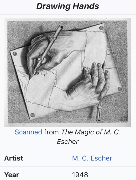
Throughout this project I have found drawing hands difficult. I therefore decided to get some inspiration from artists who are known for drawing the hand successfully.
Drawing Hands is a lithograph by the Dutch artist M. C. Escher first printed in January 1948. It depicts a sheet of paper, out of which two hands rise, in the paradox ical act of drawing one another into existence. This is one of the most obvious examples of Escher’s common use of paradox.
en.m.wikipedia.org
I love how he uses tone to show the form of the hands and I noticed how he uses shadow to show the hands are not flat against the surface. These are qualities I will try to put into my own drawings.
Even with M C Eschers influence I found drawing my hand difficult. I tried to measure and compare each finger or joint with each other and where they were in relation to each other. I tried to use shadow to show that my hand was not flat against the table and I tried to show the ‘netty’ and lined texture of my skin. I am pleased that I persevered with this drawing, however I did find it difficult and am aware there are some errors of accuracy and form.
I decided for my next drawings to change the media in which I was working and I decided to work in colour using chalk pastels. I again worked from photographs that I took on my iPhone. All of which coincidently turned out to be highly unflattering, but quite interesting compositions to draw from. Below are my drawings of, my stomach taken whilst looking down, my neck and the side of my face and ear and my knee taken with my leg in the air.
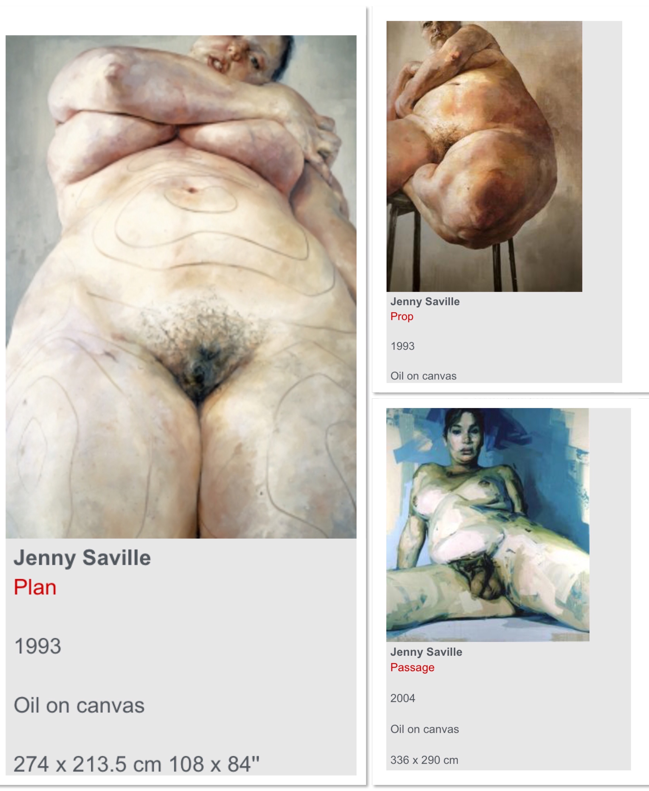
These were quicker drawings than my pencil drawings and due to the very thick nature of my chalk pastels, it was harder to achieve fine detail. However I enjoyed working with colour and feel that using colour added another dimension to my drawings. Whilst completing these drawings I looked back on my research on Jenny Saville and noted how she uses a variety of different colours to accentuate the fleshy appearance of skin. This inspired me to be brave with my own drawings and to include colours that felt un natural such as blues and greens.
For my next drawings I used acrylic paint and a palet knife, I photographed my legs and feet whilst sat down learning forward and worked from that photograph. I also photographed my elbow as I felt that the rough skin on my straightened elbow would make an interesting drawing. The good thing about working from a photograph was I noticed my head was positioned in the background of the photograph which made for a far more interesting composition than just my elbow.
Like the chalk pastels my palette knife didn’t allow for much detail but it did allow me to be experimental with both colour and texture which I thoroughly enjoyed. My first drawing was the one of my legs. I think I probably went too far with colour in this piece however by the time I got to my second drawing my use of colour and ability in actually using the palette knife was much more refined.
I really enjoyed using the palette knife with the paint, this is definitely a technique or way of working I would like to continue and try to develop further.
Overall I really enjoyed this exercise. I enjoyed learning about the structure of the human body- mine in particular. I am often ashamed of my post pregnancy belly, however I was excited to draw it and to show its fleshy nature full of curves and rolls. I think a taught beautiful belly may have been less interesting to draw.
I enjoyed working from photographs also and more of my body parts appear foreshortened in some way because of the angle of my phone whilst taking my photographs. I found this a really exciting way to explore the structure of my body.
This exercise was all about movement. I started the exercise by looking at artists who manage to show movement in their figure drawing. The first drawing I looked at was the example we were given. The Tango by Marcel Vertes.
This drawing shows movement through the rapidly drawn lines. When viewing this drawing I feel like I have captured a moment in the dance. The undulating lines appear to flow with the movement of the dance.
The next work I looked at was the drawings of Don Gale. Below are some examples of his work.
Gales work is very energetic and shows movement through his quick expressive lines. His drawings are devoid of detail but his use of repeated and close lines give the impression of movement.
Before starting my own figure drawings I experimented with creating abstract marks that depict movement. I used a selection of materials including, Indian ink, charcoal, marker pen, tipex pen, biro and pencil. Below are my drawings:
When creating these marks, I tried to feel the movement in my wrists and hands and I tried to be expressive and free with my movements. On reflection I feel my marks do show movement. Therefore it is important that I try to implement these marks in my future figure drawings.
For the main part of this exercise I used my four year old son Teddy.
I was asked to get my model (Teddy) to adopt some dynamic positions.
I worked on blue a3 sugar paper and used charcoal, biro, white crayon and marker pen.
When drawing I tried to convey the sense of energy in each pose. I tried to concentrate on the energy radiating out of Teddy rather than focus on the details. I also tried to make my marks quick and expressive in order to show movement. Below are my drawings:
For my first drawing I started with a black marker pen. I used this pen in my experiments and felt it showed movement effectively. However when I used it for my figurative drawing, it made my drawing of my son look cartoony and I didn’t manage to capture his energy at all. I thus decided to add other materials, so I worked with my biro and my white pencil to try to show movement and energy. This did improve my drawing however I decided to not use this marker pen again.
For my second drawing I started too big and only managed to fit the head and main torso in. Rather than start again I decided to carry on anyway. I experimented with lines and marks in order to show energy. However on reflection this drawing doesn’t show much energy or movement. Maybe this is because I only managed to fit in the top half of my son or maybe my marks were just ineffective at showing this?
My next couple of drawings were more effective in that I managed to fit my model on the page. I also managed to create marks that showed my sons energy more effectively.
Overall this exercise has been beneficial as it has made me think about portraying energy and movement in figurative work. This is something I would like to develop further in my later work.
For this exercise I was asked to look at the line of balance or the centre of gravity in a figure. I was then asked to mark the central axis in my drawings.
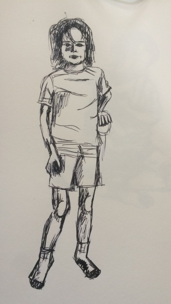
This time I drew my son Leo. I worked with ink and a sharpened stick on white paper. I chose to work with ink as I haven’t worked with ink so far in this project.
I initially asked my 6 year old son to stand still so I could move around him before I began to draw to get a sense of where he was in his allotted space and to identify his centre of gravity.
I then completed a series of quick drawings taking no longer than 5 minutes each. Below are my drawings.
I found working with ink quite unforgiving as mistakes could not be erased, however as the drawings were so quick I didn’t have time to erase mistakes anyway.
Before drawing I marked with ink the central axis, however as my drawings are quite scratchy this is not evident in my final drawings, however I did find this a very useful starting point for all of my drawings.
When reviewing my drawings my main concern was accuracy and proportions. In most of my drawings the hands are drawn too small. This is an area I have struggled with so I really do need to practice. Also when looking at my drawings I don’t feel it is immediately obvious that my drawings are of the same child? Whilst I can see my son in all of my drawings I feel they are quite inconsistent with areas that I have drawn correctly and areas I haven’t.