For this exercise I was asked to draw a sequence of six different poses lasting ten minutes each.
I again drew my husband as we are in lockdown and I have no other options. He was working so I had to work around him working.
This time I used a white pencil on black paper.
When drawing I tried to emphasise his three dimensional form and I tried to remember the work I did on basic shapes when blocking out my drawings.
I drew the whole figure in each of my drawings and didn’t concern myself too much with detail. I tried to focus on proportion whilst at the same time creating a sense of weight and three dimensional form.
Below are my drawings.
The first thing I notice about my drawings when putting them together is the proportions are different. For example in drawing 2 & 5 the heads appear larger than in the other drawings. Also in drawing 5 the foot appears smaller than in the other drawings. My first assumption for these differing proportions was that I had just got them wrong. However I now think it was just the way he was positioned or the way I was positioned when drawing him. For example where the heads look bigger in relation to the rest of the body this is because I was closer to his head than the rest of his body. This is also called foreshortening a technique I looked at in earlier exercises.
What I didn’t do very well in this exercise is focus on tone. I spent so much time trying to work on the proportions and get the shapes right that I didn’t get much opportunity in the 10 minutes to focus on the darker and lighter areas. This is something in need to work on in my future drawings.
Overall I am mostly pleased with my drawings. I mostly captured the shape and proportions of my husband, however I am aware that I do have a long way to go in accuracy. I also need to quicken up so I have time to include tonal elements also.
For this exercise I was asked to arrange my model (my husband) at a slight angle in a chair. He lounged in his chair in our living room and watched tv.
I worked on white paper with a hb pencil.
I tried to block in my husbands basic shapes by looking carefully at which planes of the body are receding and which planes or lines are parallel to the edge of my picture plane.
Below is my first drawing:
With my first drawing I positioned myself in front of my husband, he was facing me but his legs were placed over the arm of the chair which meant their was a slight twist in his body. I stuck to just drawing the main shapes rather than worry about detail as I was focusing on trying to show form. Ultimately in focussing just on the shapes I think rather than showing the form of the body my drawing just looks flat. This was something I needed to improve upon for my next drawing.
Below is my second drawing:
For my second drawing I positioned myself to the side of my husband. I sat down on a chair at the same level as him and began to draw. I still focussed on shape but this time I tried to refine my use of shape to include more detail such as toe nails and shirt creases. Because of where I was sat (with his feet very close to me.) This was an excellent opportunity to take advantage of my new learnt technique of foreshortening. However this made my drawing slightly more difficult as I am accustomed in every day life to the human figures proportions. For example I know that the average adults head fits into seven and a half times the size of a human body. However with this positioning none of these proportions made sense so I really had to concentrate and everything felt wrong whilst I was drawing. However on reflection this drawing is much more successful than my first.
Below is my third drawing:
For my third drawing I positioned myself slightly behind my husband but still to the side of him. I again tried to focus on just trying to outline his basic shapes, but making sure I was getting proportions and angles correct. On reflection, I did manage to capture the essence of my husbands form. However I I haven’t managed to capture the true shape of his head in this drawing and I have made his fore arms too narrow.
This exercise has really made me look at the human form and see shape. This hopefully will help me in future when drawing the human form. I found that splitting the human form up into basic shapes makes the whole process less daunting and much more helpful when working out proportion.
For this research point I was asked to lounge on a couch facing a mirror from the foot end and to draw my body as I saw it in the mirror. The idea being that my feet would be huge in comparison to the rest of my body.
Because of where my couch is and where my mirrors are, I needed to ask my husband to hold a mirror on the couch whilst I took a photograph of myself.
I drew from a photograph as it wasn’t possible to draw in the position I was asked to draw from. In a way it was easier as I was drawing from an image that had already been flattened and I could easily see the proportions of where everything was in relation to everything else. However I feel like when I draw from a photograph my drawing always look flatter and more prescribed. It doesn’t look as loose or as expressive as when I draw from life.
I worked with charcoal and chalk on orange sugar paper and it was a fairly quick drawing. I did notice my feet next to the mirror were bigger than my head which was further back and my non reflected foot and leg were even bigger.
Foreshortening in art is the technique that depicts a distance to appear shorter than it actually is in a drawing because it is angled towards the viewer. It can also depict parts of an object or parts of a figure to appear larger or smaller due to an illusion that is created by space.
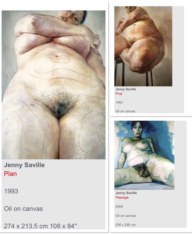
I decided to look at Jenny Savillle as she is known for using foreshortening in her portraits. Savilles portraits are often large oil paintings of female nudes who challenge society’s stereotype of beauty. She paints big women and focusses on flesh. Often these are painted in a sexualised way with the pubic areas or the breasts being in the foreground of the paintings. She often uses the technique of foreshortening to emphasise these areas. Below are some examples of her work.
I looked at Savilles 1993 painting ‘Prop’. This is an example of foreshortening that has been used to emphasize scale and mass. The nude figure is positioned balancing on a stool at an angle with her left knee and thigh in the foreground. The rest of her body is positioned leaning away from the viewer and gets progressively smaller and smaller until finally we reach her head which in comparison with her knees is tiny.
Through Savilles use of foreshortening the viewer is forced to observe the enormous scale of the nudes legs. This size is exaggerated through Savilles use of foreshortening. Saville is therefore encouraging the viewer to challenge their perception of what is considered beautiful or sexual in today’s world?
Another artist I looked at who is known for using the foreshortening technique is Duarte Vitoria. His use of foreshortening is extreme.
Below are some examples of his work:
Kurze. C. (2020) Vibrant Portraits by Duarte Vitoria. At:
The feet in these paintings seem to have been drawn from an insects perspective rendering them huge in comparison with the rest of the body. Not only does Vitorias technique of foreshortening exaggerate the expression of the body but his use of large brushstrokes also seems to enlarge every detail. I love how exciting and expressive these portraits are and I love how foreshortening is able to exaggerate the anatomical correctness of these bodies.
Both Vitorias portraits and Savilles portraits explore, challenge and confuse the notion of beauty and they use foreshortening as a way of doing this.
Foreshortening is definitely a technique I look forward to using in my future work.
After my last research point I was really inspired by Freud’s Male nude portraits. I love their vulnerability and the way he paints their flesh in such a revealing and almost private and personal way. These men seem exposed and I, the viewer feel almost like I shouldn’t be looking at them.
For this exercise I was asked to complete a 1 hour study of my model (my husband) so I thought this was the perfect opportunity to try to experiment with Freud’s style.
I asked my husband to pose without his top on, and I tried to capture him in a vulnerable unflattering pose where I had opportunity to study his skin. Because this was an hour study it was important he was comfortable so I sat him on a comfortable chair. However I asked him to slump his shoulders and arms forward so his belly rolled forward. He was sat in front of a window so the light was coming from behind but still managed to create shadow on the rolls of his stomach. He was not happy with this pose, however I felt it showed that sense of vulnerability that Freud manages to capture.
I worked a3 size on orange sugar paper. I started with charcoal and then added colour with chalk pastel.
I started by drawing out small marks on my paper trying to work out the outermost points of the figure, I did this in order to work out the figures proportions and where everything was in relation to everything else.
As I was drawing I kept checking that the body measurements were correct in relation to each other. When I was happy with my basic outline that’s when I began to add colour.
I struggled when I started to apply colour, especially as I was also looking at Freud’s work, wondering why my work was not looking like his. I decided to not worry too much about working in the style as Freud (especially as he worked in oils and I was working in chalk pastels.) Instead I just tried to concentrate on my model and trying to show form and shadow through colour whilst at the same time trying to capture the characteristics of the pose.
Below is my drawing and my process of completing the drawing.
I ended up spending longer than an hour on my drawing, in hindsight I think adding colour made my drawing more complicated. And I ended up re working and re working areas. Long after my hour had come and gone my husband refused to sit for me for any longer so I finished my drawing with just a rough outline of the chair he was sitting in.
Overall I do feel like I have captured the characteristics of the pose. I also feel to some extent I have captured my husbands vulnerabilities within this pose, which is what Freud inspired me to try to achieve. Even though my actual drawing technique is not reminiscent of Freud’s work, I feel the vulnerability I managed to capture in my husband is down to being inspired by Freud.
To a certain extent I feel I have got the proportions relatively right, however the proportions and tonal works around my husbands nipples seem wrong. I also think his shoulders should be broader?
In future to try to rectify this I think I should also take photographs, this way I have a permanent reference point? I also think I could spend even longer at the beginning of my drawing marking out proportions and accuracy.
For this exercise I was asked to draw a model in a comfortable position and position myself so that I was facing my model with an interesting viewpoint.
Being in lockdown my options for models are limited. Two very young children, a baby or my husband?
My husband reluctantly agreed to be my model.
I started my work by trying to familiarise myself with his figure by doing some quick preliminary sketches in charcoal. I did this whilst he was sitting in a chair working at his laptop. These sketches were very quick no longer than 60 seconds each, mostly because he kept moving. Below is my work.
I then asked him to pose for me in our hallway on the floor for 5 minutes at a time. I chose our hallway as it is white and bright.
This time I used a pencil on white paper and mostly focussed on proportions and using just basic lines to describe him. Below are my drawings.
I am pleased with these drawings, mostly because I did them so quickly, but I do feel that I managed to capture the essence of my husband. Due to the 5 minute time limit I wasn’t able to fix obvious mistakes, like the seemingly narrow wrists in my first drawing or the lack of his second foot. What I am pleased with in my first drawing though is my use of perspective which is obvious in my husbands foot being so large in comparison to the rest of his body due to it being closer to me.
With my second drawing I haven’t quite captured the shape of his face correctly, mainly his chin. However I do feel I have captured the way he stands. How he pushes his stomach out and stands with a slouch.
I was then asked to work on two larger 10 minute drawings. This time I worked on sugar paper and used chalk pastels. This is a medium I haven’t used yet in this course but I felt like my drawings needed to be more interesting than just black charcoal or grey pencil on a white page.
I tried to draw from the middle of my husbands body out towards the feet and head and I tried to use quick marks rather than drawing outlines. I tried to keep my marks loose at first and then work bolder as I because happy with my proportions.
For my first drawing I drew my husband standing up but bent over. After a couple of minutes he was not happy in this position so we had to keep stopping and starting. I used black and white chalk on a pale brown piece of sugar paper. Below is my drawing.
I am pleased with my drawing, especially my proportions. I surprised myself that it did actually look like him. However I struggled with his feet and hands and his feet especially, look unfinished. I think I have used the excuse that because this was just a quick 10 minute drawing I didn’t have time to focus on the feet in any more detail, however I worry that in longer drawings later on in the project I will not have this excuse?
For my second drawing I drew my husband sitting down in a similar position to one of my 5 minute drawings. This position was mostly picked out of necessity of comfort rather than it being the most interesting position. This time was my final drawing for this exercise and I definitely felt a lot more confident. I added in another colour- blue to hopefully make my drawing more exciting. I felt my marks were bolder and more expressive this time. Below is my drawing.
Some of my proportions and accuracies are not as strong as some of my previous drawings- maybe because I felt more confident my focus was lacking? Both of his fore arms are badly shaped and look wrong and I think his face is too large. I do however feel like I have captured the essence of my husband here and I do prefer my more expressive use of colour and line in this drawing. However I am aware that I really need to work on proportions and accuracy further.
My next step was to do some more quick drawings of these poses, changing my position and changing my drawing medium. I used biro, white pencil, oil pastels, tip ex pen and Indian ink. I really enjoyed this part of the exercise and really loosened up. I focussed less on accuracy (as is evident in my drawings.) But I focussed more on the marks I was making with the media I was using. These drawings were very quick and ranged between 1 and 3 minutes.
I then decided to do some very quick drawings. I changed my models to my three children. These drawings were very quick, sometimes only a line or two. Whilst my 6 year old was able to stay still for about 60 seconds, my 7 month old baby wasn’t able to stay still at all! Below are my drawings.
I feel these rapid drawings did really challenge me as my children literally couldn’t stay still for long so I was forced to draw at speed. This absolutely loosened up my wrist and really focussed my attention on single lines or marks.
For this research point I was asked to reflect and analyse how the depiction of the male and female nude has changed over the centuries.
I started off this research by watching John Bergers ‘Ways of Seeing’ (a 1970s BBC series available on you tube.)
Episode 2 focuses on the nude in European art.
I jotted notes down as I watched this episode of things that were said and my own thoughts on these comments.
Berger begins his episode by saying that ‘Men dream of woman whereas women dream of themselves being looked at.’ He then went on to say ‘how a woman appears to others and particularly to men is enormous importance to the success of her life. From earliest childhood she is taught to survey herself continuously, be it sitting in a crowded room or grieving the loss of her father.’
I found these remarks in the first few minutes of this episode quite triggering, it made me angry that a man was suggesting that even when a woman was going through the extreme emotional turmoil of loosing a parent, in the back of her mind she was still conscious of how she may appear, in particular how she may appear to a man?
I wondered how comments like these may be presented 50 years later in today’s society? And how dangerous these thoughts can be for the equality of women?
As the episode progresses Berger
States that ‘To be naked is to be oneself, to be nude is to be seen naked by others and yet not recognised as oneself, a nude has to be seen as an object in order to be a nude.’
I found this really interesting, and it made me really start to think about the difference between the naked body and the ‘Nude’ that is portrayed in art.
One of the paintings Berger discussed was Edouard Manets picnic in the grass.
This is a very famous oil painting that depicts a nude woman sitting in the grass next to two fully clothed men.
Below I have jotted down some of the things that were said in relation to this painting and the numerous other paintings that were looked at in the episode that stood out to me as important or interesting.
nakedness is a sight for those who are dressed.
In European painting the nude implies an awareness of being seen by the spectator. They are not naked as they are, they are naked as you see them.
Men looking at women judging them.
To be naked is without disguise, to be on display is to be turned into a disguise.
Most nudes in oil paintings have been lined up for the pleasure of their male spectator owner.
In oil paintings the second person that matters is the spectator viewing the picture.
Sometimes the paintings include a Male lover but the woman’s attention is rarely focussed towards him instead it is looking towards the spectator.
The women portrayed are there to feed an appetite- not to have any of their own.
I found all of these points very interesting but rather than thinking about how the nude has been portrayed in art throughout history my thoughts drifted towards how woman have been portrayed? It feels like rather than a person of importance, the woman has been portrayed as nothing but an object of desire for her male spectators? It has made me question how different the portrayal of women in these painting are to women in modern day ‘lads magazines’ or even pornography magazines?
Towards the end of the episode Berger interviews a group of women on their opinions on the theories presented in the program.
One of the women questioned the idealised unrealistic portrayal of these women that were being displayed, saying that she found it impossible to relate to these women who were showing very unrealistic features of beauty. These comments again made me think of the way social media today can be known for portraying unachievable standards of beauty amongst women? It made me question how far society has actually come in the portrayal of women in popular culture?
Another point I was interested in that was made by one of these women was the fact that women were always dressed in a uniform, the mother’s uniform, the workers uniform, the party girls uniform, and was nudity just a uniform also? Was it a uniform for sexuality?
I feel that this same point can also be applied to males? This point to me doesn’t feel as though it is gender specific? I didn’t ever think about nudity as a uniform before but I found this a very interesting point.
To summarise this episode I have been left questioning the objectification of women throughout history rather than the role of the nude itself? I am also left comparing the way that women can still be objectified in the media today and I’m left wondering how much has actually changed in the way women are presented or represented in art since the advent of feminism?
After watching this series I was interested in how the male nude was portrayed in art? This is something that had not been discussed so I did my own research.
I found the Male nude to be much less common in mainstream art and those I did find were painted as active and strong, wholly important and dominant and their nude body’s just emphasised their power by their powerful stances. See some examples below,
The way these male nudes are displayed appear to be the complete opposite to how the submissive female nudes were portrayed in Bergers television series. The female nude being presented as nothing more than an object entirely for the Male spectators pleasure. Whereas the Male nude is representing power, strength and importance.
I decided to look at how both male & female nudes are represented in more contemporary art today? To see if these very stereotypical notions of the female nude have been challenged at all by artists of this generation?
I found there are many working artists today who are challenging these the notions.
The first Artist I wanted to look at was Frida Kahlo, and although she is not a contemporary artist working today, I found her work does completely quash these stereotypes of the female nude being nothing more than an object to be admired by the Male spectator.
Frida Kahlo is known for her deeply personal self-portraits, who often portrayed her own life experiences onto these portraits. I feel like her work is extremely progressive for the time in that she focussed on her own pains and emotions and passions as a woman rather than simply portraying herself as an object to be viewed.
The nude portrait I was particularly drawn to was ‘Henry Ford Hospital 1932’
This nude portrait to me couldn’t be further from the paintings Berger looked at of the submissive nude women on display solely for the pleasure of their Male spectators.
This work is deeply personal and very uncomfortable to look at. Frida Khalo captures herself at probably the most emotional and painful time of her life when experiencing the utter horror of a miscarriage. It is raw and heart wrenching and shows the female body for exactly what it is- amazing and terrible and deeply complex.
This painting to me is at the heart of showing what the female body is all about.
The next artist I looked at was Eileen cooper. (Contemporary artist born in 1953.)
I was instantly attracted to her work as I felt like she portrays women for who they are and captures the nature of the female body and it’s physical capability’s. She appears to create art that gets to the heart of the physical experience of being a woman rather than how a woman can be presented to a male for his enjoyment.
Below are some examples of her work:
These first images show the female body as a mother.
These next images show the female nude and the male nude. Their nakedness appears to be a celebration of active sexuality between two people. Rather than the woman playing a submissive figure, the woman is active and is owning her own sexuality.
These images show the female nude as an emotional being, here Eileen Cooper has portrayed real emotion from the entireties of these nudes.
These nudes show the female body as strong and powerful and emphasises how their owners have full ownership over their bodies.
These images portray the male nude, but unlike the male nudes I looked at earlier these men appear to be dominated by the women in these pieces.
I then decided to look at Lucien Freud. I chose to look at Freud because his exploration of the nude, in particular the male nude is very different to the nude stereo types I have looked at previously.
I love Freud’s nudes, I feel like his work is almost too real and almost too difficult to look at. His focus on the detail and texture of the flesh makes me feel like I am intruding upon someone’s personal and private space & seeing something I shouldn’t. These male nudes seem to be in complete contrast to the male nudes I looked at previously, they are not trying to show power or strength or dominance. They are real and fleshy and show vulnerabilities and imperfections.
In summary the portrayal of the ‘nude’ throughout history is extremely broad. In my research I have just touched upon a very small number of artists portrayals. I have found this subject fascinating, however I think it would be very naive of me to summarise my findings at this stage. In my experience one artist may express a view point or a portrayal, however you are almost certain to find another artist with an opposing viewpoint or portrayal. This is certainly a subject I intend to explore further.
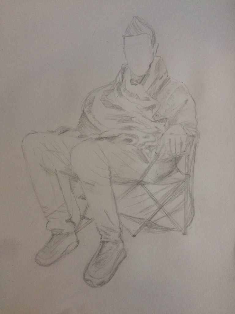
For this exercise I was asked to sketch a seated figure wearing a plain and pale coloured shawl, baggy jumper or soft dressing gown.
I sketched my husband sat in a chair in our garden with a large cream coloured knitted blanked wrapped around him.
I started by using very light marks in pencil on a3 white paper to sketch the overall shape of my husband.
I tried to disregard details and concentrate on drawing the body and the fabric as though it was a single form. I tried to consider the cloth as much a part of the body as the skin, flesh and bones.
I tried to very lightly and simply dictate the general shapes for the head, hands and feet without going into detail as my emphasis was on the overall form of the main part of the body.
I tried to observe how the fabric mounds gently around and softens angles and how marks and lines can create the illusion of three- dimensional form and believable weight.
Below are the different steps of my drawing and my final drawing.
The difficulties I encountered when approaching the figure as a whole were the feet. Even though I was asked to just sketch the general shapes for some reason I found this really difficult! I struggled with perspective & the fact the foot closer to me needed to be drawn bigger than the foot slightly further away.
I also found it difficult knowing where to start, I found it quite daunting having the entire figure sat in front of me knowing I was expected to draw it.
Over all I am pleased with my drawing, I feel like I have really captured the posture and shape of my husband sitting down.
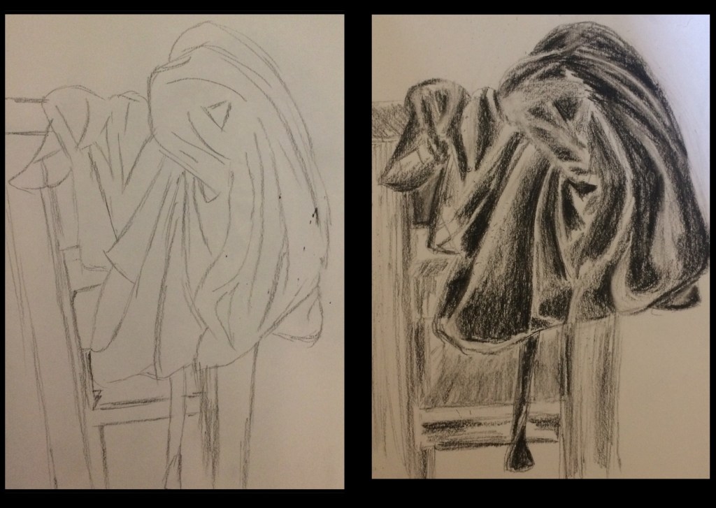
For this exercise I was asked to throw a piece of clothing or a length of plain fabric across a chair to make folded and soft layers of fabric and then make two 15 minute sketches, one using line and the other concentrating on tone.
I draped my dressing gown over a kitchen chair. I drew using charcoal on a3 white paper. I started with a quick 15 minute line drawing, I tried to observe the lines of the fabric following the curves, rises and falls.
Because I only spent 15 minutes on my drawing, there will undoubtedly be some inaccuracies, however drawing quickly forced me to concentrate fully on the lines of the objects in front of me and produce a more raw and fluid drawing without worrying about mistakes and inaccuracies.
My next drawing was in tone. I again used charcoal and I again only spent 15 minutes on my drawing. I worked quickly and I tried to identify and emphasise the areas of light and shade. I think I did manage to show the creases and folds in my dressing gown as well as showing the weighty thickness of the fabric. However my drawing is quite unrefined and I think I have overused the charcoal, my drawing may have been more effective if my charcoal use was less heavy and more subtle.
I then divided my page into 12cm squares where I drew five minute sketches of different parts of the fabric. I tried to look at the shapes caused by the folds and I tried to emphasise form by showing areas of light and shade. I used a selection of different media’s including, charcoal, Indian ink, colouring pencils and oil pastels.
I enjoyed doing this exercise as I enjoy working quickly and I enjoyed using a selection of different media’s. I did find it difficult though to create volume in the folds of the fabric and clearly some drawings are more successful than others.
For example my drawing using colouring pencils is quite successful as I can see clearly the folds in the material and where shadow is created. I have also managed to show form through tonal areas. My drawing using purple and yellow pastel paint is less successful though, I think this is mainly because I drew in pastel to start with then I added water to activate the paint! However the colour of the paint seemed to run into each other & I lost the form that I had created.
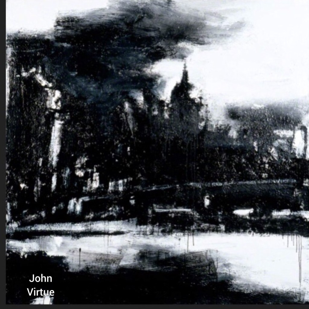
For this assignment I was asked to draw an outdoor scene of my choice. Unfortunately due to a global pandemic and the U.K. currently being on lockdown my only choice for an outdoor scene was my house and garden. This was disappointing for me as I would have chosen to base this assignment on a townscape as I feel this was my most successful work in this project so far.
I started this assignment by looking back at the artists I had looked at throughout part three and I selected the works that I found could be inspirational for this assignment.
The first work being by John Virtue,
Even though the mood of this piece does not fit with the mood of my house and garden in the current sunny weather, I do like the idea of creating an effect like this style using charcoal.
The next three artists I selected I felt were more appropriate for my house. I live in a beautiful 400 year old grade 2 listed cottage that is set in the middle of a beautiful big garden. At this present time we are also currently experiencing beautiful weather that includes bright sunshine and blue skies.
John constables ‘The Hay Wain’ I felt showed a similar atmosphere to how I would like to portray my home.
I love his realistic portrayal of the beautiful countryside, his use of light and shadow really make this piece atmospheric as does his use of colour in the beautiful countryside. These are skills I would really like to adopt in my own work.
The next artist I looked at was Durers ‘The Willow Mill 1498.’
The reason I picked this painting is because of the tree. My garden is filled with big beautiful trees just like this one and taking inspiration from his style of working especially the way he shows light and shadow on the branches and leaves of the tree.
The next work I looked at was Monets ‘Coup de Vent’
I wanted to look at this work as I am inspired by Monets use of marks to show the grass and plants. I would like to somehow employ this expressive impressionist style into my own work.
After researching these artists I began my practical work by taking some photographs of and around my house. I took these photographs on my phone, I wasn’t too concerned about getting quality photographs or compositions, I just wanted a starting point for inspiration.
My next step was to complete some very quick drawings from a few different positions. I decided to only allow my self 60 seconds to complete each drawing so I could just focus on sketching out the basic shapes in order to think about view and composition. I gave myself 5 minutes for one of the drawings so I could include more detail. Below are my drawings:
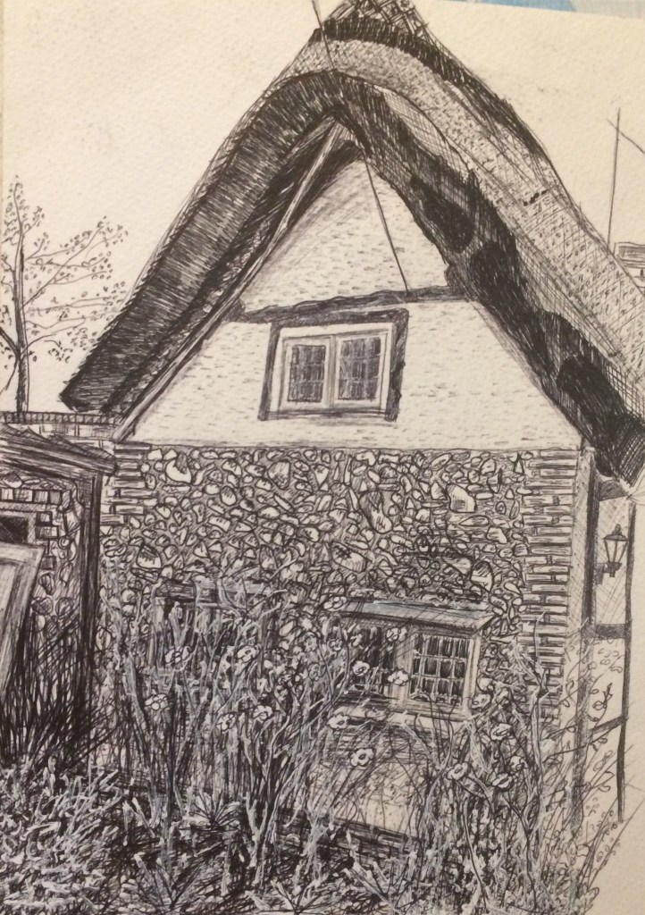
I then decided to complete some longer more detailed drawings. My first drawing was of the end of my house, I love this view as this is the only wall of my house made of flint, and in front of the wall I have lots of beautiful (if slightly overgrown) plants and flowers.
I worked with a biro on a4 paper and I tried to focus on all of the small detail I could see. I also tried to catch where the light was falling.
Below is my drawing:
Overall I am pleased with my drawing, however I am aware that I have some areas that need improvement, the first being the flint stones, it is clear from my drawing that I lost focus as I was drawing as my flint bricks look made up and cartoony with heavy outlines and predictable shading. In future I need to be careful to observe what’s in front of me rather than getting carried away with drawing what I think things should look like.
The other area that I found difficult was the drawing of the plants and flowers in front of the wall. I ended up drawing the flint wall then drawing the plants on top of this! This didn’t work and it ended up just looking like a mess. In order to try to reserect my drawing I added my white tipex pen to try to define the light areas of the plants. This did make my drawing look slightly more effective as it added another layer of texture to my drawing but I’m not sure it solved my problem of space between the wall and the plants. This is definitely something I need to experiment with further before beginning my final piece.
Overall though I am relatively pleased with my drawing and I enjoyed using a biro and tipex pen.
Before beginning another composition I decided to experiment further with drawing the plants in front of the wall. My house is surrounded by garden so whatever view point I was going to draw from this was something I know I needed to work on.
I focussed on drawing a small area in front of the window. This time with the aim to show a clear definition between the house and the plants growing up it. I feel like I achieved this so hopefully my drawing of plants against the backdrop of my house will be more successful in the future.
I then experimented with colour. I used watercolour and worked on top of my biro drawing. Whilst I think the colour shows a nice representation of the actual colours, it is not detailed or mixed enough to show a good realistic representation.
For my next drawing I worked with Charcoal, this time I sat on my path in front of my house and I drew the view ahead of me. I tried to show perspective this time as perspective is something my last drawing lacked. I tried to show this particularly with the lines of the path and the tonal graduation of the tree behind the house. When shading the tree I tried to keep in mind Durers ‘The Willow Mill’ tree, I tried to consider the way he applied tone to show the foliage of the tree.
I also tried to show where the light was shining and show shadow across the house and roof as best as I could.
I again really struggled with the foliage, plants and flowers in the borders either side of the path, this is something I need to work on further before I can develop my final piece. Below are some drawings I did to experiment with these areas.
For my final piece I decided to do a more detailed and much larger drawing of this same view. I liked the fact that I could show perspective from this view and this is my favourite part of my garden.
Before starting my drawing though I felt it was important to experiment with mark making and texture so I knew how I was going to draw areas of my garden in my final piece. Below are some of my experiments:
I took inspiration from Monets impressionist expressive marks when experimenting with these marks.
For my final piece I worked a2 size and I used a black biro. I set my self up on my path in my garden and I surrounded myself with my preliminary sketches for reference.
When I started drawing my two children kept running around me distracting my view so I decided to include them in my drawing. I drew them quickly as children of this age do not stand still for long. In my quick drawing I made lots of errors but I found I was able to work on these later on in my drawing. I felt that adding my children to my drawing just made my drawing even more personal to me.
After drawing my children I decided to focus on my old brick path. I tried to show linear perspective by drawing the lines of the path receding onwards towards each other.
I then experimented with mark marking and detail on the bricks on a separate piece of paper as I had overlooked this detail on my original preliminary drawing. Below are my experiments.
I regretted working with a biro fairly soon into the drawing. I found creating large areas of tone difficult and my biro was much better suited towards creating small marks which I found tedious on such a large scale.
Below is my final drawing:
Overall I am pleased with my drawing and upon looking back throughout my work so far on this course it is clear to me that my drawing is improving. However I am very aware that I have a long way to go before my drawing skills are competent.
Reflection:
Here I will reflect upon my work against the assessment criteria points.
Demonstration of technical and visual skills- materials, techniques, observational skills, visual awareness, design and compositional skills.
My drawings for this assignment show observational skills and compositional skills. I have shown an understanding of linear perspective by showing that my drawings have demonstrable depth to them.
My depiction of light and shadow shows visual awareness and observational skills. My biro work demonstrates an understanding of that medium, the ability to create mark making and it’s restrictions.
My charcoal work also demonstrates an understanding of the medium and how it can be used to effectively portray light and shadow.
Quality of outcome- content, application of knowledge, presentation of work in a coherent manner, discernment, conceptualisation of thoughts, communication of ideas.
The content of my work follows the given assignment criteria. It is a drawing of an outdoor scene that includes natural objects and it demonstrates my understanding of linear perspective. It includes straight lines as well as items drawn from nature.
I have presented my work in a logical and coherent manner whilst aiming to conceptualise my thoughts and communicate my ideas.
I tried to explain my thinking process at every step and I hope my drawings and experiments follow a logical development of ideas along with the evolution of my design process.
Demonstration of creativity- imagination, experimentation, invention, development of a personal voice.
I feel I was restricted in the initial stages of this assignment where it came to imagination as I had little choice but to draw my house and garden, this was partly due to the assessment t criteria but mainly due to lockdown and the global pandemic we are currently living through. However I hope as my project started to develop my demonstration of imagination and creativity resurfaced. My experimentation is evident throughout be it with different techniques and media’s such as photographs, work with charcoal, work with biro, experimentation with colour and tips pen. I also experimented with different techniques such as mark making.
I experimented with my final composition by including my eldest children and focussing on much more foliage in the garden.
As for a personal voice, I think I am focussing so much on trying to improve my actual ability to draw that maybe my personal voice is missing? I do however feel that I need to try and master the technical aspect of drawing before I focus on putting my own personal voice on my work.
Context reflection- research, critical thinking.
I have tried to show how I have been influenced by the different artists I have looked at. I have outlined it in my learning log and hopefully their influence is evident in my work. Even though I didn’t discuss these artists in great depth on my assignment I did research them in much more detail on my previous research points during part 3.
On reflection maybe I should have made my links and influence more obvious and maybe created some more experiments in the style of these artists?
I have tried to reflect on my work and my process in my learning log continually and I have tried to be more critical with every piece I create and every artist I look at.
For this exercise I was asked to look for statues outside in streets, parks, cemeteries, town squares etc.
Last summer I was on holiday in Berlin and visited the Staatliche museem zu Berlin. (The Old National Gallery.) I had read up on this exercise in advance so decided as I was there I would complete this exercise there and then. (It is a good job I did as we are currently in lockdown with the coronavirus pandemic so this would be a very difficult exercise to complete at this moment in time.)
Below are some photographs I took of some of the statues in the museums grounds. I tried to photograph the statues from different angles and I experimented with looking up at statues and looking down on to statues.
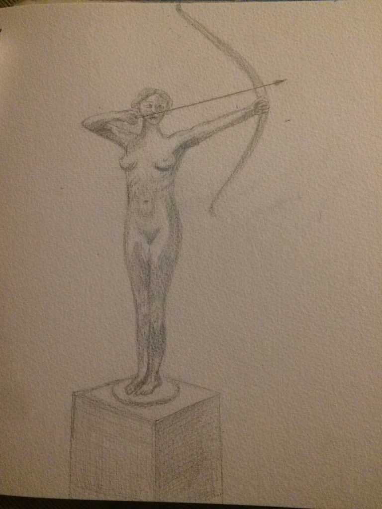
My first drawing is of a statue of a young strong naked woman holding a bow and arrow standing on a box. I liked this statue as it portrays a strong woman. Often in popular culture priority is placed on women being perceived as beautiful over powerful, whereas to me this statue shows strength and power.
On the box were the words, F. Lepcke Bogenspannerin I presume this could be the name of the artist and name of the work.
I drew the the woman from a slight angle as I felt this was the most interesting view.
I worked with a hb and a 2b pencil, I drew a4 size and I worked on cartridge paper.
I completed this drawing fairly quickly as I was accompanied by my two young children. I enjoyed drawing the figure but assumed as it was still it should be easier than drawing an actual person, but I still struggled with some accuracy. Perhaps if I spent longer on my drawing reworking and reworking it could have been more accurate?
I struggled in particularly with the feet and hands. Below is my drawing.
The next statue I drew was inside the entrance of the gallery, I didn’t note the name or artist of this piece of work. This statue was again of a woman draped in a loose fitting pants dress or piece of fabric. The woman is crouching down playing a banjo type of instrument. The sculpture is completely white and appears to be made out of marble.
I sat on a step level to the sculpture park whilst I drew. Again like my previous drawing I felt I was unsuccessful in drawing the statues hands and feet. This time however I had longer to complete my drawing as my husband entertained my children so I strived for more accuracy. At the time I was pleased with my drawing however upon looking at it from a photograph it appears that I drew the statues neck too big. Below is my drawing,
For my last drawing I worked from a photograph (my very young children were fed up with watching me draw at this stage.) The statue I chose was at the entrance of the museum but again I didn’t take down its name or the name of the artist. The statue was high so in order to get a good photograph of it I had to step away from it and point my phone to look up towards it. This meant it appeared bigger at the bottom and appeared to get smaller the higher up it went. The statue was of what I would guess to be a father with his two young sons. I was immediately interested in this statue as I too had two young’s sons of similar age (I now have three.)
This was a more successful drawing for me, I assume it was because I was working from a 2d photograph of the sculpture rather than the 3d sculpture itself? I did still however struggle with all of the hands and feet. Below is my drawing,
The main thing I learnt about this exercise is that drawing hands and feet is very difficult for me and this is clearly an area I need to work on, especially for the next project which is about drawing the human figure.