Research Point 4: Viewpoints

Research point

For this research point I was asked to look at paintings that focus on domestic interiors. 

The first work I looked at was Anthony Greens ‘study for Mrs Madeline Jocelyn with her son’ 1987.  

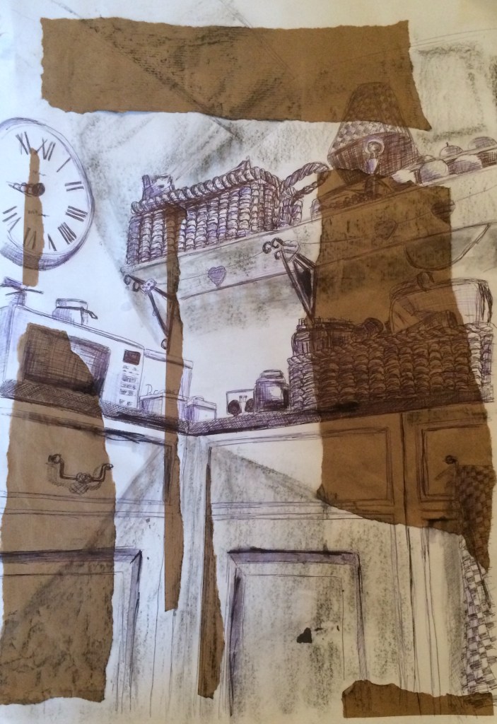
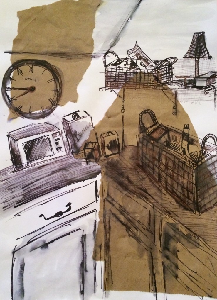
In this image the viewer looks down on the scene and is able to look at the room from many angles. It looks almost like a box has been unfolded and opened to reveal an exciting interior of a living room. Since I began drawing interiors of my house I have realised that in order to include everything in the room it would take me a lot of drawings as drawing just the four corners of my rooms excluded the majority of the room. I feel that this drawing is an exciting and intimate exploration into somebody’s entire room. 

I then looked at Van Gogh’s ‘The Bedroom’ -1888, 1889 and 1889, these are paintings of Van Goghs bedroom. They each contain his bed, a windows, a small table, two chairs and a selection of pictures on the wall. It really allows me, the viewer a sense of intimacy into Van Goghs world. I think there is something very personal about somebody’s bedroom, and these images allow me to feel a very personal connection with Van Gogh. 

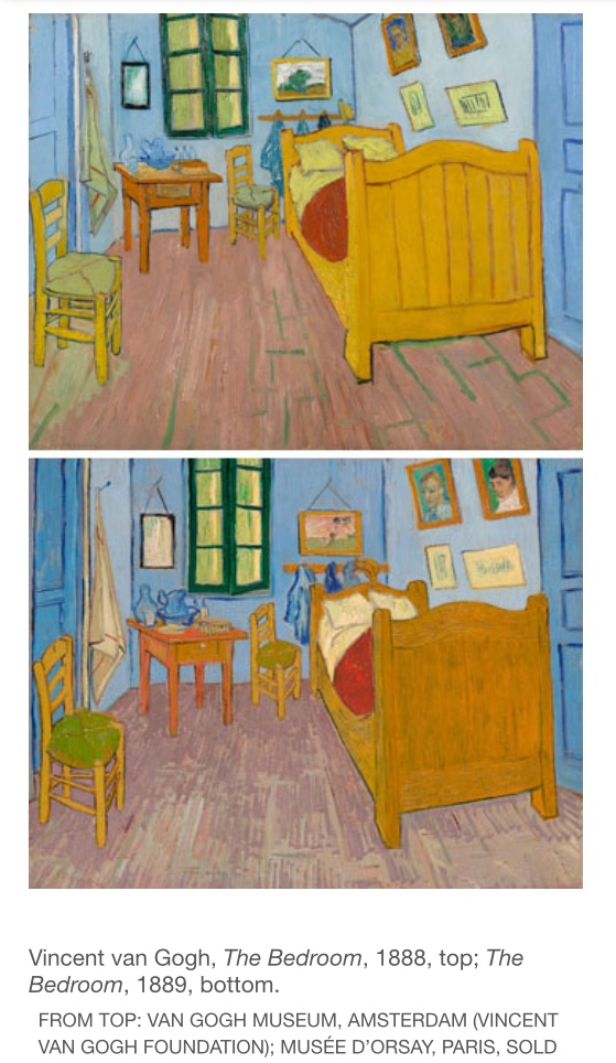
The most fascinating thing about these paintings however are the fact that these three separate paintings of his bedroom in Arles France are actually different. 
At first glance I thought they were the same painting, however upon further inspection I noticed extremely subtle differences such as different paintings on the wall and different items of clothing on the hooks behind the bed. This reminded me of my own work, especially my kitchen studies where I encountered differences such as my baskets or tins at different angles or food items added or missing. For my work this indicated the passing of time, if only by a few hours or days, but for Van Goghs work that passing of time was across a year and the fact his wall paintings were different shows real decisions of choice, taste and ideals changing over such a short period. 

The next artist I decided to look at was David Hockney. 

The work I chose to look at is ‘Montcalm Interior with 2 Dogs’ 1988

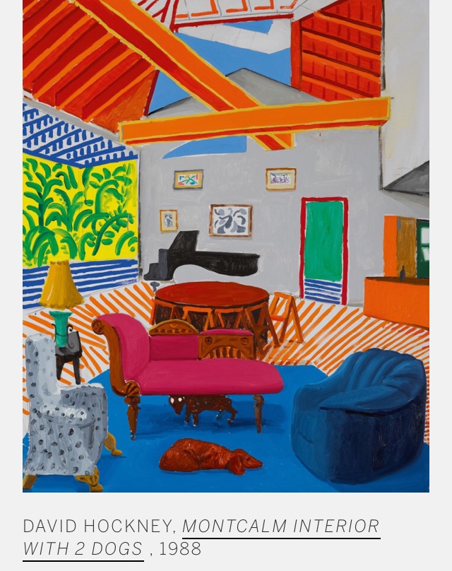
This is a piece of work that was painted after the artist moved from the north of England to California. 

I love Hockneys use of bright and vibrant colour in this painting. I am led to wonder if his move to sunny California from the north of England was inspiration for the glorious brightness of this work? 

I also love how his bold use of pattern forces the eye to travel all around this piece. I find that the orange stripes on the floor are almost like arrows directing my eye. 

I am also fascinated by its compositional structure- the way he has managed to show his very high ceiling and his angular beams along with his triangular high window makes the entire composition very exciting. 

I then found out that Hockney actually featured this Californian home in a number of his works. 

The other piece that I am going to look at is entitled ‘large interior, Los Angeles’ (1988). It is considered the ‘sister’ painting of ‘Montcalm Interior with 2 Dogs’ 1988. 

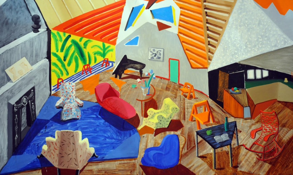
This painting also depicts Hockney’s high-ceilinged living room. However this painting shows his living room from a slightly different viewpoint or angle. It looks at the room from above, from the vaulted ceiling. However it appears that some of the furniture has been moved around (again showing the passage of time just like Van Gogh’s bedroom work.) 

Another link I can see with David Hockneys living room and with Van Gogh’s bedroom work is the expressive brushwork and use of bright colour. 

Like Anthony Greens study for ‘Mrs Madeline Jocelyn with her son’ 1987.  What I find fascinating about Hockneys paintings is how he manages to fit such a large percentage of the room in just one two dimensional painting.

The next piece of work I am looking at is Philip Pearlsteins, ‘male model with kimono, female model with mirror’ 1985. 

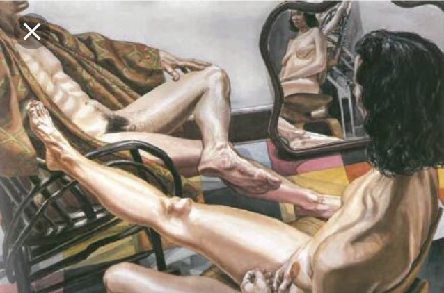
This painting is of male and female nudes sitting in chairs across from each other, the males head is not in the picture and the female has her head tilted so we are unable to see her face. Opposite the female lies a mirror. (For me this is the most exciting part of the painting as it allows me, the viewer to see parts of the image I feel I am not entitled to see. It makes me feel like I am almost inside the room).The mirror also takes the painting away from just being about a portrait of the nudes to being a painting of the interior of the room, through this mirror the viewer not only gets to see the woman from a different angle but also gets to explore the rest of the room or living space. 

I love the almost diagonal viewpoint of this painting. Having the nudes positioned on their chairs opposite one another really allows this diagonal viewpoint to be so effective. The mirror also adds a more distanced frontal view of the woman, which just adds to the depth of this painting. 

This painting links to both Hockneys work and Pearlstein and Greens work in that it offers more of the room to the viewer than you might originally expect. 

From this research I would really like to experiment with different viewpoints further in my work and try to be more exciting and experimental in my approach to viewpoints. 

Bibliography: 

Tuchman, P. (2016) Domestic Dreams: ‘Van Gogh’s Bedrooms’ at the Art Institute of Chicago Offers a Rich Look at Three Masterworks. At: http://www.artnews.com/2016/03/14/domestic-dreams-van-goghs-bedrooms-at-the-art-institute-of-chicago-offers-a-rich-look-at-three-masterworks/ ( Accessed11/06/2019).

Tate. (2019) David Hockney Pembroke Studio Interior 1984. At: https://www.tate.org.uk/art/artworks/hockney-pembroke-studio-interior-p20106 ( Accessed11/06/2019).

Sothebys. (2019) A Peek Into David Hockney’s Vibrant Private World. At: https://www.sothebys.com/en/videos/david-hockney-vibrant-private-world ( Accessed11/06/2019).

Exercise 3: Material Differences

Following on from exercise two I now have a clear idea of the basic elements of the drawing I intend to create in this exercise. 

I decided to focus in on the corner of my kitchen where my microwave is, as I find this corner interesting because it is so busy. I decided to sit on the floor and look up for my drawing as I really liked the angles it created. 

I decided to work a2 size and I drew out my composition using black biro as I like the thin, strong line biro can create. However biro does come with its own difficulties as mistakes can not be erased. In order to map out my composition I started by using light marks from my biro so mistakes could easily be covered.

I tried to use all of the paper space, however I again found working on such a large scale quite a challenge. Below is an image of my line drawing.

My next stage was to start to add tone and texture. I continued to use my black biro and I didn’t find this too difficult as there is a big variety of texture in this corner of my kitchen. Below is an image of my work so far. 

I then added more texture with my blue biro, I felt this added a bit more depth to my drawing.

I decided to use charcoal to show light and shadow. I tried to look carefully at how the light fell across my kitchen corner. I half closed my eyes to help me see the broad tonal areas and map them onto my drawing.  However I am not pleased with the result. I think I captured the light in the correct places however using charcoal didn’t seem to be effective.

I tried to work into this further to improve my shadow work by using biro and Indian ink. I think I improved it marginally however I also think I would have been better off just sticking to biro for the entire drawing.

Exercise 2: Composition- An Interior.

For this exercise I decided that my chosen interior would be my kitchen. Aside from being very small my kitchen is over 400 years old and was historically used as the horses stables. My kitchen is full and very busy and thus I felt it would be my most exciting room to draw. 

For this exercise I was to make some quick sketches of my kitchen in order to prepare me for a finished drawings. 

I looked carefully at the angles and areas of my kitchen noting where objects are placed. I decided to focus on the corner of my kitchen above my dishwasher where my microwave is placed. This area is busy with lots of objects and is in my opinion visually very interesting. 

Even though I decided to focus on this area to draw, I decided to shift my viewpoint slightly until I found different compositions that pleased me. I looked for strong tonal contrasts, textures, linear qualities and strong positive and negative shapes. 

I worked A4 size, again using collaged brown paper in the background and I used a mixture of ink with a sharp stick and biro. I also experimented working portrait and landscape. Sometimes I couldn’t fit in all of my subjects, but I found that this actually added dynamism and interest to my compositions.

The drawings I was most pleased with were the drawings where I was sat on the floor and was looking up. I found the angle on this work really exciting. 

Above is my final composition sketch for my final drawing. I used less brown paper this time so as not to take away too much from the actual compositions and I worked in biro as I could be more accurate and less scratchy. I love the angle it is at and the busyness of the piece. 

Exercise 1: Quick sketches around the house.

For this exercise I was asked to make quick sketches in each room in my house. I live in a very small 400 year old thatched cottage that has lots of wonky low beams, it is a very higgledy piggeldy cottage where no door frames or windows or even walls are straight. I love my cottage and feel like it is a real piece of art in itself so I thoroughly enjoyed this exercise. 

For my first two drawings I drew my sitting room. I worked a3 size and I used charcoal. However I found using charcoal very messy and I kept leaning on my work and smudging it.

I decided for my next drawings I would work in ink using a sharp stick. I also decided to collage some scraps of brown paper down on the paper before hand to try to take away from the bright white backgrounds. After my first drawing using ink I decided to add water using a paintbrush to my work, just to try to add more tone and texture to my work. On most of my drawings this worked well however on a couple of my drawings I added too much water and my ink smudged too much. On these drawings I worked on top of my smudged areas with biro, to try to replace the texture I lost. I felt this worked as it gave another dimension to my drawings. 

I think the main problems I had with my drawings was getting all the angles right. Because I tended to focus on the corners of the rooms the furniture tended to be positioned in opposing angles. As I was drawing quickly I noticed at the end of my drawings where I had gone wrong with angles. I think really in future the best way to ensure my angles and proportions are correct is to work slower and to take more care figuring out exact placements and proportions. 

That being said I really enjoyed the quick speed in which I worked, I enjoyed the looseness of my work and their expressive nature. 

Exercise 4: Monochrome

For this exercise I was instructed to work  towards creating an image in a single colour. 

I was really inspired by the fish on the plate drawing in the handbook. Created by an OCA student of a mackerel and a blue patterned plate. 

I loved the shimmer of the mackerel and it’s beautiful pattern and fine detail. 

I decided to take a trip to Sainsburys and buy my own fish. 

I put my fish on a plate, considered my viewpoint and started sketching my composition a3 size using my blue biro. I enjoyed using a biro as it gave a permanent line. It allowed me no room for mistakes and certainly no room to get hung up rubbing out mistakes over and over again. 

Before I applied more tones of colour I decided to practice a range of blue tones so I was prepared. I used watercolour as it is a medium I haven’t used so far in this course. I also thought it may work quite well with the biro. 

As I began to add paint and build the colour up, I tried to focus on looking at the way the light catches on the fish and against the plate. I tried to capture some of the small detail of the fish scales and I tried to do this by showing the contrast between the very plain plate against the very detailed fish. 
I tried to show the texture of the fish through mark making with my biro and through building up colour with my paint. 

I found using monochrome quite difficult. Especially as I was working from still life. I kept wanting to work into the flesh of the fish using flesh tones of pinks and browns. Also looking at my finished piece it is clear I have been somewhat hesitant on the application of colour and I could have built up my colours tones further in order for it to be a more effective drawing? 

In my drawing I think I have managed to capture the pattern and shimmer and tone of the fish effectively. However what hasn’t worked so well is it’s contrast against the plain white plate. In hindsight I think this would have been a more effective piece of work if I had of used a more detailed and more exciting patterned plate. 

Exercise 3: Experimenting with mixed media.

For this exercise I set up a still life of vegetables from my fridge, I found the form of these foods interesting and theirs colours vibrant and exciting- especially when placed together. 

I again experimented with their layout and took lots of photographs of them in different positions. 

In order to get a clearer idea of the layout I wanted to use, I completed some very quick rough sketches of compositions and viewpoints. This helped me further to see visually how my drawing may look. 

I started my drawing using pencil to draw out the rough shapes on a3 paper. 

I then added bits of scrap paper, foil and card to try to collage in sections of my drawing. I even added some crushed up Rice Krispies. 

I then added more colour with my children’s wax crayons. 

I found this looked quite ineffective, so I began to work on top with oil paint. 

To finish my drawing I used Indian ink. This gave a very different effect to what I was expecting as I was working on top of oil paint. It just seemed to settle on the surface of the paint? 

I really enjoyed creating this drawing. I felt I was able to be expressive and creative. And because I was working with a range of materials and media’s I didn’t worry so much about small details and accuracy. 

Exercise 2: still life in tone using colour.

For this exercise I set up another Still life group.  This time I used a selection of plastic and drink bottles. I wanted to go for something completely different. I also really like the reflections the plastic bottles make and hope it will make an interesting drawing. 

I started by setting up a few different compositions and taking photos of them. I also tried taking photos from different viewpoints and angles. 

I found it helpful to then review my photos to see which ones worked best.

As I was still unsure of my favourite layout and viewpoint  I experimented with some quick rough thumbnail drawings to try to work out the best set up. 

I started my drawing by drawing it’s rough outline using pencil. 

I decided to use oil paint on cardboard. I decided to use oil paint as it is quite permanent and I didn’t want to spend my time hung up on or worrying about accuracy and mistakes. 
I started my drawings by using blue tones. I tried to really focus on the lightest and darkest areas first then as my work progressed I tried to add in more tones of colour. 

I found this exercise quite difficult as I naturally wanted to use the colours I saw rather than using colour to show tone. For example I wanted to paint the red bottle red and the green bottle green. 

I tried to work quickly to keep my drawing energetic but I think this in turn made it look a bit messy. However I did really enjoy creating this painting. 

I didn’t feel I’d made the best use of line, tone and colour on my first drawing so I decided to create another drawing this time I decided to use red tones as I didn’t want my work to be too similar. 

I again really enjoyed creating this drawing, I felt like I was being expressive and free. Again my final result is quite messy, and lacking in small detail but I am still pleased with my final result. 

Overall I really enjoyed this exercise, it made me think about using colour differently. I am so used to using colour as I see it that I have never considered it as a tool to show tone or depth before. 

Exercise 1: Still life using line.

For this exercise I set up a Still life with a selection of natural objects that myself and my three year old son found in my back garden.
We then arranged them on some black paper where I took photographs of them from differing angles. 

I was inspired by the student example in my handbook by oca student carol smith ‘driftwood’ (white ink on black paper.) 

I just love how effective her striking white lines were and I wanted to try something similar myself.

I worked a3 size with white ink on black paper. I tried to make a drawn study that shows my understanding of the forms and the connections and spaces between the forms.

I completed two drawings, and for a first attempt at using this media I wasn’t too displeased. I enjoyed making marks using white, but as I am so used to drawing with a dark media on white paper I did find myself getting a little confused at times. 

I think for my drawings my main area for improvement would have to be the arrangement of my objects. In hindsight I think I could have arranged them in a more interesting way or drawn them from a more exciting viewpoint. I would however really like to experiment with using these media’s again in the future. 

Exercise 1: Detail and Tone.

For this exercise I was asked to select a single natural object. I chose a dead rose bud from my garden. I chose this because I love all of its tiny beautiful detail, the closer I look at it the more detail I can see. I tried to introduce contrast into my drawing by using strong darks and very light tones.

I used a3 paper and a variety of soft- medium pencils. I lightly sketched in the outline of my object then I screwed up my eyes to identify the darkest areas. I firstly worked on the stem and leaves and  I began to tone in the darkest areas of my drawing. I made sure I worked all around the area so that I could compare the tones of different areas of the drawing.
I practiced building up dark, medium and light tones, using my pencils and using a range of mark making techniques. I tried to get a varied effect by combining soft and medium grade pencils and altering the direction of the strokes I made. 

I tried to constantly review my drawing by stepping back from it and asking myself if I had sufficient contrasts and variation in marks.

I am not sure if I am pleased with my final result. 
I found it very difficult enlarging such a small object to such a large scale, in doing this I think I lost some of its accuracy. 
I also am not very pleased with my pencil work in some areas. Some areas my pencil work is too heavy and some of my small detail appears to be outlined. This results in some areas of my drawing looking quite flat. 

I am pleased with some areas of detail and texture, but overall I would really like to see my pencil work develop and improve over the duration of this course. 

Research point 2: Positive and negative space

For my next research point I have tried to explore the importance of positive and negative space. I have done this by looking at a range of artists to see how they incorporate positive and negative spaces in their work. 

The first artist I looked at was Gary Hume

Gary Hume is a contemporary English artist best known for his paintings of everyday objects.

His work often looks abstract and simple with little detail and large areas of flat colour. 

One example of Gary Humes work is ‘Capital’

‘Capital’ is a screen print on paper that was produced as part of a portfolio of twelve other prints by British artists for the 2012 olympics and Paralympics. 

In this work Gary Hume has abstracted elements from an image of a wheelchair- tennis player. He has  included a selection of leaves and he has used a range of soft and subtle colours. 

The big burgundy circle at the bottom of the page looks like the wheel of the player’s wheelchair and the black circle above looks like it could be the tennis ball. 

Gary Hume believes that the most important aspects of his work are the edges, he wanted them to be clear and crisp and this is certainly evident in this work. With such crisp edges and such dominant colours and pale backgrounds Gary Humes use of positive and negative space is very obvious. In fact I think it is his use of negative space that makes his work so exciting. Because not only am I drawn to his painted objects but I am drawn to his plain backgrounds and the shapes that are made even more dominant.

The next artist I decided to look at was Patrick Caulfield. 

Patrick Caulfield was a British painter and printmaker whose works show simple images and bold flat colours combined with different social and political images or messages. 

I decided to look at Patrick Caulfields ‘Still life with dagger’ (1963)

This painting comprises of a mostly grey background with a top left hand square of dark blue. Geometric shapes seem to make up the vast majority of the negative space. Central to the piece is a drawing of a jug with an orange outline. On the handle of the jug is a set of beads with slightly more detail than the jug and on the right hand side of the piece is a more detailed dagger with what looks like a horses head as it’s handle. 

The painting shows no visible brushwork and it has very little detail and the objects are simplified to a basic outline. These objects are also quite mundane. What does however make this work exciting though is it’s composition and use of space. I find that the lack of detail and simple outlines mean that the positive space blends into the negative space and there is no clear distinction of where the positive spaces begins and the negative space ends? 

The next work I decided to look at was ‘Inside a Weekend Cabin’ (1969) 

This piece shows the interior of a cabin with a bench, three stools and a table. The entire background scene of the cabin is painted brown and has no detail bar the black outline of the wood of the cabin and the bench and stools. On the table, in high contrast to the rest of the piece there is a bright white tablecloth. This immediately draws the viewers eye to the tablecloth. 

This piece I think shows an element of architecture. And in my opinion makes for an exciting interior piece. However the vast amount of brown used in this piece creates an atmosphere of melancholy.

I love Caulfields use of negative space in his work, at first glance it feels awkward or wrong, but to me that is what makes it so exciting. I am not sure where the positive space is? Is it the table cloth? Is it the brown interior? I think his lack of detail and tone really enforce this feeling of confusion when it comes to its space and composition? 

The final artist I decided to look at was Noma Bar. Noma Bar is an Israeli illustrator who is known for his use of simple outlines, minimal detail and flat colours. His work mostly carries double meanings that are created by his very clever use of negative space. His work often carries political or social messages and are often very thought provoking. 

Noma Bars work relies on the negative space that surrounds the subject in order to provide shape and meaning. 

The first piece of Noma Bars work that I decided to look at is called ‘Gun Crime’ this is an illustration of a flat black gun with no detail set against a flat beige/buff background. On the trigger there is a drop of red blood. Upon looking at this illustration a second time round it becomes apparent that Noma Bar has used his negative space around the gun trigger to create a sad face with blood coming out of his mouth. This really enforces the message of the effect of gun crime. In this instance Noma Bar has used his negative space to relay an important message and to give his work a double meaning. 

The next piece of work I looked at is called ‘How fashion Loves Art’ 
This piece shows the face of a woman using only three flat colours, beige, black and red. Just like ‘Gun Crime’ Noma Bar uses his negative space to enforce the images meaning. When you look closer at the image you can see that the basic shapes of the woman’s features are actually made up of art materials or practices. The woman’s red lips are made up of a hand holding a paintbrush painting in her beauty mark. Her eye is actually a dripping paintbrush and her nose is an upside down clothes hanger. Again Noma Bar has made clever use of his negative space to create an exciting illustration with a double meaning. 

The final piece of Noma Bars work that I decided to look at is called ‘Final Cut’ this is an illustration of a directors black cutting board set against a grey black ground with droplets of blood. Upon a second glance at this illustration it becomes apparent that through Noma Bars clever use of negative space that there is in fact a knife dripping with blood between the background and the cutting board. This could be used to symbolise the cut throat nature of the film industry? But either way Noma Bar has managed to create an eye catching piece of work by employing the untouched space surrounding the cutting board and turning it into a knife. 

In conclusion I have discovered how positive and negative spaces play a vital role in determining the overall composition of a piece of art. I also discovered that In order to create a sense of balance across a drawing both positive and negative spaces share equal importance. 

Bibliography:

Tom (Bored Panda Staff). (2012) Negative Space Art by Noma Bar. At:

(Accessed 17/08/2019).

Wikipedia. (2019) Noma Bar. At: https://en.m.wikipedia.org/wiki/Noma_Bar (Accessed 17/08/2019).

Webb, P. (2012) Patrick Caulfield – part 1. At: http://poulwebb.blogspot.com/2012/07/patrick-caulfield-part-1.html?m=1(Accessed 17/08/2019).

Tate. (2019) Gary Hume Capital. https://www.tate.org.uk/art/artworks/hume-capital-p13277 (Accessed 17/08/2019).

Artnet Artists. (2019). Gary Hume. At: http://www.artnet.com/artists/gary-hume/6 (Accessed 17/08/2019).

Sheerin, M. (2013) Patrick Caulfield and Gary Hume paired up for complementary shows at Tate Britain. At: https://www.culture24.org.uk/art/painting-and-drawing/art438003 (Accessed 17/08/2019).

RICHMAN-ABDOU, K. (2019) 40+ Striking Works of Art That Creatively Make the Most of Negative Space. At: https://mymodernmet.com/negative-space-art/ (Accessed 17/08/2019).