Research point 1: Still life genre.

For this research point I have been asked to research into the still life genre. 

I firstly discovered that still life is a work of art that depicts a collection of objects. Still life has origins in the Middle Ages and in ancient Roman times however it really emerged as a distinct genre in western painting in the late 16th century, and has remained significant since then. 

I started by looking at some traditional approaches by sixteenth and seventeenth century Dutch painters

I discovered that the term still life is derived from the Dutch word stilleven. 

I found out that still-life paintings, particularly before 1700, often contained religious symbolism relating to the objects. 

Often the scenes were somber and are read symbolically through the lens of Christian religious traditions. They often represented the cycle or transience of life. For example, rotting fruit or withered flowers would be used to show this. This type of still life was often described as ‘Vanitas’ which is a term used to describe a still life painting of a 17th-century Dutch genre containing symbols of death or change as a reminder of their inevitability.

I decided to look at Jacques De Gheyns, Vanitas Still Life, 1603.

This painting is considered to be one of the the earliest known still life painting of a vanitas subject. 

Colour wise this is a dark somber piece that evokes feelings of fear or depression in me. Central to the piece is a large bubble with what looks like a wheel of torture floating inside it. Below the bubble is a skull with flowers and a smoking urn either side of it. This could all refer to the shortness of life? Along the bottom of the piece are Spanish coins and a Dutch medal that could refer to the foolishness of the human race?  The figures next to the arch’s are said to be Democritus and Heraclitus, the laughing and weeping philosophers of ancient Greece.

As the century developed and Holland became richer the Dutch  people became more interested in material goods and representations of wealth. This led to a change in still life painting. Society now wanted art that showed their new found luxury’s. One example of this is Dutch artist Abraham Van Beyeren’s painting ‘Still life with lobster and fruit.’ 

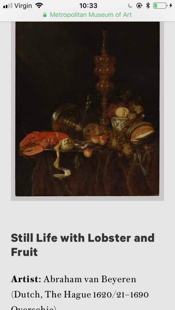
Like Jacques De Gheyns, Vanitas Still Life, 1603. This painting feels quite dark. (Maybe because both backgrounds are black?) However unlike the vanitas works, Abraham Van Beyeren’s painting ‘Still life with lobster and fruit’ feels rich and luxurious. It’s richness of colour and exquisite detail makes me feel hungry and as if this heavily laden table full of lush fruits and lobster is a banquet for for a king! I love Abraham Van Beyeren’s use of reflective surfaces of both glass and metal it just seems to emphasise these luxurious food items further. The painting doesn’t just boast of luxurious food but shows imported goods such as the blue and white porcelain bowl from China. (During this time imported goods were a sure sign of wealth.) 

I then moved on to nineteenth century artists and tried to explore how the genre was interpreted by artist Paul Cexanne and modernist artists like the cubists Picasso and Braque. 

Cézanne has been described as one of the greatest masters of the Post-Impressionist movement. He developed his own style, which has been described as architectural or sculptural. 

He wanted to break away from the realistic works of the impressionists before him, he wanted his work to be more abstract. He wanted his work to look like a painting rather than be an exact replica of the work his was producing. He did this by reducing his objects into their simplest forms and shapes and doing the same with colour. 

I decided to look at Cézanne’s Dish of Apples, 1879.  This is a painting of a metallic looking dish of red apples, they are positioned on a bright white table cloth on a table next to a patterned teapot. The brightness of the white table cloth  really emphasises  the red colour of the apples. In the background is what appears to be a beautifully elaborated cupboard or chest of drawers.

In this painting Cézanne’s style is evident. The apples are basic sphere shapes made up of scales of colour, with very little attention to detail or accuracy.
This painting is less realistic than the last couple of paintings I have looked at and the brushstrokes are more obvious or expressive. In turn this makes me think that I am looking at a painting of a dish of apples rather than an actual dish of apples. Which is exactly what Cézanne was hoping to achieve. 

Cézanne’s new style has been said to set the stage for Cubists, Fauvists, and avant-garde art movements. 

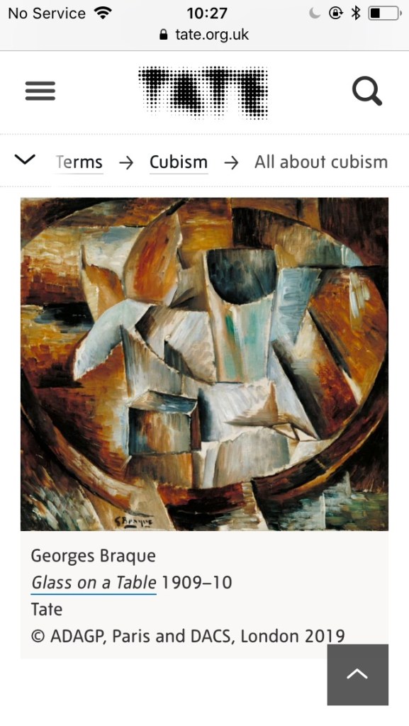
I decided to move on, to look at how Picasso & Braque depicted this still life genre in their cubist works. 

I discovered that both artists forged a close relationship both as friends and as rivals and together they began the cubist movement. 

Both Picasso and Braque wanted to move away from the very realistic paintings of the past and they were both inspired by Cézanne. They did this by transforming everyday objects into geometric shapes. 

While their Cubist works look very similar, Picasso and Braque often strove for different results – Braque wanted his works to keep a sense of balance while Picasso wanted the opposite and tried to to disrupt this harmony.

Below are some examples of their work: 

Finally I looked at how contemporary artists today are working with still life. I discovered the work of Audrey Flack, an artist best known for her photo realist still life paintings. I questioned how her approach differs from traditional practice in terms of subject matter, materials and composition. 

Audrey flack was one of the first artists to use photographs as the basis for painting. Audrey Flacks work takes its cues from Pop art by bringing in everyday household items like tubes of lipstick and perfume bottles. She was however also inspired by the works of Dutch 17th century still life paintings too. 

I decided to look at her 1977  Marilyn painting. This was a painting that was part of a collection titled ‘Vanitas.’

The painting comprises of an image of Marlyn Monroe, surrounded by a rose, a selection of whole and cut fruit. An hourglass, a pocket watch, a calendar, a blue drinking glass filled with a pearl necklace, paint pots, a candle, a mirror reflecting Marlyn’s face and make up  all resting upon a rich red fabric. 

Flack has clearly been inspired by 17th century Dutch artists here by creating a modern day ‘Vanitas’ she has tried to show life’s transient nature by including conventional vanitas symbols such as an hourglass a candle and a flower. She has also included modern symbols too such as a photograph of Marlyn Monroe and a calendar. 

Bibliography: 

Manchester Art Gallery. (2019) Inside a weekend cabin. At: https://artuk.org/discover/artworks/inside-a-weekend-cabin-204651 (Accessed 13/07/2019).

Wikipedia. (2019) Marilyn (Vanitas). At: https://en.m.wikipedia.org/wiki/Marilyn_(Vanitas) (Accessed 13/07/2019).

Morgan, R.C. (2019) AUDREY FLACK and the Revolution of Still Life Painting At: https://brooklynrail.org/2010/11/artseen/audrey-flack-and-the-revolution-of-still-life-painting (Accessed 13/07/2019).

Tate. (2019) All about cubism. At: https://www.tate.org.uk/art/art-terms/c/cubism/all-about-cubism (Accessed 13/07/2019).

Wikipedia. (2019) Audrey Flack. At: https://en.m.wikipedia.org/wiki/Audrey_Flack (Accessed 13/07/2019).

Pablo Picasso.org. (2019) At: https://www.pablopicasso.org/still-life-with-chair-caning.jsp (Accessed 13/07/2019).

Master works fine art. (2019) Georges Braque and Pablo Picasso. At: https://www.masterworksfineart.com/blog/georges-braque-and-pablo-picasso/ (Accessed 13/07/2019).

Muscato, C. (2019) Paul Cezanne’s Still Life Paintings At: https://study.com/academy/lesson/paul-cezannes-still-life-paintings.html (Accessed 13/07/2019).

Met Museum (2019) Vanitas still life 1603. At: https://www.metmuseum.org/art/collection/search/436485 (Accessed 13/07/2019).

Liedtke, W. (2003) Still-Life Painting in Northern Europe, 1600–1800. At: https://www.metmuseum.org/toah/hd/nstl/hd_nstl.htm (Accessed 13/07/2019).

Wikipedia. (2019) Still Life. At: https://en.m.wikipedia.org/wiki/Still_life (Accessed 13/07/2019).

Fiore, J. (2018) In Dutch Still Lifes, Dark Secrets Hide behind Exotic Delicacies. At: https://www.google.co.uk/amp/s/www.artsy.net/article/artsy-editorial-dutch-lifes-dark-secrets-hide-exotic-delicacies/amp (Accessed 13/07/2019).

Exercise 2: Observing shadow using blocks of tone

For this exercise I was asked to place two pale, simple shaped objects together and position a lamp so they were lit from one side. 
I experimented with a white ceramic bowl a white ceramic tea cup and a white ceramic mug. Below are some photographic layouts. 

Then I was asked to make some quick sketches in my a2 sketchbook observing light and dark, mapping out the broad areas of light and shade. 
Below is my first drawing. I worked a2 size and used a stick of charcoal. I worked with the charcoal as I would a pencil and I am not happy with my result! I seem to have misjudged its shape and form and whilst working to fix its proportions, I worked over and over my shades of black charcoal, which has not worked. I decided that the best thing to do with this drawing was to leave it and to start a new.

For my second drawing I used my charcoal stick on its side to achieve thick bold strokes . I then tried to block in the graduation of tone. I started with mid tones then added lighter and darker tones, pressing down harder and lighter as I worked. I also tried to work on smaller details such as interlocking shadows. 
Overall I felt this was a better drawing than my first one. I think my tonal work with the charcoal was more successful as was my initial use of shape and form. 

I found this work difficult, mainly because I was working on such a large scale. I am not especially happy with my results, however I feel it has been a good learning tool and hopefully this method will improve my drawings in the future. 

Exercise 1: Groups of objects

For this exercise I was asked to choose at least 6 objects of different sizes and shapes some of them being 3D shapes like rectangles and cylinders and some of them being less regular in their form. The six objects I chose were, a tube of paint, a jar of linseed oil, my sons money box, a limo cutting tool, my sons miniature vanish bottle and a bottle on sunscreen. I selected the objects due to their shape and form. 

I began by photographing my objects from different positions experimenting with layout to get the best composition. Below are my different layouts.

For my drawing I worked on a2 sized paper. Before starting my drawing I wanted to make my page more interesting so I collaged over it using brown paper and greaseproof paper. On reflection a simpler background may have been more effective?

I used just  a pencil, a graphite stick and a biro for my drawing and I tried to loosely describe my objects. I tried to work big and fill the space. I was asked to imagine I could see through my objects. I believe this was so I could focus purely on shape and form and not get too carried away with fine detail? 
Below are the different stages of my drawing.

I struggled to fill the a2 paper, I am not confident about working on such a large scale and I feel this is evident in my drawing. I found working on such a large scale difficult but I can see the benefits as it really loosened up my wrist and I really felt like I was expressing myself. 
I ended up cutting my paper down so my drawings fitted the page better and this did work, however in the future I must really focus on this. 

I am relatively pleased with my drawing however aside from not working large enough I can see that I do need to work on my accuracy of form. 

Assignment 1

For my first assignment I have been asked to choose a few objects that trigger a response from me. I am currently away from home so don’t have too many objects of significance with me. However I chose both of my sons ‘special’ items my youngest son Teddy who is 3 has ‘baby’ a raggedy old teddy bear and my eldest son Leo who is 5 has ‘babby’ a raggedy old blanket. We have been living in Australia for the last few months but are due to leave in the next couple of weeks. I have chosen a bag with the name of my sons school on it. It is a wonderful loving and vibrant international school and it has been a big part of all of our lives whilst we have been here. I have also included my sons goggles as both my children have learnt to swim in Australia and this has been a really big deal. These chosen objects I think really summarise my last few months here in Australia and will always allow me to look back on a wonderful time in my life. I spent a little while placing these objects in different positions to create the perfect layout. I tried to set them up in a space where they could create interesting shapes and angles. I also tried to consider lighting hitting the objects at an interesting angle. I did this by experimenting with positioning my bedside lamp at different angles. Below are some photographs of my different arrangements.

For my drawing I worked on a3 paper. I started with a pencil and I tried to take my time blocking out proportions and positioning. I tried to utilise some of the experimental mark making skills I have discovered in this course so far and I tried to think about applying shadow. I finished my drawing using charcoal where I tried to draw out the darkest areas.

Reflecting upon my drawing, I am pleased with some of my mark making technique and some areas of accuracy on my drawing. However I still feel that my drawing looks flat in areas and I am not especially pleased with it. I feel that adding charcoal on top of my pencil work to draw out darker areas almost ruined it and it was better before hand. (I unfortunately didn’t photograph this though.) I am however aware that this is just the start of the course and hopefully as the course develops so will my work.

Reflection on my progress: I looked at the assessment criteria for the course and I tried to review my work using this criteria. For the first assessment criteria point I was to demonstrate my technical and visual skills, materials, techniques, observational skills, visual awareness, design and compositional skills. I feel I have demonstrated all of these above points not only in my assignment but in my project work leading up to my assignment. The next assessment criteria point was the quality of my outcomes, content, application of knowledge, presentation of work in a coherent manner, discernment, conceptualisation of thoughts and communication of ideas. Even though I achieved all of these points I think I may loose marks on the quality of some of my outcomes. The next assessment criteria point was a demonstration of my creativity, my imagination, my experimentation, invention and development of a personal voice. For this criteria point I think my work may be lacking as I feel for these projects and my assignment I was following a set of very clear instructions and had limited opportunity to demonstrate my own creativity and imagination. The final assessment criteria point was on context reflection- research and critical thinking. For this point I have tried to reflect upon my work as best as possible but without any feedback or guidance so far or without examples of how to best achieve this I feel I am unable to comment further on this area until my work has been assessed by my tutor.

Exercise 4: Shadows and reflected light

For this exercise I was asked to draw two objects with reflective surfaces, I chose two glasses. I set them against a black background (two black tshirts taped to the wall.) below are some experimentations of layout. 

I was asked to use charcoal and a putty rubber and to work large scale (a2). I found this exercise difficult. I felt like I was constantly not happy with my work, however instead of constantly throwing my work away and re starting I decided to pursue my drawing and battle through. I tried to show the reflected light and shade of one object falling onto the other and I tried to focus on the shapes, shadow and light. 

I started my work by drawing my objects basic outline then adding the basic lines of shadow. 

I used my white paper to represent my lightest tonal areas. I started with the mid tones and worked up to the dark tones. I tried to lift out the smallest lightest tones with the point of my putty rubber (however I found this difficult as it didn’t seem to lift as much as I wanted it too. I tried to use the sharpest edge of my charcoal to work into the finest details. 

Overall I am not especially pleased with my drawing. I did find it incredibly helpful to be directed how to use tone effectively, however I think that in future I need to spend longer in the beginning stages working out the exact shapes and forms of the objects individually and in relation to each other before I start to add the tone. 

Research point: Odilon Redon

For my research point I was asked to look at Odilon Redon’s Two trees 1875 (charcoal on paper). I was asked to note the artists expressive use of tone, blocks of sharp charcoal in sharp contrast to expanses of light and then the smaller details, lines and spots that pull the image together as an ambient scene.

I was also asked to research more of Redons work and to discuss the atmospheric potential of tone.

Odilon Redon (born in 1840) was a French Symbolist painter who was also known for his drawings with graphite and charcoal.

I decided to look at ‘Woman with an outstretched arm 1868’ the materials used were graphite on ivory wove paper. This work shows a partially naked woman sitting on a rock whilst stretching out her arm, she appears to be sheltered by another larger rock, the background either depicts a really moody sky or a rough sea.


I find this work enchanting I love the sensitivity of his tonal marks and how my eye is drawn to the woman from the very dark tones above her. I find Redons use of dark and light captivating in this piece and how my eye is forced to travel around the page. The mood is dark, and the atmosphere makes me feel lonely and cold. It is incredible how a piece of graphite can create these incredible tones that are able to make me the viewer feel so heavy inside.

The next piece of work I looked at was called ‘The crying spider’ I picked this work as it contrasts so much with the other two pieces I have looked at. It is an image of what looks like a giant spiders body but with 12 hairy legs. Placed on its body is a male human head who appears to be crying. I can’t say I ‘like’ this work as I think it is horrible. However I am in complete awe of the dark mood it portrays. It has been drawn with charcoal and I think Redons use of tone and texture is spectacular. His use of the dark tones of the spiders body contrasted again the much lighter background really emphasises it somber mood, and the small hatching lines of hair on the spiders leg against the pale background emphasises the eeriness of the work. This dark somber fantastical creature makes me think of a nightmare, but equally the pain in this creatures face makes me feel great pity and loss. The background just adds to this feeling with the dark rough texture around the edges reinforcing the light space around the creature.

I hope that as my drawing improves that I can start to portray some sort of mood and feeling into my own work.

Bibliograpy:

Wikipedia. (2019) Odilon Redon
At: https://en.m.wikipedia.org/wiki/Odilon_Redon (Accessed 17/04/2019).

Gorlinkski, V. (2019) Odilon Redon
At: https://www.britannica.com/biography/Odilon-Redon (Accessed 17/04/2019).

Moma. (2019) Odilon Redon: French 1840-1916
At: https://www.moma.org/artists/4840 (Accessed 17/04/2019).

Exercise 3: Creating shadow using lines and marks.

For this exercise I was asked to choose a simple single object, I chose a tube of acrylic paint.
I was then asked to work with four drawing tools, I chose a pencil, a biro, black ink and a ball point pen.
I then split my page into four and drew the object four different times using my different drawing tools, rather than drawing heavy outlines though, I worked using mark making techniques such as cross hatching, hatching spots and a scribble. Below are my results.

I am not especially pleased with the accuracy of my drawings however I am pleased with my mark making. This mark making allowed me to think about adding tone in a way that’s different than just shading with my pencil. I look forward to using this technique in the future.

I then arranged more objects. This time I chose, two perfume bottles, the tube of acrylic paint and my tea cup. I chose these objects as I found their reflective properties exciting, and I hoped the reflections would make for an interesting drawing? Below I have experimented with layout.

I then drew my favourite layout and I tried to fiocus on showing tone with different mark making techniques. I worked a2 size and used a range of drawing materials such as ink, graphite stick, charcoal and a biro. Below is my result.

Even though I worked on a2 paper I didn’t manage to fill the page. Working large scale is something I clearly need to work on.
I enjoyed the process of this drawing, not worrying too much about accuracy and experimenting quickly with mark making. However I am not entirely happy with my final result. My shape and form isn’t as accurate as I would like it to be. Even though I like my marks and find them quite exciting and expressive I don’t think they are accurate enough?

Exercise 2: Observing shadow using blocks of tone.

For this exercise I was asked to place two pale, simple shaped objects together and position a lamp so they were lit from one side.
I experimented with a white ceramic bowl a white ceramic tea cup and a white ceramic mug. Below are some photographic layouts.

Then I was asked to make some quick sketches in my a2 sketchbook observing light and dark, mapping out the broad areas of light and shade.
Below is my first drawing. I worked a2 size and used a stick of charcoal. I worked with the charcoal as I would a pencil and I am not happy with my result! I seem to have misjudged its shape and form and whilst working to fix its proportions, I worked over and over my shades of black charcoal, which has not worked. I decided that the best thing to do with this drawing was to leave it and to start a new.

For my second drawing I used my charcoal stick on its side to achieve thick bold strokes . I then tried to block in the graduation of tone. I started with mid tones then added lighter and darker tones, pressing down harder and lighter as I worked. I also tried to work on smaller details such as interlocking shadows.


Overall I felt this was a better drawing than my first one. I think my tonal work with the charcoal was more successful as was my initial use of shape and form.

I found this work difficult, mainly because I was working on such a large scale. I am not especially happy with my results, however I feel it has been a good learning tool and hopefully this method will improve my drawings in the future.

Exercise 1: Groups of objects.

For this exercise I was asked to choose at least 6 objects of different sizes and shapes some of them being 3D shapes like rectangles and cylinders and some of them being less regular in their form. The six objects I chose were, a tube of paint, a jar of linseed oil, my sons money box, a lino cutting tool, my sons miniature vanish bottle and a bottle of sunscreen. I selected the objects due to their shape and form.

I began by photographing my objects from different positions experimenting with layout to get the best composition. Below are my different layouts.

For my drawing I worked on a2 sized paper. Before starting my drawing I wanted to make my page more interesting so I collaged over it using brown paper and greaseproof paper. On reflection a simpler background may have been more effective?

I used just a pencil, a graphite stick and a biro for my drawing and I tried to loosely describe my objects. I tried to work big and fill the space. I was asked to imagine I could see through my objects. I believe this was so I could focus purely on shape and form and not get too carried away with fine detail?
Below are the different stages of my drawing.

I struggled to fill the a2 paper, I am not confident about working on such a large scale and I feel this is evident in my drawing. I found working on such a large scale difficult but I can see the benefits as it really loosened up my wrist and I really felt like I was expressing myself.
I ended up cutting my paper down so my drawings fitted the page better and this did work, however in the future I must really focus on this.

I am relatively pleased with my drawing however aside from not working large enough I can see that I do need to work on my accuracy of form.

Experimenting with texture

For this exercise I was asked to collect a range of different objects with different surface textures. I chose a selection of fabrics, bubble wrap, children’s toys, work tops, foods and place matts.

I then drew these textures in rectangles in my sketchbook. I experimented with different media’s, marks and materials to try to recreate these textures. Below are my results.

I am pleased with my results, I hope that I can incorporate this sort of texture into my future drawings.

The next stage in this exercise was to experiment with frontage. This involved placing paper over rough surfaces and rubbing the back with my graphite stick in order to create an impression of the surface quality of the objects. Below are my results,

  1. Leaf x3
  2. Wicker on bed
  3. Camera case
  4. Spikey stick
  5. Plastic toy dinosaur surface
  6. Coins
  7. Wall
  8. Outdoor Matt
  9. Back of pencil sharpener
  10. Plant pot

I really enjoyed this exercise, I used to do ‘rubbings’ as a small child and this work brought me right back to that moment in time. I loved the results I achieved and I am excited about using this technique in my future work.